|
一年一度的/520/七夕情人节/女朋友生日/程序员表白,是不是要给女朋友或者正在追求的妹子一点小惊喜呢,今天这篇博客就分享下前端代码如何实现3D立体动态相册。赶紧学会了,来制作属于我们程序员的浪漫吧!
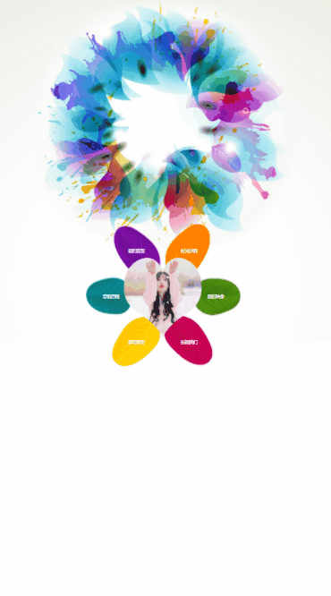
❤七夕情人节表白[樱花飘落3D相册],程序员也可以很浪漫哦 ! 程序员向妹子表白专用代码!❤ HTML+css3+js 抖音很火的3d旋转相册-包含音乐,(送女友,表白,生日)动态生成效果,这样制作的~,现在,越来越多的人喜欢用视频记录生活,照片多的友友也会选择制作动态相册视频,不仅创意十足,同时还能展现自我风采, 撩妹神器哦!
视频演示
01
❉ 樱花雨3D相册(含背景音乐)
在线演示地址 文字开场白+演示地址
❉ 加点萤火虫金光闪闪的效果?? 在线演示地址
文字开场白+演示地址
 
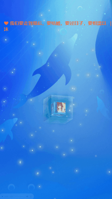
❉ 蓝色背景

❉ H5端

❉ (动画)蓝色梦幻海洋网页特效(可自行替换背景图片)
在线演示地址 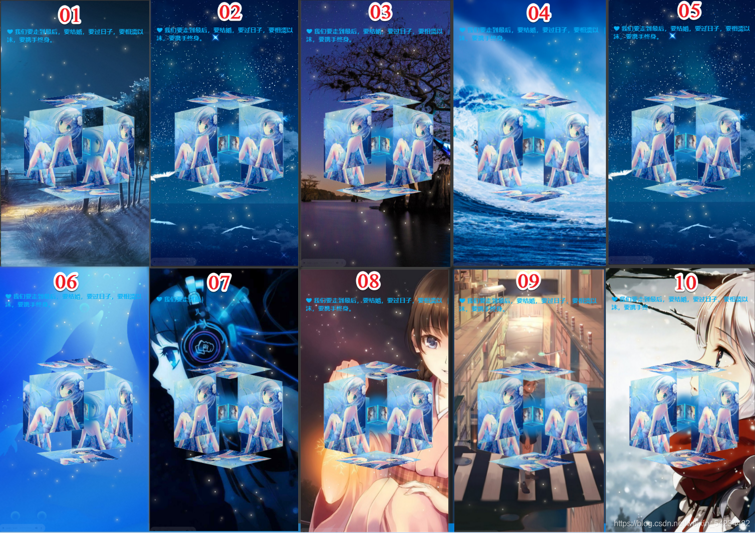
❉ 动态效果演示(太多了就不一一演示了)
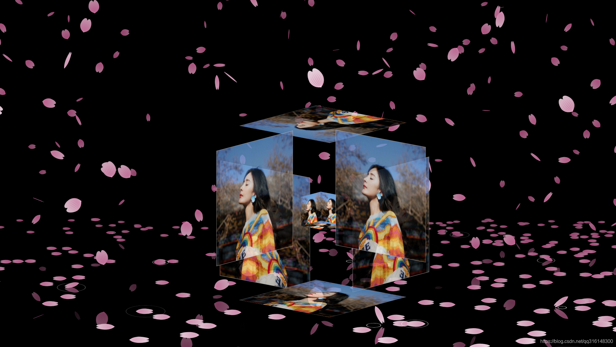
❉ html5+canvas烂漫的空中散落的花瓣3D相册 H5端
在线演示地址
文字开场白+演示地址

❉ html5+canvas烂漫的空中散落的花瓣3D相册 PC端
在线演示地址
文字开场白+演示地址

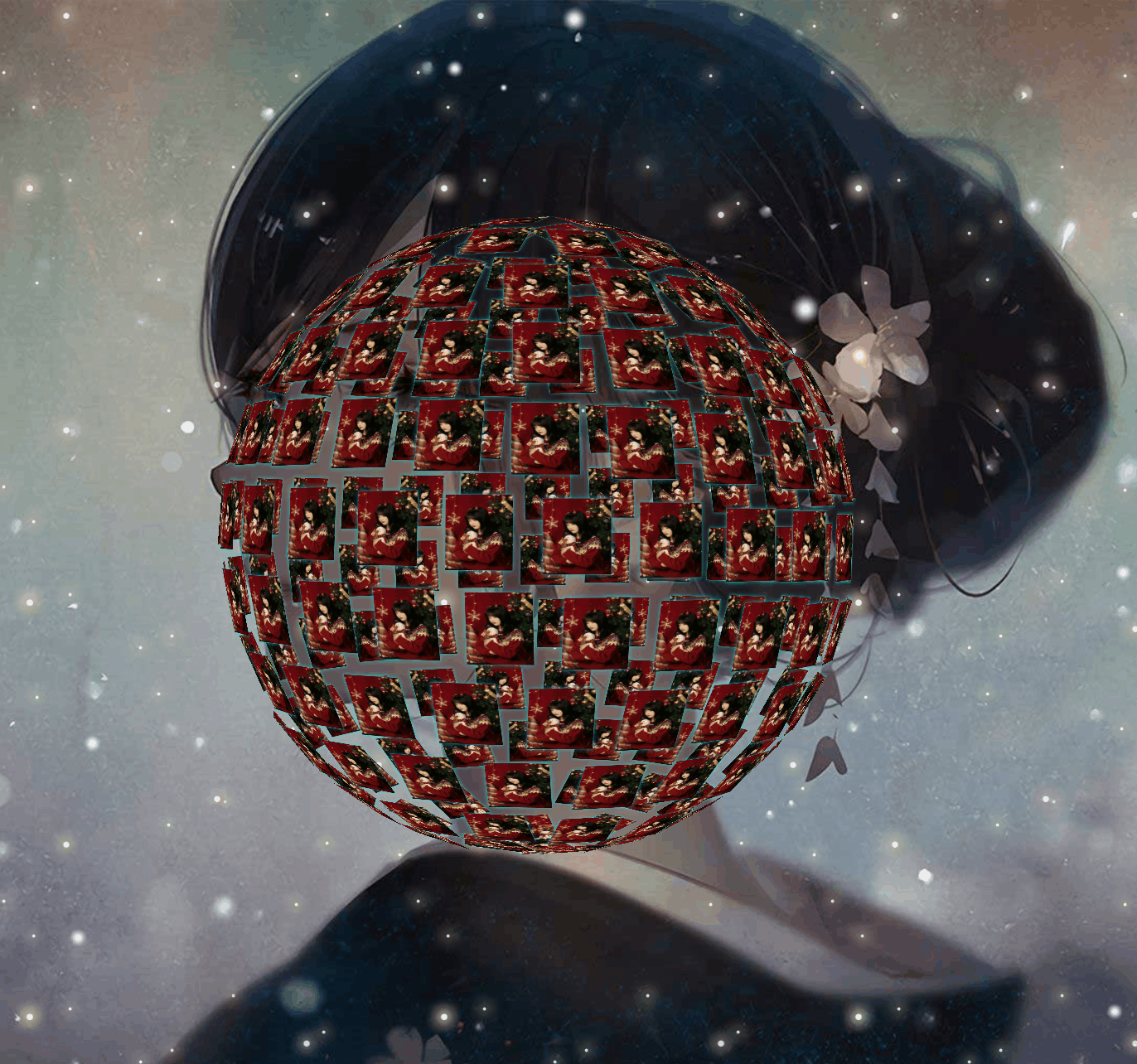
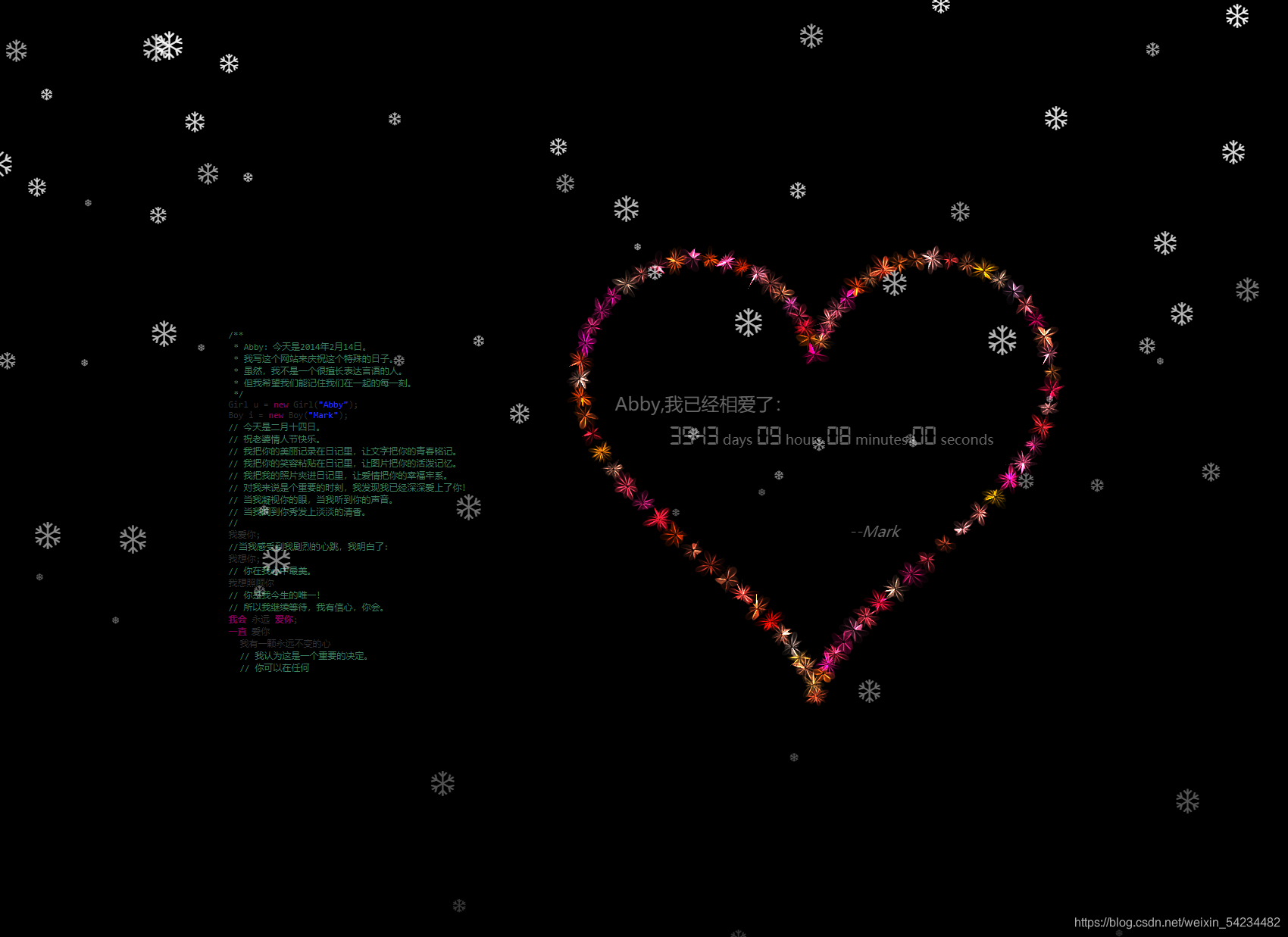
❉ 圣诞节❉(雪花飘落)3D相册(含背景音乐)
在线演示地址 
动态效果图(已兼容 H5移动端 和 pc端 )
里面配置了MP3音乐文件, 可自行替换你喜欢的MP3,免费下载教程下面有
H5移动端

PC 电脑端

静态大图效果展示
新年烟花❤表白/拜年/情人节❤ html+css+js 放一场浪漫烟花秀(含音乐/定制❤相片)程序员表白必备烟花
1.拜年烟花演示地址
2.表白烟花演示地址
3.开场表白-烟花线演示地址
   
❤520情人节到了,作为程序猿的我用代码给女朋友送了一个礼物「可以拿去送给自己喜欢的人」
点↓↓↓下方链接即可查看线上地址
❤在线演示地址

❤来点樱花点缀一下吧

点↓↓↓下方链接即可查看效果
❤烟花在线演示地址

❤ 旋转3D流星雨相册(可旋转/拖拽/滚动-含音乐)
在线演示地址

❤ 助力程序员撩妹手到擒来❤ html+css+js 烟花表白(含音乐)可自定义编辑文字
在线演示地址 
❉ 元旦节/跨年夜❉(照片墙)3D相册/含背景音乐/可自定义文字 具有多种相册图形变化
在线演示地址
电脑端
点↓↓↓下方链接即可查看线上地址
❤在线演示地址
 
手机端
动态效果
静态效果

520表白 Html+Js+Css 实现雪花爱心❤ (爱心3D动画,自定义文字)/ 程序员表白必备
原文地址
❤在线演示地址
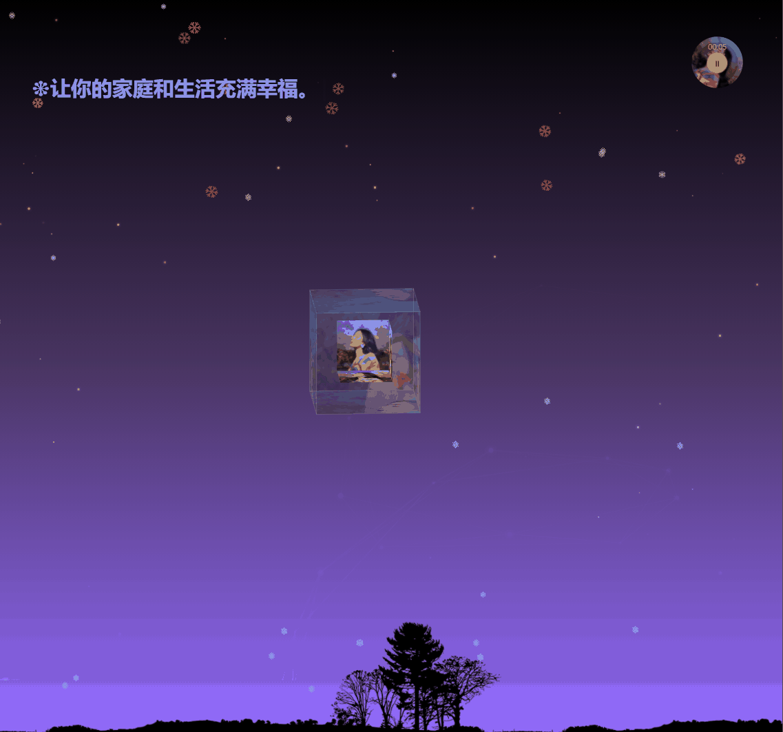
❉ 元旦节/跨年夜❉(满天星空)3D相册/含背景音乐/可自定义文字 具有背景颜色渐变
在线演示地址
❉ ❉html+css+js❉ 绘制冬季下雪3D相册 (521程序员表白代码大公开)
原文地址 在线演示地址 
3d相册制作教程
需要12张图片, 1-6 图片是大图 400400 ,01-06 图片是小图 100100
将准备好的图片,自行替换images 文件中的图片即可 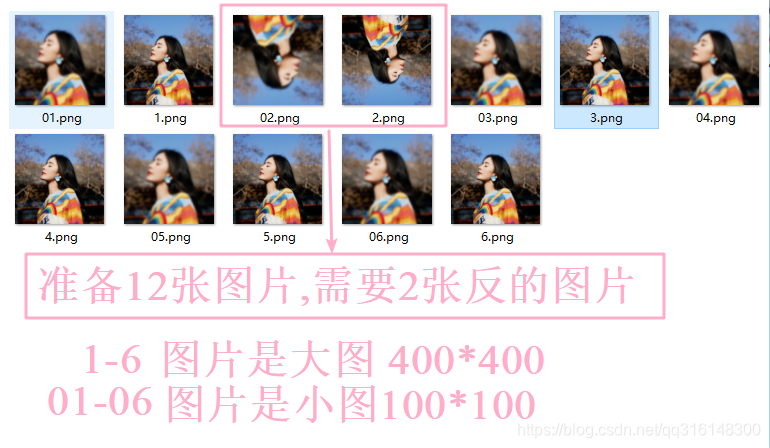
美图秀秀(电脑版)裁剪图片
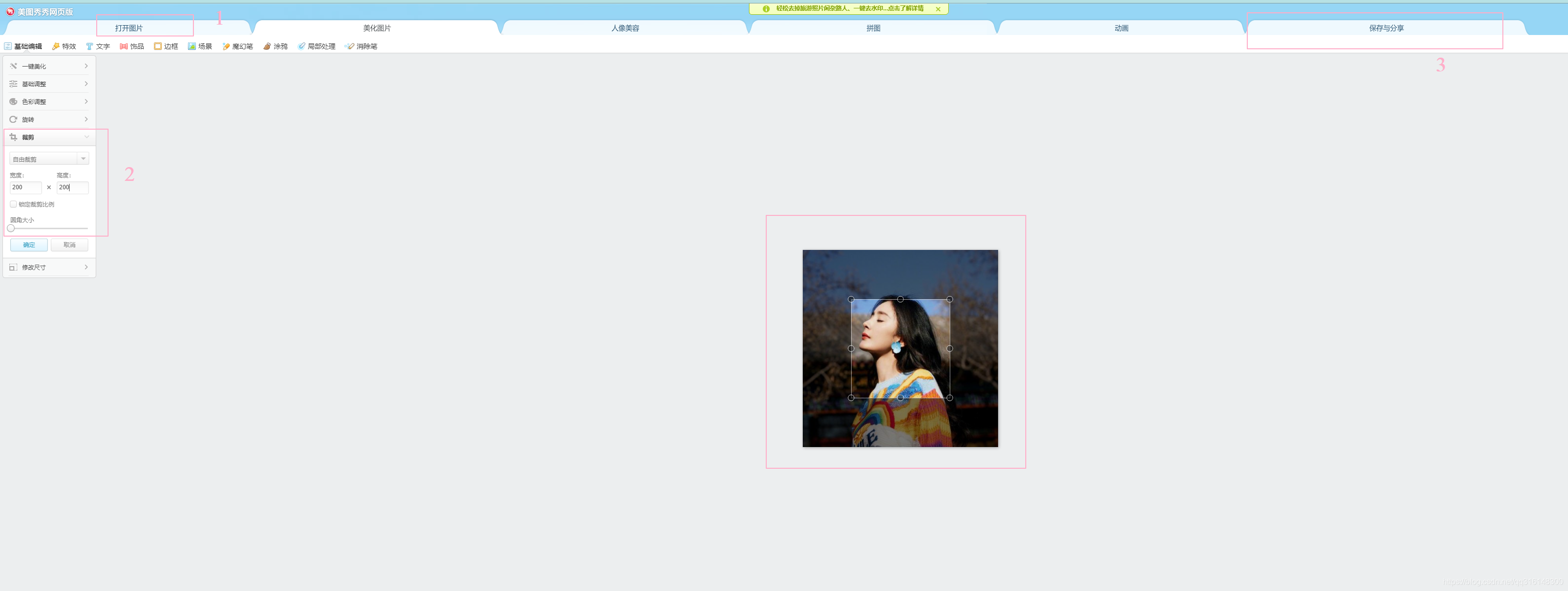 在线裁剪图片链接 在线裁剪图片链接
MP3 免费下载
mp3免费下载地址 如需更换mp3 背景音乐,可自行下载更换即可…
mp3下载教程
❉ -------------------- 好了废话不多说 上正题 >>>>樱花雨3D相册代码如下--------------------
❉ 樱花雨3D相册代码如下
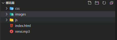
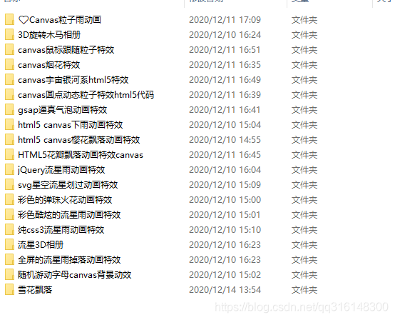
❉ 文件目录
❉ html代码
DOCTYPE html>
html,
body {
width: 100%;
height: 100%;
margin: 0;
padding: 0;
overflow: hidden;
}
.container {
width: 100%;
height: 100%;
margin: 0;
padding: 0;
background-color: #000000;
}
....
❉ 相册旋转 css代码
@charset "utf-8";
*{
margin:0;
padding:0;
}
body{
max-width: 100%;
min-width: 100%;
height: 100%;
background-size: cover;
background-repeat: no-repeat;
background-attachment: fixed;
background-size:100% 100%;
position: absolute;
margin-left: auto;
margin-right: auto;
}
li{
list-style: none;
}
.box{
width:200px;
height:200px;
background-size: cover;
background-repeat: no-repeat;
background-attachment: fixed;
background-size:100% 100%;
position: absolute;
margin-left: 42%;
margin-top: 22%;
-webkit-transform-style:preserve-3d;
-webkit-transform:rotateX(13deg);
-webkit-animation:move 5s linear infinite;
}
.minbox{
width:100px;
height:100px;
position: absolute;
left:50px;
top:30px;
-webkit-transform-style:preserve-3d;
}
.minbox li{
width:100px;
height:100px;
position: absolute;
left:0;
top:0;
}
.minbox li:nth-child(1){
background: url(../images/01.png) no-repeat 0 0;
-webkit-transform:translateZ(50px);
}
.minbox li:nth-child(2){
background: url(../images/02.png) no-repeat 0 0;
-webkit-transform:rotateX(180deg) translateZ(50px);
}
.minbox li:nth-child(3){
background: url(../images/03.png) no-repeat 0 0;
-webkit-transform:rotateX(-90deg) translateZ(50px);
}
.minbox li:nth-child(4){
background: url(../images/04.png) no-repeat 0 0;
-webkit-transform:rotateX(90deg) translateZ(50px);
}
.minbox li:nth-child(5){
background: url(../images/05.png) no-repeat 0 0;
-webkit-transform:rotateY(-90deg) translateZ(50px);
}
.minbox li:nth-child(6){
background: url(../images/06.png) no-repeat 0 0;
-webkit-transform:rotateY(90deg) translateZ(50px);
}
.maxbox li:nth-child(1){
background: url(../images/1.png) no-repeat 0 0;
-webkit-transform:translateZ(50px);
}
.maxbox li:nth-child(2){
background: url(../images/2.png) no-repeat 0 0;
-webkit-transform:translateZ(50px);
}
.maxbox li:nth-child(3){
background: url(../images/3.png) no-repeat 0 0;
-webkit-transform:rotateX(-90deg) translateZ(50px);
}
.maxbox li:nth-child(4){
background: url(../images/4.png) no-repeat 0 0;
-webkit-transform:rotateX(90deg) translateZ(50px);
}
.maxbox li:nth-child(5){
background: url(../images/5.png) no-repeat 0 0;
-webkit-transform:rotateY(-90deg) translateZ(50px);
}
.maxbox li:nth-child(6){
background: url(../images/6.png) no-repeat 0 0;
-webkit-transform:rotateY(90deg) translateZ(50px);
}
❉ 樱花飘落 js代码
var RENDERER = {
INIT_CHERRY_BLOSSOM_COUNT: 30,
MAX_ADDING_INTERVAL: 10,
init: function() {
this.setParameters();
this.reconstructMethods();
this.createCherries();
this.render();
if (
navigator.userAgent.match(
/(phone|pod|iPhone|iPod|ios|Android|Mobile|BlackBerry|IEMobile|MQQBrowser|JUC|Fennec|wOSBrowser|BrowserNG|WebOS|Symbian|Windows Phone)/i
)
) {
var box = document.querySelectorAll('.box')[0];
console.log(box, '移动端');
box.style.marginTop = '65%';
}
},
setParameters: function() {
this.$container = $('#jsi-cherry-container');
this.width = this.$container.width();
this.height = this.$container.height();
this.context = $('')
.attr({ width: this.width, height: this.height })
.appendTo(this.$container)
.get(0)
.getContext('2d');
this.cherries = [];
this.maxAddingInterval = Math.round(
(this.MAX_ADDING_INTERVAL * 1000) / this.width
);
this.addingInterval = this.maxAddingInterval;
},
reconstructMethods: function() {
this.render = this.render.bind(this);
},
createCherries: function() {
for (
var i = 0,
length = Math.round(
(this.INIT_CHERRY_BLOSSOM_COUNT * this.width) / 1000
);
i
requestAnimationFrame(this.render);
this.context.clearRect(0, 0, this.width, this.height);
this.cherries.sort(function(cherry1, cherry2) {
return cherry1.z - cherry2.z;
});
for (var i = this.cherries.length - 1; i >= 0; i--) {
if (!this.cherries[i].render(this.context)) {
this.cherries.splice(i, 1);
}
}
if (--this.addingInterval == 0) {
this.addingInterval = this.maxAddingInterval;
this.cherries.push(new CHERRY_BLOSSOM(this, false));
}
}
};
var CHERRY_BLOSSOM = function(renderer, isRandom) {
this.renderer = renderer;
this.init(isRandom);
};
更多演示
❤ Html5+canvas 爱情树表白动画模板代码 (含背景音乐)
在线演示地址 
❉ html5+canvas生日快乐文字烟花背景动画特效
在线演示地址 
❉ html+js+css生日快乐
在线演示地址

❉ 流星3D相册
在线演示地址 
❉ 抖音超火❤罗盘时钟(免费附源码)
在线演示地址 
❉ 前端 零基础 入门到高级 (视频+源码+开发软件+学习资料+面试题) 一整套
❉ 表白源码
❉ 其他素材源码

❉ 特效
❉ 150套 Echart 图表源码
一万年太长,和你在一起,只争朝夕。 情书给你一封,情话给你一句,余生给你一人。 我想要的未来,就是每天早上起床,都能看见你和阳光都在。
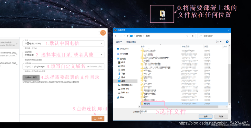
做好的网页效果,如何通过发链接给别人看?
1.1解决部署上线~> 部署上线工具(永久免费使用)
1.不需要买服务器就能部署线上,全世界都能访问你的连接啦, 这里给大家推荐一个程序员必备神器~ 插件集成了超级多好用的插件,免费下载安装,简单易懂, 简直神器 ~ 需要可在文章 ↓ 下方公Z号获取
2.就是把你的代码效果做好了以后, 部署到线上, 把链接发给别人, 就可以让对方通过你的连接点击进去, 就能看到你的网页效果啦, 电脑端和手机端都可以噢! (不然别人看你的网页都要发文件过去,体验感不太好哦~)
1.1部署流程
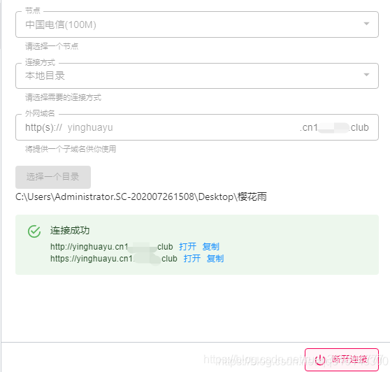
1.2 哇~ 部署成功
哇~ 部署成功! 将你写好的页面部署上线后, 全世界的人都可以通过链接访问到你的网页了(永久免费使用哦)~
前端 零基础 入门到高级 (视频+源码+开发软件+学习资料+面试题) 一整套 (教程)
适合入门到高级的童鞋们入手~
❉ 源码获取
❉ ~ 关注我,点赞博文~ 每天带你涨知识!
❉ 1.看到这里了就 [点赞+好评+收藏] 三连 支持下吧,你的「点赞,好评,收藏」是我创作的动力。
❉ 2.关注我~ 每天带你学习 :各种前端插件、3D炫酷效果、图片展示、文字效果、以及整站模板 、大学生毕业模板 、期末大作业模板 、等! 「在这里有好多 前端 开发者,一起探讨 前端 Node 知识,互相学习」!
❉ 3.以上内容技术相关问题可以相互学习,可关注↓公Z号 获取更多源码 !

❉更多表白源码
❤100款表白源码演示地址
|