| Python数据可视化库seaborn | 您所在的位置:网站首页 › 绘制条形图的方法有哪些 › Python数据可视化库seaborn |
Python数据可视化库seaborn
|
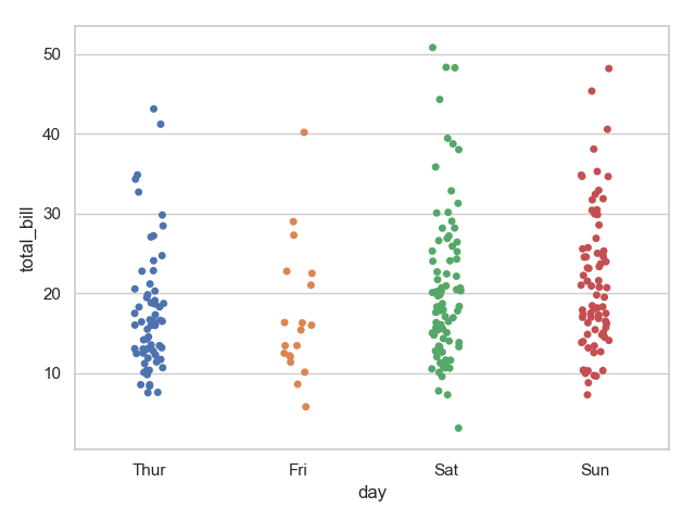
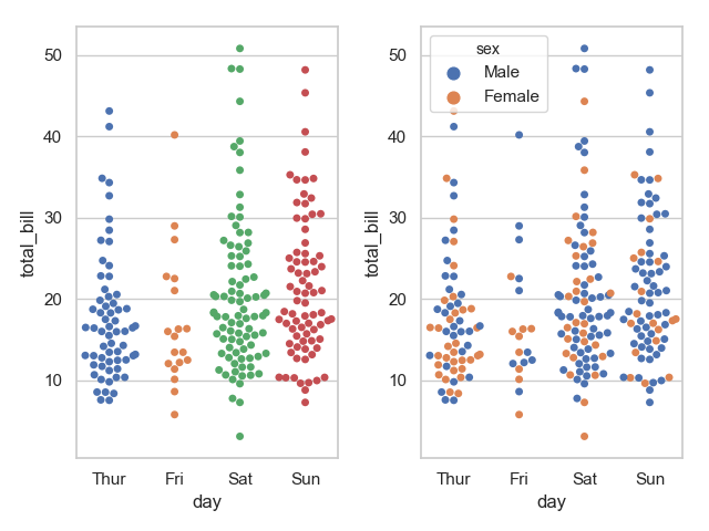
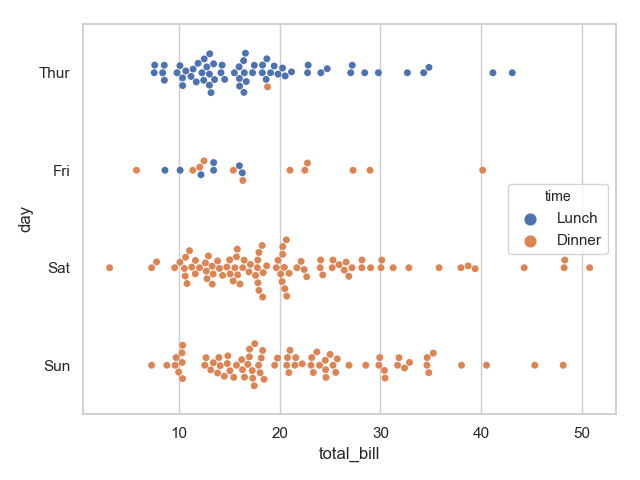
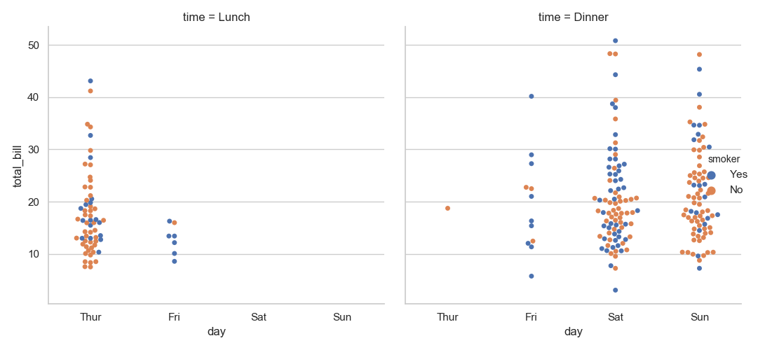
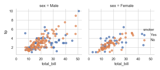
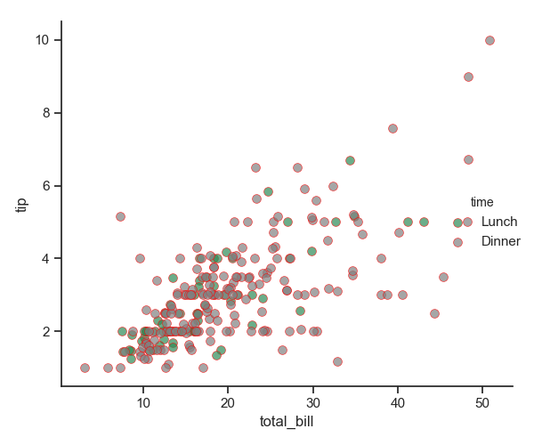
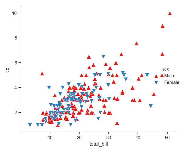
seaborn官方文档:http://seaborn.pydata.org/api.html 绘制多变量的分布图 先绘制两个变量的分布图,其中X变量为分类变量,Y为数值变量。 1 import pandas as pd 2 import numpy as np 3 import seaborn as sns 4 import matplotlib.pyplot as plt 5 import matplotlib as mpl 6 tips = sns.load_dataset("tips") 7 sns.set(style="whitegrid", color_codes=True) 8 sns.stripplot(x="day", y="total_bill", data=tips) 9 plt.show()运行结果: 注意:观察上图不难发现,带图默认是有抖动的,即 jitter=True 。下面用 swarmplot 绘制带分布的散点图。并且将展示在图中分割多个分类变量,以不同的颜色展示。 1 plt.subplot(121) 2 sns.swarmplot(x="day", y="total_bill", data=tips) 3 plt.subplot(122) 4 sns.swarmplot(x="day", y="total_bill", hue="sex", data=tips) 5 plt.show() 6 sns.swarmplot(x="total_bill", y="day", hue="time", data=tips) 7 plt.show()运行结果: 通过上面的图像我们很容易观察到 day 与 time 、sex 之间的一些关系。
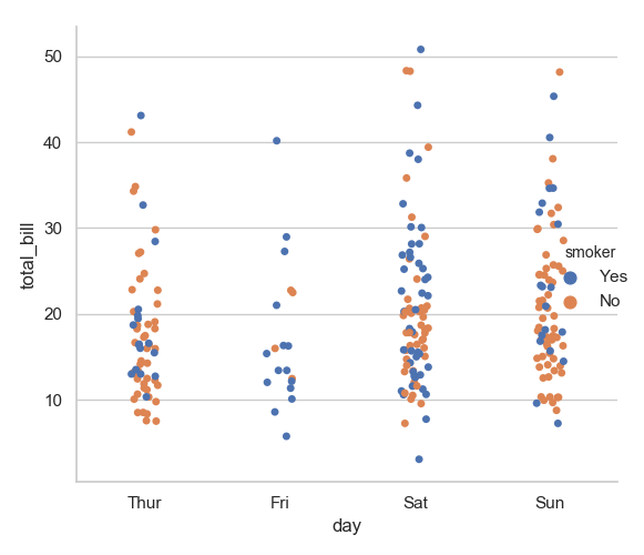
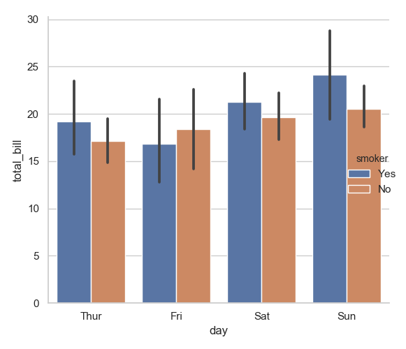
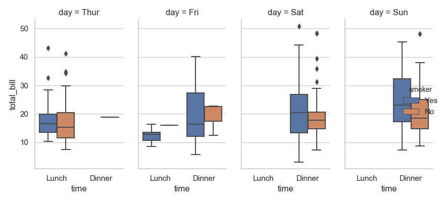
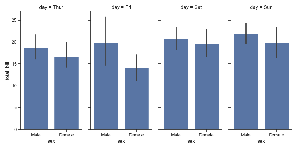
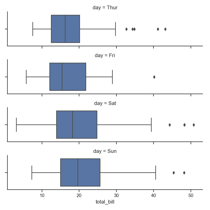
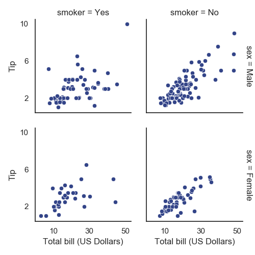
箱线图与小提琴图 下面我们将绘制箱线图以及小提琴图展示 变量间的关系 盒图 IQR即统计学概念四分位距,第一/四分位 与 第三/四分位之间的距离 N = 1.5IQR 如果一个值>Q3+N或 scalar, optional Statistical function to estimate within each categorical bin. ci : float or “sd” or None, optional Size of confidence intervals to draw around estimated values. If “sd”, skip bootstrapping and draw the standard deviation of the observations. If None, no bootstrapping will be performed, and error bars will not be drawn. n_boot : int, optional Number of bootstrap iterations to use when computing confidence intervals. units : name of variable in data or vector data, optional Identifier of sampling units, which will be used to perform a multilevel bootstrap and account for repeated measures design. order, hue_order : lists of strings, optional Order to plot the categorical levels in, otherwise the levels are inferred from the data objects. row_order, col_order : lists of strings, optional Order to organize the rows and/or columns of the grid in, otherwise the orders are inferred from the data objects. kind : string, optional The kind of plot to draw (corresponds to the name of a categorical plotting function. Options are: “point”, “bar”, “strip”, “swarm”, “box”, “violin”, or “boxen”. height : scalar, optional Height (in inches) of each facet. See also: aspect. aspect : scalar, optional Aspect ratio of each facet, so that aspect * height gives the width of each facet in inches. orient : “v” | “h”, optional Orientation of the plot (vertical or horizontal). This is usually inferred from the dtype of the input variables, but can be used to specify when the “categorical” variable is a numeric or when plotting wide-form data. color : matplotlib color, optional Color for all of the elements, or seed for a gradient palette. palette : palette name, list, or dict, optional Colors to use for the different levels of the hue variable. Should be something that can be interpreted by color_palette(), or a dictionary mapping hue levels to matplotlib colors. legend : bool, optional If True and there is a hue variable, draw a legend on the plot. legend_out : bool, optional If True, the figure size will be extended, and the legend will be drawn outside the plot on the center right. share{x,y} : bool, ‘col’, or ‘row’ optional If true, the facets will share y axes across columns and/or x axes across rows. margin_titles : bool, optional If True, the titles for the row variable are drawn to the right of the last column. This option is experimental and may not work in all cases. facet_kws : dict, optional Dictionary of other keyword arguments to pass to FacetGrid. kwargs : key, value pairings Other keyword arguments are passed through to the underlying plotting function. Returns:g : FacetGrid Returns the FacetGrid object with the plot on it for further tweaking. Parameters: x,y,hue 数据集变量 变量名 date 数据集 数据集名 row,col 更多分类变量进行平铺显示 变量名 col_wrap 每行的最高平铺数 整数 estimator 在每个分类中进行矢量到标量的映射 矢量 ci 置信区间 浮点数或None n_boot 计算置信区间时使用的引导迭代次数 整数 units 采样单元的标识符,用于执行多级引导和重复测量设计 数据变量或向量数据 order, hue_order 对应排序列表 字符串列表 row_order, col_order 对应排序列表 字符串列表 kind : 可选:point 默认, bar 柱形图, count 频次, box 箱体, violin 提琴, strip 散点,swarm 分散点 size 每个面的高度(英寸) 标量 已经不用了,现在使用height aspect 纵横比 标量 orient 方向 "v"/"h" color 颜色 matplotlib颜色 palette 调色板名称 seaborn颜色色板 legend_hue 布尔值:如果是真的,图形大小将被扩展,并且图画将绘制在中心右侧的图外。 share{x,y} 共享轴线 True/False:如果为真,则刻面将通过列和/或X轴在行之间共享Y轴。 下面将是常用图像的展示: 1 sns.catplot(x="day", y="total_bill", hue="smoker", data=tips) 2 plt.show()
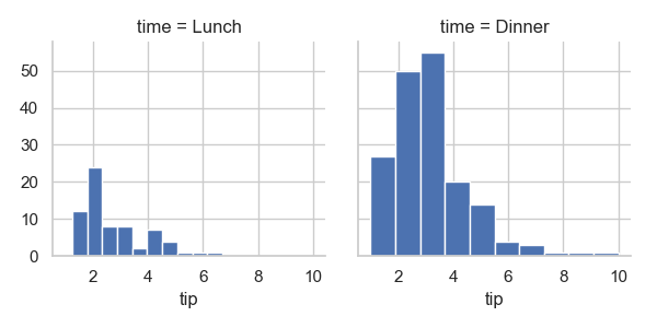
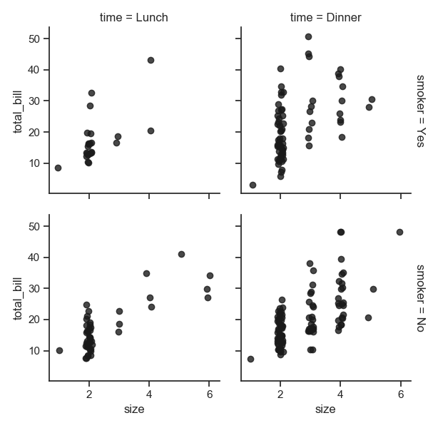
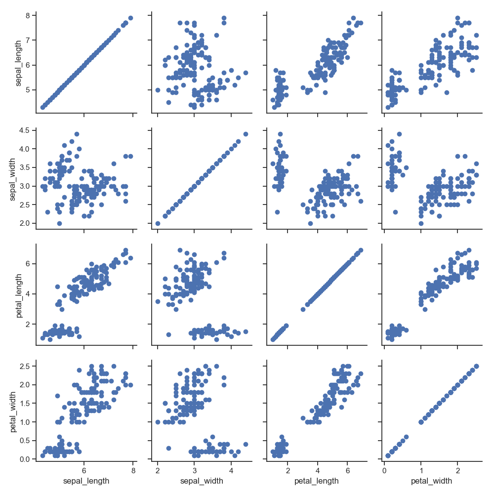
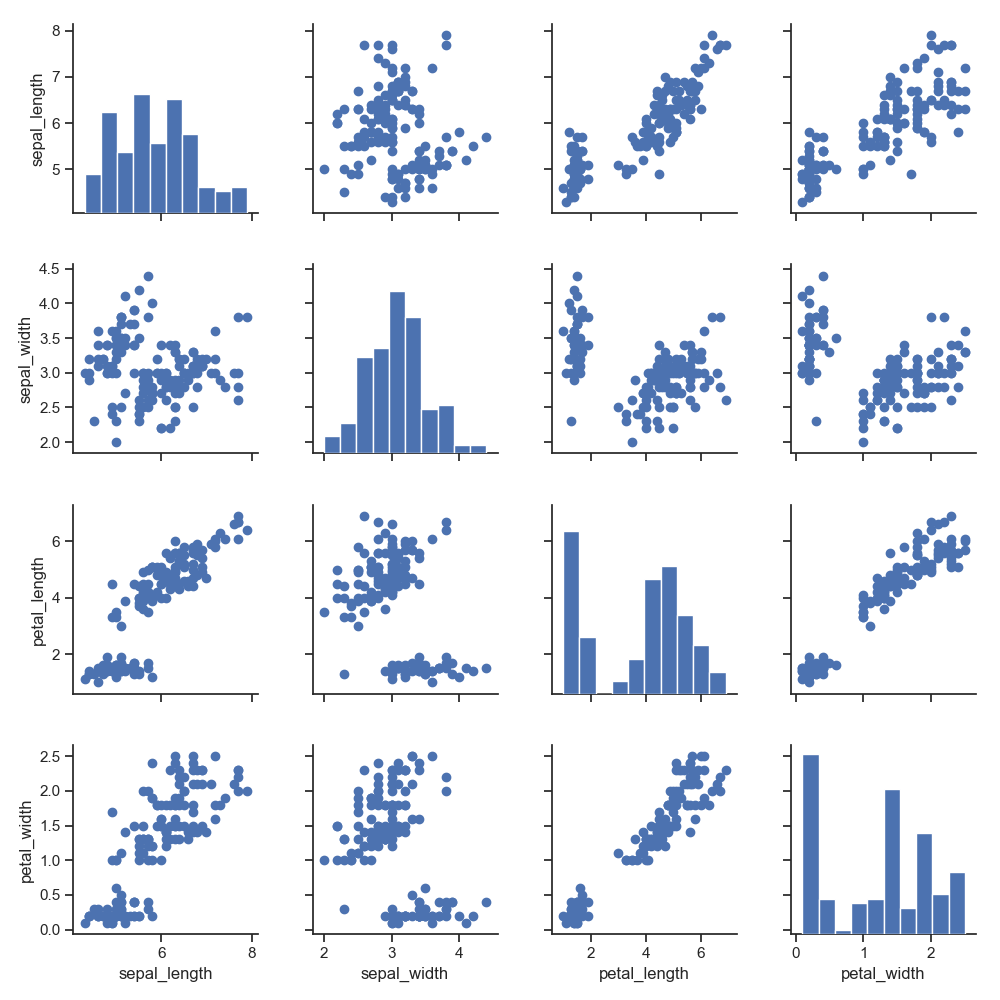
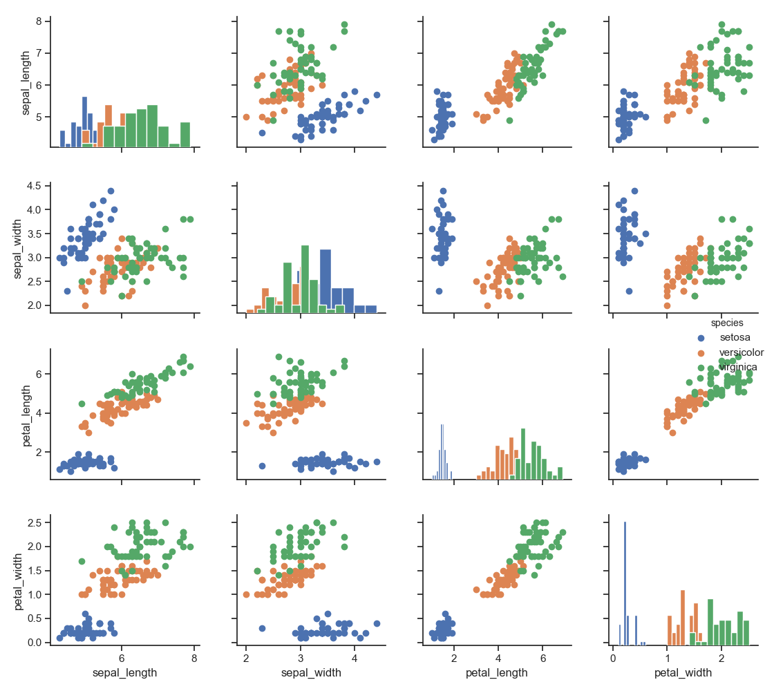
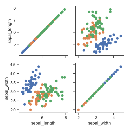
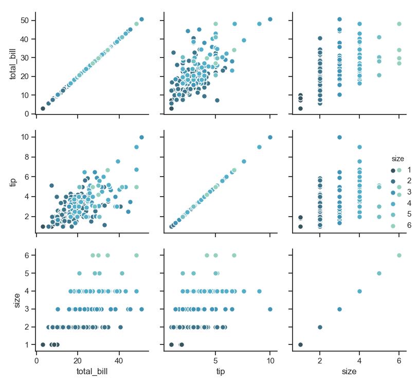
用 FacetGrid 这个类来展示数据 更多内容请点击上面的链接,下面将简单展示 1 g = sns.FacetGrid(tips, col="time") # 占位 2 g.map(plt.hist, "tip") # 画图;第一个参数是func 3 plt.show() PairGrid 的简单展示 1 iris = sns.load_dataset("iris") 2 g = sns.PairGrid(iris) 3 g.map(plt.scatter) 4 plt.show()
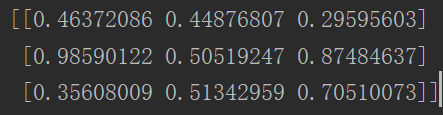
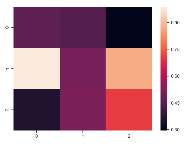
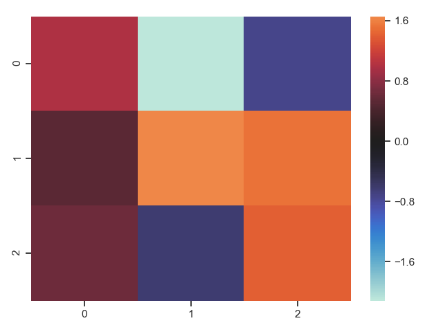
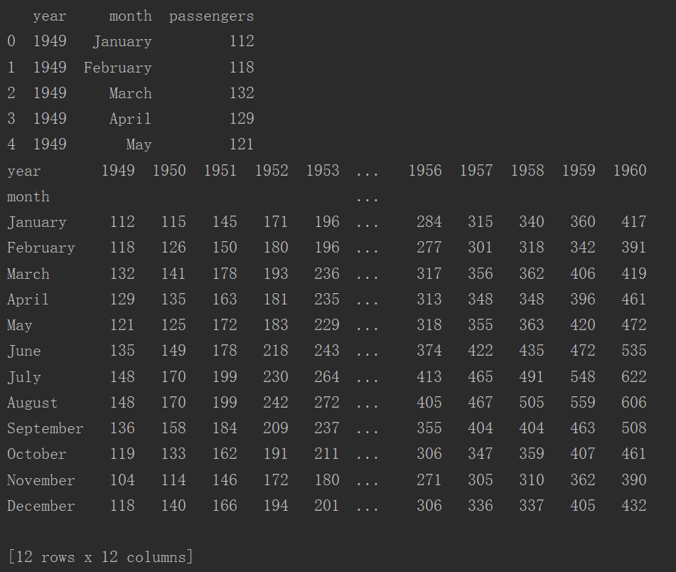
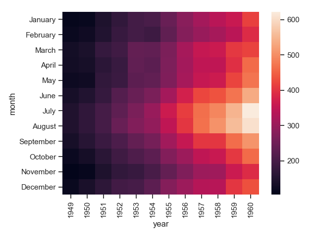
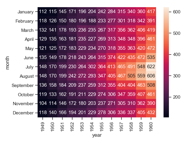
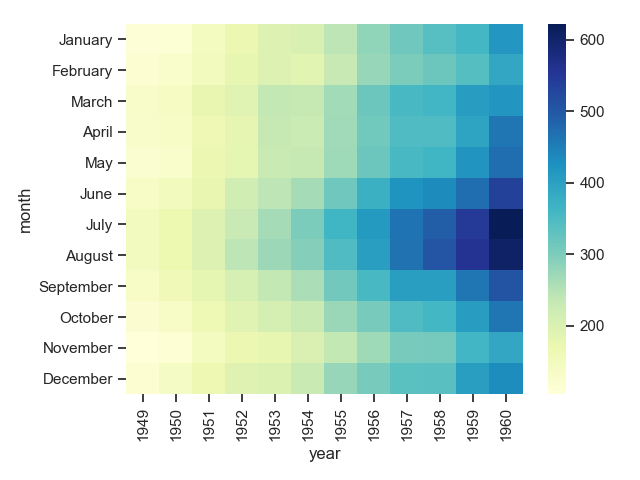
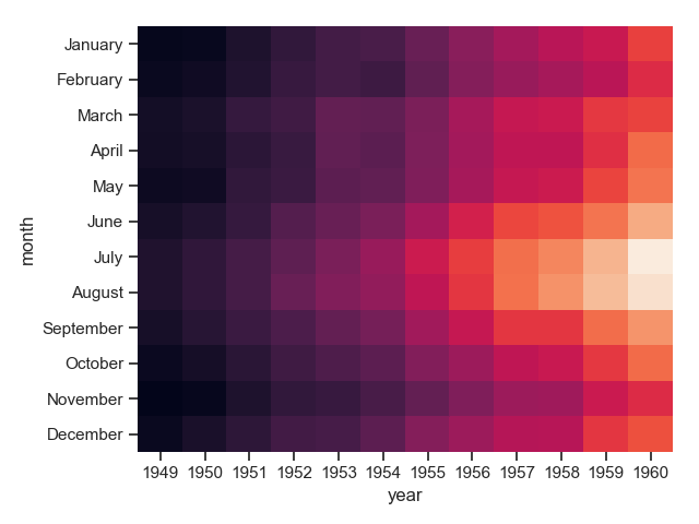
热力图 用颜色的深浅、亮度等来显示数据的分布 1 uniform_data = np.random.rand(3, 3) 2 print(uniform_data) 3 heatmap = sns.heatmap(uniform_data) 4 plt.show() 注意上图的随机数发生了变化。 1 normal_data = np.random.randn(3, 3) 2 print(normal_data) 3 ax = sns.heatmap(normal_data, center=0) # 中心值 4 plt.show()
|


【本文地址】