| FigDraw 11. SCI 文章绘图之小提琴图 (ViolinPlot) | 您所在的位置:网站首页 › 钢琴图怎么画简单 › FigDraw 11. SCI 文章绘图之小提琴图 (ViolinPlot) |
FigDraw 11. SCI 文章绘图之小提琴图 (ViolinPlot)
|
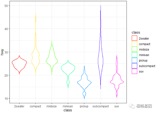
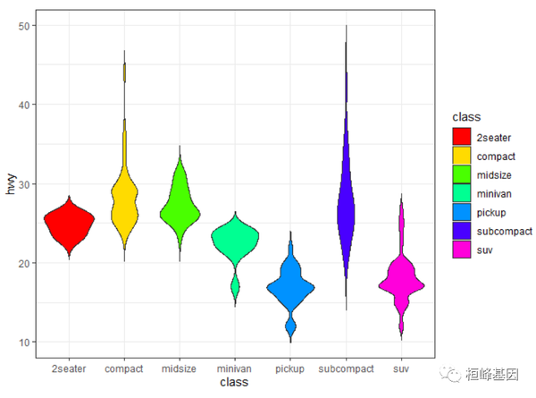
桓峰基因公众号推出基于R语言绘图教程并配有视频在线教程,目前整理出来的教程目录如下: FigDraw 1. SCI 文章的灵魂 之 简约优雅的图表配色 FigDraw 2. SCI 文章绘图必备 R 语言基础 FigDraw 3. SCI 文章绘图必备 R 数据转换 FigDraw 4. SCI 文章绘图之散点图 (Scatter) FigDraw 5. SCI 文章绘图之柱状图 (Barplot) FigDraw 6. SCI 文章绘图之箱线图 (Boxplot) FigDraw 7. SCI 文章绘图之折线图 (Lineplot) FigDraw 8. SCI 文章绘图之饼图 (Pieplot) FigDraw 9. SCI 文章绘图之韦恩图 (Vennplot) FigDraw 10. SCI 文章绘图之直方图 (HistogramPlot) FigDraw 11. SCI 文章绘图之小提琴图 (ViolinPlot) 前言小提琴图 (Violin Plot)是用来展示多组数据的分布状态以及概率密度,是优于箱线图的一种统计图形。他结合了箱线图与密度图,箱线图位于小提琴图内部,两侧是数据的密度图,能显示出数据的多个细节,而学会软件来绘制精美的小提琴图,则是科研中必备的手段。 为了使数据表达更加丰富,同时将小提琴图与箱线图和误差条图相结合。另外,当每个组别有两个属性变量时,分半的小提琴图可节省绘图空间,同时更美观。为了突出小提琴图表达数据的优越性,常规的条形图结合误差条图也被绘制。小提琴图(Violin Plot)用于显示数据分布及其概率密度,因其形状酷似小提琴而得名。 这种图表结合了箱线图和密度图的特征,主要用来显示数据的分布形状。中间的黑色粗条表示四分位数范围,从其延伸的幼细黑线代表95% 置信区间,而白点则为中位数。如果需要,中间的箱线图还可以替换为误差条图。 箱线图或误差条图在数据显示方面受到限制,简单的设计往往隐藏了有关数据分布的重要细节。例如使用箱线图时,我们不能了解数据分布是双模还是多模。小提琴图能够展示数据的真正分布范围和形状。值得注意的是,虽然小提琴图可以显示更多详情,但它们也可能包含较多干扰信息。 软件包安装R语言使用ggplot2工具包绘制小提琴图,此外还有ggpubr和高颜值绘图软件包ggstatsplot,安装并加载,如下: if (!require(ggplot2)) install.packages("ggplot2") if (!require(ggpubr)) install.packages("ggpubr") if (!require(ggstatsplot)) install.packages("ggstatsplot") library(ggplot2) library(ggpubr) library(ggstatsplot) 数据读取我们使用两套数据集,包括 mpg 和 iris,例子中大家稍微注意下,主要时因为分组的不同,需要选了不同的数据集。数据读取如下: data(mpg) mpg$year 1. 简单小提琴图直接读取数据,加上 geom_violin() 就可以绘制出来小提琴图,非常简单! ggplot(mpg, aes(x = class, y = hwy)) + geom_violin() + theme_bw()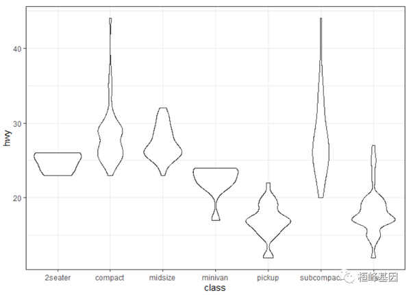 2. 水平小提琴图 2. 水平小提琴图旋转极坐标轴 coord_flip(), 实现水平旋转,如下: ggplot(mpg, aes(x = class, y = hwy)) + geom_violin() + coord_flip() + theme_bw()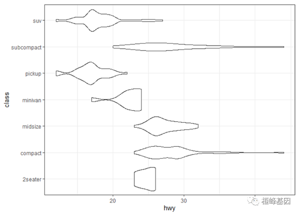 3. 不修剪小提琴的尾部 3. 不修剪小提琴的尾部我们也可以考虑保留小提琴的尾部 trim = FALSE,如下: ggplot(mpg, aes(x = class, y = hwy)) + geom_violin(trim = FALSE) + theme_bw()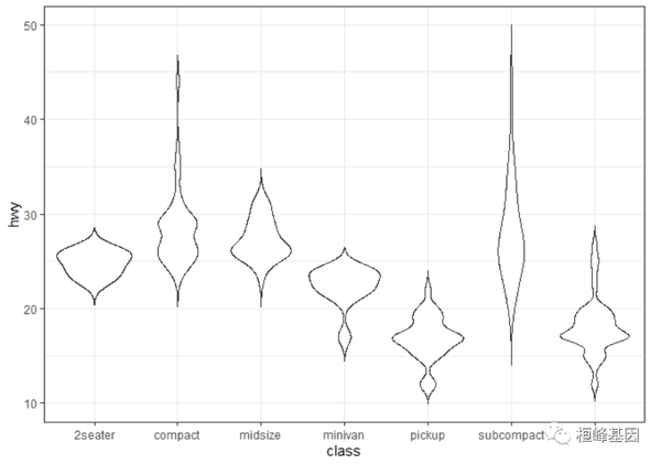 4. 添加统计值 4. 添加统计值使用stat_summary()添加统计量 mean,使用point显示均值的位置,如下: ggplot(mpg, aes(x = class, y = hwy)) + geom_violin(trim = FALSE) + stat_summary(fun = mean, geom = "point", shape = 23, size = 2, color = "blue") + theme_bw()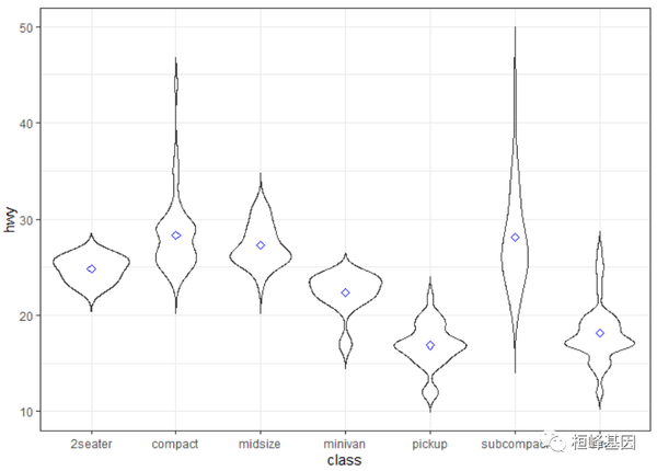 5. 加均值及标准差 5. 加均值及标准差使用stat_summary()添加均值和标准差,如下: ggplot(mpg, aes(x = class, y = hwy)) + geom_violin(trim = FALSE) + stat_summary(fun.data = "mean_sdl", fun.args = list(mult = 1), geom = "pointrange", color = "red") + theme_bw()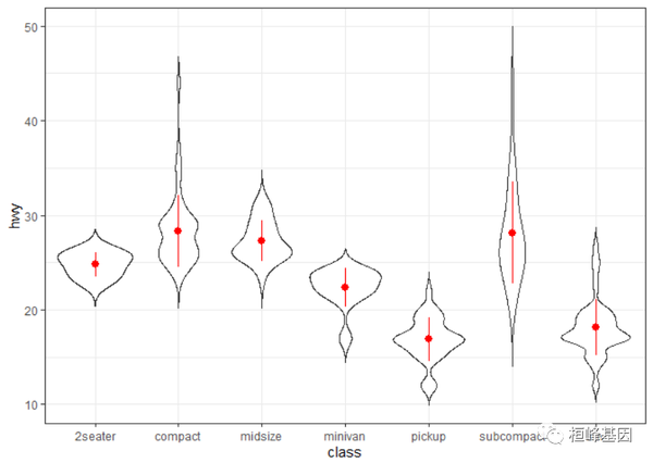 6. 加框,包含中位数及四分位数 6. 加框,包含中位数及四分位数添加箱式图,非常简单其实就是图像的叠加,使用geom_boxplot()即可,注意调整一下width。 ggplot(mpg, aes(x = class, y = hwy)) + geom_violin(trim = FALSE) + geom_boxplot(width = 0.2) + theme_bw()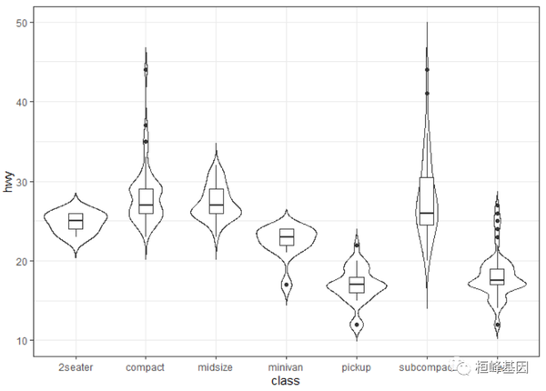 7. 改变边框颜色 7. 改变边框颜色设置边框颜色 (color),如下: ggplot(mpg, aes(x = class, y = hwy)) + geom_violin(aes(color = class), trim = FALSE) + theme_bw() 8. 改变填充色 8. 改变填充色设置填充颜色 (fill),如下: ggplot(mpg, aes(x = class, y = hwy)) + geom_violin(aes(fill = class), trim = FALSE) + theme_bw() 9. 自定义边框颜色ggplot(mpg, aes(x = class, y = hwy)) + geom_violin(aes(color = class), trim = FALSE) +
theme_minimal() + scale_color_manual(values = rainbow(7)) + theme_bw() 9. 自定义边框颜色ggplot(mpg, aes(x = class, y = hwy)) + geom_violin(aes(color = class), trim = FALSE) +
theme_minimal() + scale_color_manual(values = rainbow(7)) + theme_bw()
 10. 自定义填充颜色ggplot(mpg, aes(x = class, y = hwy)) + geom_violin(aes(fill = class), trim = FALSE) +
theme_minimal() + scale_fill_manual(values = rainbow(7)) + theme_bw() 10. 自定义填充颜色ggplot(mpg, aes(x = class, y = hwy)) + geom_violin(aes(fill = class), trim = FALSE) +
theme_minimal() + scale_fill_manual(values = rainbow(7)) + theme_bw()
 11. 添加分组变量 11. 添加分组变量对边框颜色进行修改,添加分组变量,如下: ggplot(mpg, aes(x = class, y = hwy)) + geom_violin(aes(color = year), trim = FALSE) + theme_bw() 12. 修改填充颜色 12. 修改填充颜色对填充颜色进行修改,添加分组变量,如下: ggplot(mpg, aes(x = class, y = hwy)) + geom_violin(aes(fill = year), trim = FALSE) + scale_fill_manual(values = c("#999999", "#E69F00")) + theme_bw() 13. 添加散点 13. 添加散点在小提琴上添加散点(geom_point),如下: ggplot(mpg, aes(x = class, y = hwy)) + geom_violin(trim = FALSE) + geom_point(position = position_jitter(0.2)) + theme_bw() 14. 添加抖动点 14. 添加抖动点在小提琴上添加抖动点(geom_jitter),如下: ggplot(mpg, aes(x = class, y = hwy)) + geom_violin(trim = FALSE) + geom_jitter(shape = 16, size = 2, position = position_jitter(0.2)) + theme_bw() 15. 添加箱图和抖动点 15. 添加箱图和抖动点在小提琴上同时添加箱式图(geom_boxplot)和抖动点(geom_jitter),注意还需要调整箱图的宽度(width)和抖动点的大小,位置和形状等。 ggplot(mpg, aes(x = class, y = hwy)) + geom_violin(trim = FALSE) + geom_boxplot(width = 0.2) + geom_jitter(shape = 16, size = 1, position = position_jitter(0.2)) + theme_bw()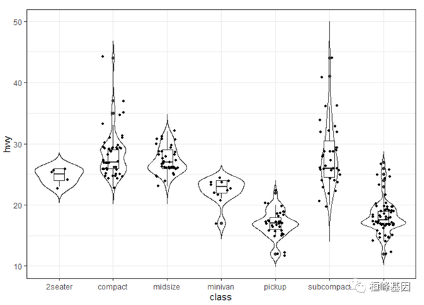 16. 双样本组间比较 16. 双样本组间比较在小提琴图上条件一些统计量,比如P值和显著性等统计结果,这里同样也要考虑不同比较情况时采用的统计学方法是不同的。 Wilcox(秩合检验)秩合检验适合大样本量,先对给出来比较的分组,然后在绘制图形,如下: comparisons也可以通过ggpubr软件包一次完成,如下: library(ggpubr) ggviolin(iris, x = "Species", y = "Sepal.Length", fill = "Species", palette = c("lancet"), add = "boxplot", add.params = list(fill = "white"), order = c("virginica", "versicolor", "setosa"), error.plot = "errorbar") + stat_compare_means(comparisons = comparisons) T检验 T检验T检验适合小样本量,一般样本量小于30个,如下: library(ggsci) p117. 多组样本比较方差分析我们还可以在stat_compare_means函数里面设置不同的参数,这里默认使用wilcox检验,最后一个stat_compare_means函数还可以使用方差分析(method=""anova")。 p2 Kruskal-Wallis检验在这里我们运用Kruskal-Wallis检验。具体原理,具体原理本文不做阐述,读者请移步非参数统计的相关内容。这里会用到ggpubr包。 ggplot(iris, aes(Species, Sepal.Length, fill = Species)) + geom_violin() + geom_boxplot(width = 0.2) + scale_fill_jco() + geom_jitter(shape = 16, size = 2, position = position_jitter(0.2)) + stat_compare_means() + guides(fill = FALSE) + theme_classic() 18. 添加p值和显著性添加p值library(reshape2)
iris %>%
melt() %>%
ggplot(aes(variable, value, fill = Species)) + geom_violin() + scale_fill_jco() +
stat_compare_means(label = "p.format") + facet_grid(. ~ variable, scales = "free",
space = "free_x") + theme_bw() + theme(axis.text.x = element_blank()) + xlab(NULL) +
guides(fill = FALSE) 18. 添加p值和显著性添加p值library(reshape2)
iris %>%
melt() %>%
ggplot(aes(variable, value, fill = Species)) + geom_violin() + scale_fill_jco() +
stat_compare_means(label = "p.format") + facet_grid(. ~ variable, scales = "free",
space = "free_x") + theme_bw() + theme(axis.text.x = element_blank()) + xlab(NULL) +
guides(fill = FALSE)
 添加显著性iris %>%
melt() %>%
ggplot(aes(variable, value, fill = Species)) + geom_violin() + scale_fill_jco() +
stat_compare_means(label = "p.signif", label.x = 1.5) + facet_grid(. ~ variable,
scales = "free", space = "free_x") + theme_bw() + theme(axis.text.x = element_blank()) +
guides(fill = FALSE) 添加显著性iris %>%
melt() %>%
ggplot(aes(variable, value, fill = Species)) + geom_violin() + scale_fill_jco() +
stat_compare_means(label = "p.signif", label.x = 1.5) + facet_grid(. ~ variable,
scales = "free", space = "free_x") + theme_bw() + theme(axis.text.x = element_blank()) +
guides(fill = FALSE)
 19. 双数据小提琴图 19. 双数据小提琴图绘制分半小提琴图的代码来源: https://gist.github.com/Karel-Kroeze/746685f5613e01ba820a31e57f87ec87source("split_violin_ggplot.R") 简单双数据小提琴图我们这里分组比较的是1999年和2008年的情况,然后设计出来抖动点的位置,这样可以避免点的重合,如下: comparisons = list(c("1999", "2008")) mpg 修改颜色ggplot(mpg, aes(x = class, y = hwy, fill = year)) + geom_split_violin(trim = T, draw_quantiles = 0.5) + geom_jitter(aes(scat_adj + dist_cat_n, y = hwy, fill = year), position = position_jitter(width = 0.1, height = 0), shape = 21, size = 1) + scale_fill_manual(values = c("#197EC099", "#FED43999")) + theme_bw() + xlab("") 添加P值ggplot(mpg, aes(x = class, y = hwy, fill = year)) + geom_split_violin(trim = T, draw_quantiles = 0.5) +
geom_jitter(aes(scat_adj + dist_cat_n, y = hwy, fill = year), position = position_jitter(width = 0.1,
height = 0), shape = 21, size = 1) + scale_fill_manual(values = c("#197EC099",
"#FED43999")) + stat_compare_means(data = mpg, aes(x = class, y = hwy), label = "p.format",
method = "t.test") + theme_bw() + xlab("") 添加P值ggplot(mpg, aes(x = class, y = hwy, fill = year)) + geom_split_violin(trim = T, draw_quantiles = 0.5) +
geom_jitter(aes(scat_adj + dist_cat_n, y = hwy, fill = year), position = position_jitter(width = 0.1,
height = 0), shape = 21, size = 1) + scale_fill_manual(values = c("#197EC099",
"#FED43999")) + stat_compare_means(data = mpg, aes(x = class, y = hwy), label = "p.format",
method = "t.test") + theme_bw() + xlab("")
 添加显著性p3 19. 云雨图 添加显著性p3 19. 云雨图云雨图,顾名思义,像云和雨一样的图。由两个部分组成:上图像云,本质上是小提琴的一半;下图像雨,本质上是蜂窝图的一半,主要用于数据分布的展示。 我们需要下载大牛的源码: https://github.com/hadley/ggplot2/blob/master/R/geom-violin.rsource("geom-violin.R") 竖直云雨图使用geom_split_violin()函数绘制分半的小提琴图代码如下: library(grid) p4 水平云雨图p5 20. 组合小提琴图选择几个小提琴图进行组图,组合后的效果如下: library(patchwork) (p1 | p2 | p3)/(p4 | p5)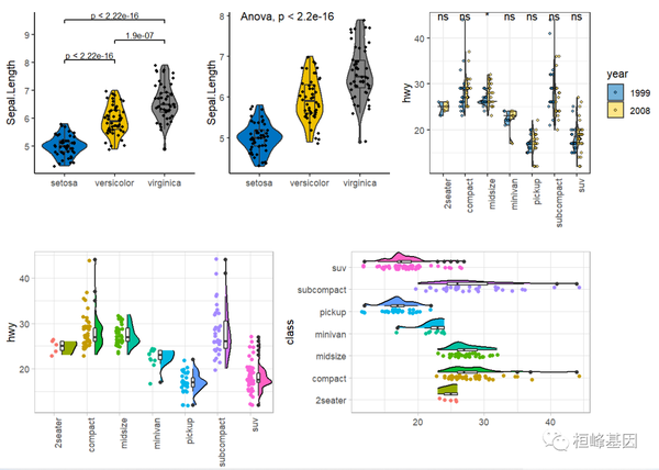 21. 高颜值小提琴图(ggstatsplot) 21. 高颜值小提琴图(ggstatsplot)ggstatsplot是ggplot2的扩展,用于绘制带有统计检验信息的图形。ggstatsplot采用典型的探索性数据分析工作流,将数据可视化和统计建模作为两个不同的阶段;可视化为建模提供依据,模型反过来又可以提出不同的可视化方法。ggstatsplot的思路就是将这两个阶段统一在带有统计细节的图形中,提高数据探索的速度和效率。 ggstatsplot提供了多种类别的统计绘图。用户可以在图形上添加统计建模(假设检验和回归分析)的结果,可以进行复杂的图形拼接,并且可以在多种背景和调色板中进行选择,使图形更美观。ggstatsplot和它的后台组件还可以和其他基于ggplot2的R包结合起来使用。 ggbetweenstatsggbetweenstats函数用于创建小提琴图、箱形图或组间或组内比较的组合图。此外,该函数还有一个grouped_变量,可以方便地在单个分组变量上重复相同的操作。 library(ggstatsplot) if (require("PMCMRplus")) { # to get reproducible results from bootstrapping set.seed(123) library(ggstatsplot) library(dplyr, warn.conflicts = FALSE) library(ggplot2) # the most basic function call grouped_ggbetweenstats(data = filter(ggplot2::mpg, drv != "4"), x = year, y = hwy, grouping.var = drv) # modifying individual plots using `ggplot.component` argument grouped_ggbetweenstats(data = filter(movies_long, genre %in% c("Action", "Comedy"), mpaa %in% c("R", "PG")), x = genre, y = rating, grouping.var = mpaa, ggplot.component = scale_y_continuous(breaks = seq(1, 9, 1), limits = (c(1, 9)))) }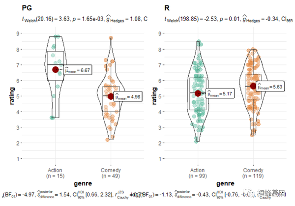 ggwithinstats ggwithinstatsgbetweenstats函数有一个用于重复度量设计的相同的孪生函数ggwithinstats,两个函数以相同的参数运行,但ggbetweenstats引入了一些小的调整,以正确地可视化重复度量设计。从下面的例子中可以看出,结构的唯一区别是,ggbetweenstats通过路径将重复度量连接起来,以突出数据类型。 if (require("PMCMRplus")) { # to get reproducible results from bootstrapping set.seed(123) library(ggstatsplot) library(dplyr, warn.conflicts = FALSE) library(ggplot2) # the most basic function call grouped_ggwithinstats( data = filter(bugs_long, condition %in% c("HDHF", "HDLF")), x = condition, y = desire, grouping.var = gender, type = "np", # non-parametric test # additional modifications for **each** plot using `{ggplot2}` functions ggplot.component = scale_y_continuous(breaks = seq(0, 10, 1), limits = c(0, 10)) ) }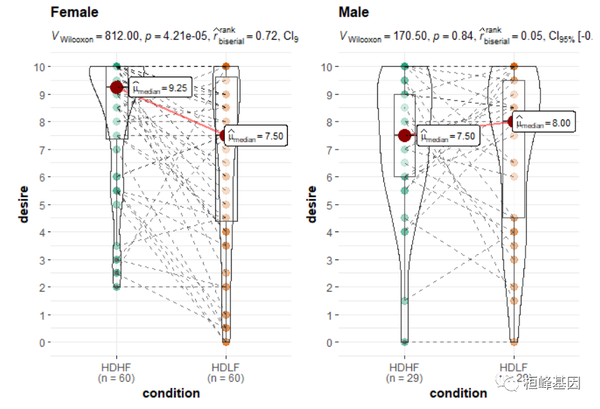 这期小提琴图其实蛮简单的,在是使用过程中根据自己的数据情况进行调整参数,我相信通过我这套教程,各位老师、同学都能够实现ggplot2绘图自由,未来也会成为一名会作图的科研人员! 本文使用 文章同步助手 同步 |
【本文地址】
| 今日新闻 |
| 推荐新闻 |
| 专题文章 |