|
前言
Flutter 是 Google 开源的应用开发框架,仅通过一套代码就能构建支持Android、iOS、Windows、Linux等多平台的应用。Flutter的性能非常高,拥有120fps的刷新率,也是目前非常流行的跨平台UI开发框架。
本专栏为大家收集了Github上近70个优秀开源库,后续也将持续更新。希望可以帮助大家提升搬砖效率,同时祝愿Flutter的生态越来越完善🎉🎉。
正文
一、🚀 轮子介绍
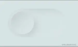
名称:flutter_neumorphic
概述:易用的拟态风格UI套件,几乎可以在任何App中使用它。
作者:idean Team
仓库地址:Flutter-Neumorphic
推荐指数: ⭐️⭐️⭐️⭐️⭐️
常用指数: ⭐️⭐️⭐️⭐️⭐️
效果预览:
二、⚙️ 安装及使用
dependencies:
flutter_neumorphic: ^3.0.3
import 'package:flutter_neumorphic/flutter_neumorphic.dart';
三、🔧 常用属性
1.基本
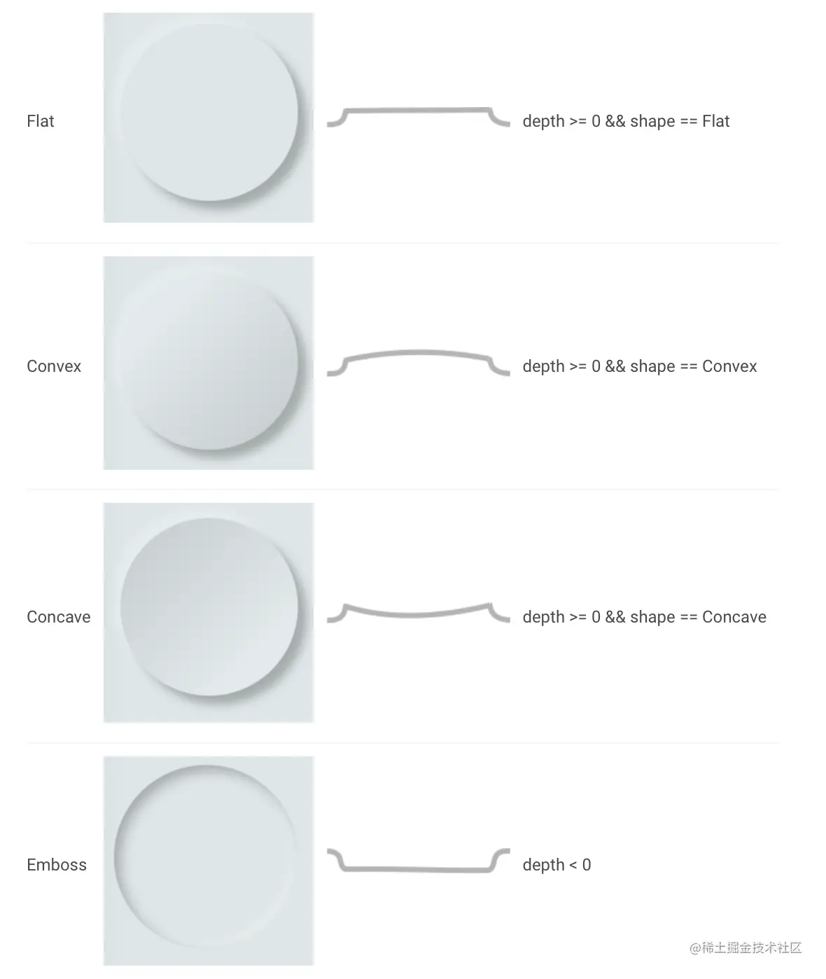
属性描述LightSource特定于theme或小组件的光源,用于投射浅色/深色阴影shape拟态容器中使用的曲线形状Depth小组件与父组件的垂直距离Intensity光的强度,它影响阴影的颜色SurfaceIntensity组件表面的明暗效果Color拟态组件的默认颜色Accent拟态组件的选中颜色,例如复选框Variant拟态组件的次要颜色BoxShape拟态组件形状Border边框
2.Shapes
四、🗂 内置组件介绍
tips:为了更直观的展示效果,本文案例已将组件和背景设置为同一色值的浅灰色。
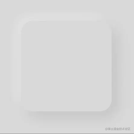
1.Neumorphic
一个基本的拟态容器组件,可根据光源、高度(深度)添加浅色/深色渐变的容器。
NeumorphicStyle(
depth: 3,
lightSource: LightSource.left,
color: Colors.grey[200],
),
child: const SizedBox(
width: 200,
height: 200,
),
)
2.NeumorphicButton
拟态按钮,默认按下有高度变化及震动反馈

NeumorphicButton(
style: NeumorphicStyle(
boxShape: NeumorphicBoxShape.roundRect(
BorderRadius.circular(12),
),
color: Colors.grey[200],
shape: NeumorphicShape.flat,
),
child: Container(
color: Colors.grey[200],
width: 100,
height: 25,
child: const Center(
child: Text('Click me'),
),
),
onPressed: () {},
)
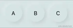
3.NeumorphicRadio
单选按钮
class NeumorphicButtonWidget extends StatefulWidget {
const NeumorphicButtonWidget({Key? key}) : super(key: key);
@override
State createState() => _NeumorphicButtonWidgetState();
}
class _NeumorphicButtonWidgetState extends State {
int _groupValue = 1;
@override
Widget build(BuildContext context) {
return Row(
mainAxisAlignment: MainAxisAlignment.center,
children: [
getChild('A', 1),
const SizedBox(width: 12),
getChild('B', 2),
const SizedBox(width: 12),
getChild('C', 3),
],
);
}
Widget getChild(String str, int value) {
return NeumorphicRadio(
child: Container(
color: Colors.grey[200],
height: 50,
width: 50,
child: Center(
child: Text(str))),
value: value,
groupValue: _groupValue,
onChanged: (value) {
setState(() {
_groupValue = value as int;
});
});
}}
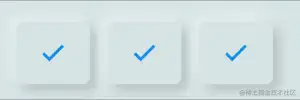
4.NeumorphicCheckbox
多选按钮
class NeumorphicCheckboxWidget extends StatefulWidget {
const NeumorphicCheckboxWidget({Key? key}) : super(key: key);
@override
State createState() => _NeumorphicCheckboxWidgetState();
}
class _NeumorphicCheckboxWidgetState extends State {
bool check1 = false;
bool check2 = false;
bool check3 = false;
@override
Widget build(BuildContext context) {
return Row(
mainAxisAlignment: MainAxisAlignment.center,
children: [
const SizedBox(width: 12),
NeumorphicCheckbox(
value: check1,
onChanged: (value) {
setState(() {
check1 = value;
});
},
),
const SizedBox(width: 12),
NeumorphicCheckbox(
value: check2,
onChanged: (value) {
setState(() {
check2 = value;
});
},
),
const SizedBox(width: 12),
NeumorphicCheckbox(
value: check3,
onChanged: (value) {
setState(() {
check3 = value;
});
},
),
],
);
}
}
5.NeumorphicText
拟态文字
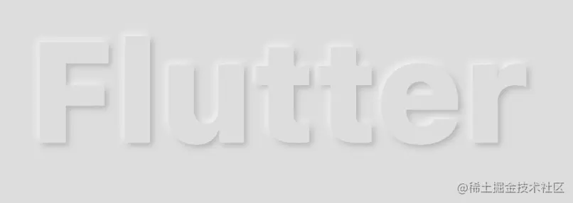
NeumorphicText(
'Flutter',
textStyle: NeumorphicTextStyle(
fontSize: 80,
fontWeight: FontWeight.w900,
),
style: NeumorphicStyle(
depth: 3,
lightSource: LightSource.left,
color: Colors.grey[200],
),
)
6.NeumorphicIcon
拟态图标
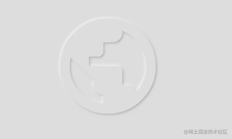
NeumorphicIcon(
Icons.public,
size: 180,
style: NeumorphicStyle(
depth: 3,
lightSource: LightSource.left,
color: Colors.grey[200],
),
);
7.material.TextField
拟态文本输入框
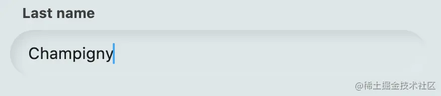
Neumorphic(
margin: const EdgeInsets.only(left: 8, right: 8, top: 2, bottom: 4),
style: NeumorphicStyle(
depth: NeumorphicTheme.embossDepth(context),
boxShape: const NeumorphicBoxShape.stadium(),
color: Colors.grey[200]),
padding: const EdgeInsets.symmetric(vertical: 14, horizontal: 18),
child: const TextField(
decoration: InputDecoration.collapsed(hintText: 'NeumorphicTextField'),
),
);
8.NeumorphicSwitch
拟态开关
class NeumorphicSwitchWidget extends StatefulWidget {
const NeumorphicSwitchWidget({Key? key}) : super(key: key);
@override
State createState() => _NeumorphicSwitchWidgetState();
}
class _NeumorphicSwitchWidgetState extends State {
bool isChecked = false;
bool isEnabled = true;
@override
Widget build(BuildContext context) {
return NeumorphicSwitch(
style: NeumorphicSwitchStyle(
trackDepth: 3,
activeThumbColor: Colors.grey[200], // 开启时按钮颜色
activeTrackColor: Colors.green, // 开启时背景颜色
inactiveThumbColor: Colors.green, // 关闭时按钮颜色
inactiveTrackColor: Colors.grey[200], // 关闭时背景颜色
),
isEnabled: isEnabled,
value: isChecked,
onChanged: (value) {
setState(() {
isChecked = value;
});
},
);
}}
9.NeumorphicToggle
拟态滑动选择器

class NeumorphicToggleWidget extends StatefulWidget {
const NeumorphicToggleWidget({Key? key}) : super(key: key);
@override
State createState() => _NeumorphicToggleWidgetState();
}
class _NeumorphicToggleWidgetState extends State {
int _selectedIndex = 0;
@override
Widget build(BuildContext context) {
return NeumorphicToggle(
height: 50,
style: NeumorphicToggleStyle(
backgroundColor: Colors.grey[200],
),
selectedIndex: _selectedIndex,
displayForegroundOnlyIfSelected: true,
children: [
ToggleElement(
background: const Center(
child: Text(
"This week",
style: TextStyle(fontWeight: FontWeight.w500),
)),
foreground: const Center(
child: Text(
"This week",
style: TextStyle(fontWeight: FontWeight.w700),
)),
),
ToggleElement(
background: const Center(
child: Text(
"This month",
style: TextStyle(fontWeight: FontWeight.w500),
)),
foreground: const Center(
child: Text(
"This month",
style: TextStyle(fontWeight: FontWeight.w700),
)),
),
ToggleElement(
background: const Center(
child: Text(
"This year",
style: TextStyle(fontWeight: FontWeight.w500),
)),
foreground: const Center(
child: Text(
"This year",
style: TextStyle(fontWeight: FontWeight.w700),
)),
)
],
thumb: Neumorphic(
style: NeumorphicStyle(
boxShape: NeumorphicBoxShape.roundRect(
const BorderRadius.all(Radius.circular(12))),
),
),
onChanged: (value) {
setState(() {
_selectedIndex = value;
});
},
);
}}
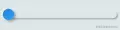
10.NeumorphicSlider
拟态滑动控制器
class NeumorphicSliderWidget extends StatefulWidget {
const NeumorphicSliderWidget({Key? key}) : super(key: key);
@override
State createState() => _NeumorphicSliderWidgetState();
}
class _NeumorphicSliderWidgetState extends State {
double num = 0;
@override
Widget build(BuildContext context) {
return NeumorphicSlider(
min: 8,
max: 75,
value: num,
onChanged: (value) {
setState(() {
num = value;
});
},
);
}
}
11.NeumorphicProgress
拟态百分比进度条
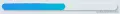
NeumorphicProgress(
height: 20,
percent: 0.5,
);
12.NeumorphicProgressIndeterminate
渐进式进度条
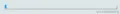
NeumorphicProgressIndeterminate(
height: 10,
);
13.NeumorphicBackground
拟态背景,可以使用Radius裁剪屏幕
class NeumorphicPageView extends StatelessWidget {
const NeumorphicPageView({Key? key}) : super(key: key);
@override
Widget build(BuildContext context) {
return NeumorphicBackground(
borderRadius: const BorderRadius.all(Radius.circular(130)),
child: Scaffold(
backgroundColor: Colors.grey[200],
));
}
}
14.NeumorphicApp
使用拟态设计的应用程序。可以处理主题、导航、本地化等
void main() => runApp(MyApp());
class MyApp extends StatelessWidget {
@override
Widget build(BuildContext context) {
return NeumorphicApp(
debugShowCheckedModeBanner: false,
themeMode: ThemeMode.light,
title: 'Flutter Neumorphic',
home: FullSampleHomePage(),
);
}
}
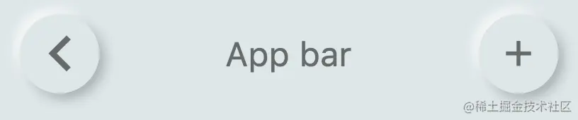
15.NeumorphicAppBar
拟态导航条
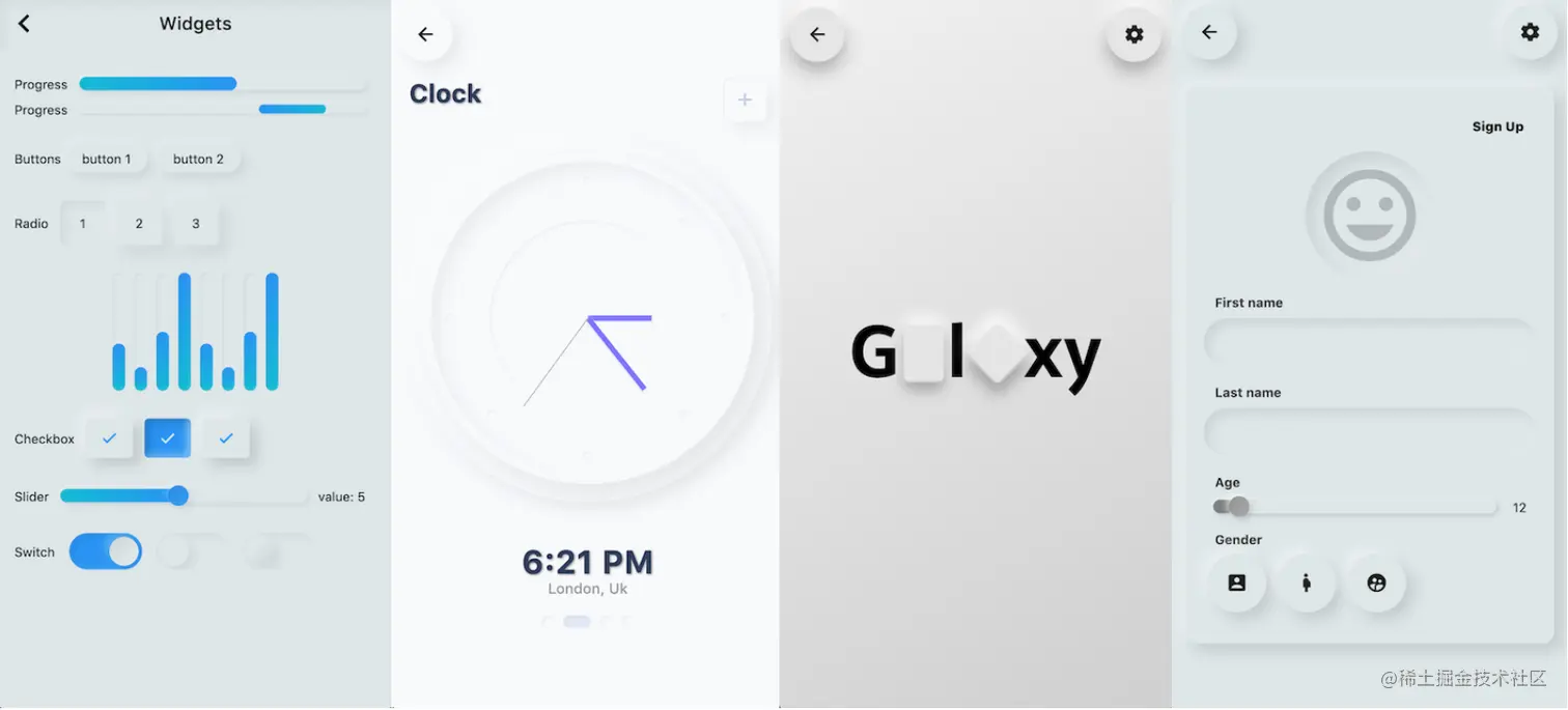
五、🏠 使用案例
|