| JS022. 使用原生JS与组件化思想从零封装实现一个公共Alert插件(HTML5: Shadow DOM / CSS3: Animation / ES6: Class extends) | 您所在的位置:网站首页 › 原生js组件封装过程 › JS022. 使用原生JS与组件化思想从零封装实现一个公共Alert插件(HTML5: Shadow DOM / CSS3: Animation / ES6: Class extends) |
JS022. 使用原生JS与组件化思想从零封装实现一个公共Alert插件(HTML5: Shadow DOM / CSS3: Animation / ES6: Class extends)
|
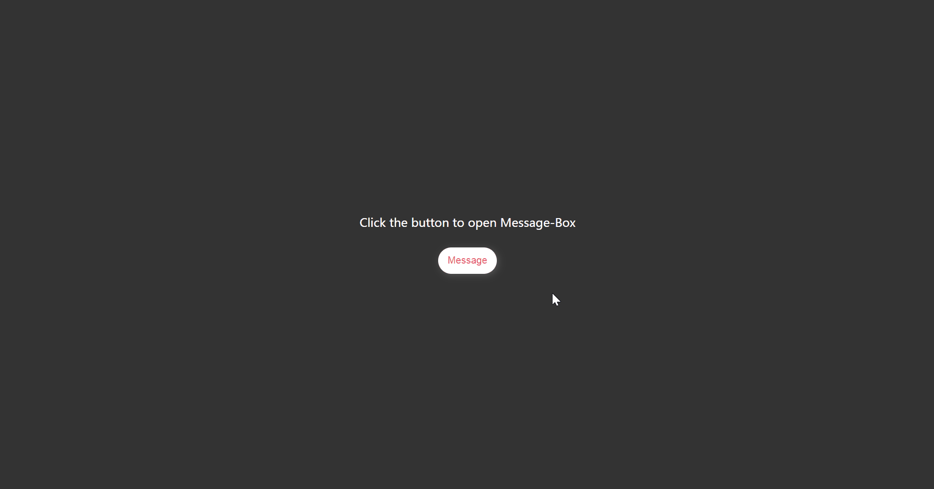
效果预览
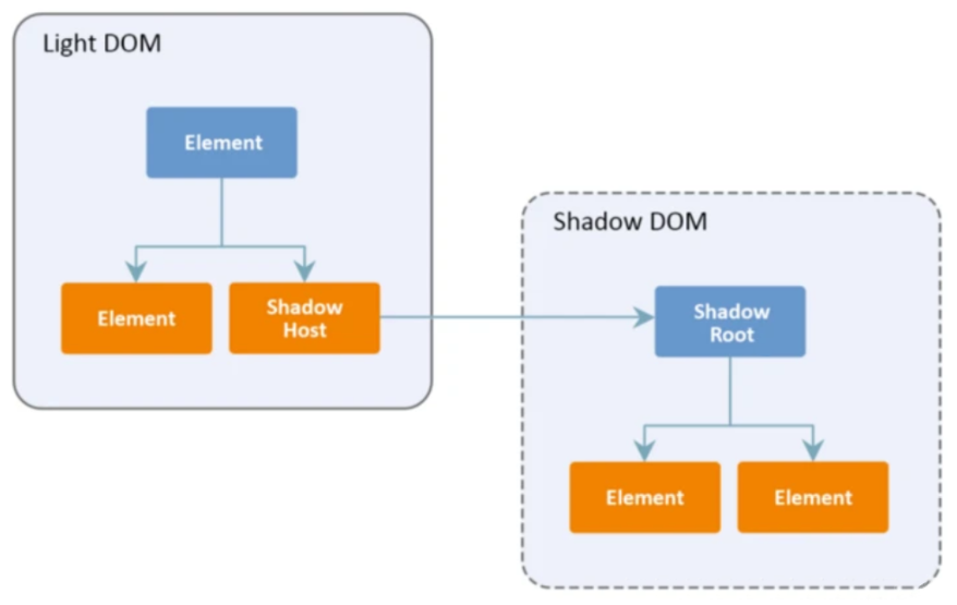
Web components 的一个重要属性是封装——可以将标记结构、样式和行为隐藏起来,并与页面上的其他代码相隔离,保证不同的部分不会混在一起,可使代码更加干净、整洁。其中, Shadow DOM 接口是关键所在,它可以将一个隐藏的、独立的 DOM 附加到一个元素上 [ MDN ] 。
当我们对 DOM(文档对象模型)有一定的了解,它是由不同的元素节点、文本节点连接而成的一个树状结构,应用于标记文档中(例如 Web 文档中常见的 HTML 文档)。请看如下示例,一段 HTML 代码: Simple DOM example
Here we will add a link to the Mozilla homepage 这个片段会生成如下的 DOM 结构:
Shadow DOM 允许将隐藏的 DOM 树附加到常规的 DOM 树中——它以 shadow root 节点为起始根节点,在这个根节点的下方,可以是任意元素,和普通的 DOM 元素一样。
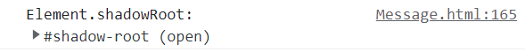
常规的 alert 一般是一个 粘性布局 & 层级较高 的盒子,它能够被任意页面 / 组件 调用,它不应该被同时多次调用。 盒子包含三块内容:消息图标、消息文本、关闭btn。 设计思路插件的设计思路是有良好的封闭性,不影响外部文档本身的DOM树;易于维护,便于需求更改,在下一个项目中重复使用;足够灵活,通过传入参数配置组件在不同文档中的调用效果;能够定制,可以通过外部文档调整插件。 Shadow DOM的基本使用使用 Element.attachShadow() 方法来将一个 shadow root 附加到任何一个元素上。它接受一个配置对象作为参数,该对象有一个 mode 属性,值可以是 open 或者 closed: let shadow = elementRef.attachShadow({mode: 'open'}); let shadow = elementRef.attachShadow({mode: 'closed'});两者的区别在于能否通过 shadow.shadowRoot 访问 shadowDOM 中的元素。 { mode: 'open' } :可以通过页面内的 JavaScript 方法来获取 Shadow DOM
{ mode: 'closed' } :不能从外部获取 Shadow DOM , Element.shadowRoot 将会返回 null。
浏览器中的某些内置元素就是如此,例如 ,包含了不可访问的 Shadow DOM。 将 Shadow DOM 附加到一个元素之后,就可以使用 DOM APIs对它进行操作,就和处理常规 DOM 一样。 var para = document.createElement('p'); shadow.appendChild(para); etc. 实现过程首先构造一个 Shadow DOM : class MessageBox extends HTMLElement { constructor() { super(); const shadowRoot = this.attachShadow({ mode: 'open' }) } }行1 - extends关键字用于类声明或者类表达式中,以创建一个类,该类是另一个类的子类 [ MDN ]。 行2 - 构造函数属于被实例化的特定类对象 。构造函数初始化这个对象,并提供可以访问其私有信息的方法。构造函数的概念可以应用于大多数面向对象的编程语言。本质上,JavaScript 中的构造函数通常在类的实例中声明 [ MDN ]。 行3 - super关键字用于访问和调用一个对象的父对象上的函数。在构造函数中使用时,super关键字将单独出现,并且必须在使用this关键字之前使用。super关键字也可以用来调用父对象上的函数 [ MDN ]。可以理解为 super 代表父类的构造函数。 行4 - Shadow DOM 的方法属性,用于将一个 shadow root 添加到 instance class 上。 接下来根据需求分析的三块内容编写盒子,预留好消息和关闭按钮的 slot插槽: template() { let dom = ` ` return dom }为盒子编写样式: stylesheet() { let style = ` * { margin: 0; padding: 0; box-sizing: border-box; } main { position: fixed; top: 20px; left: 50%; transform: translateX(-50%); padding: 12px 24px; color: #5e5e5e; font-size: 1rem; user-select: none; background: linear-gradient(to bottom right, rgba(176, 219, 125, .65) 40%, rgba(153, 219, 180, .65) 100%); box-shadow: 2px 2px 10px rgb(119 119 119 / 50%); border-radius: 4px; z-index: 999999; } .icon { opacity: .85; color: #52c41a; position: relative; top: 2px; } .close { color: #fff; font-size: 14px; cursor: pointer; } .animeShow { animation: show .35s ease-out 1 forwards; } .animeHide { animation: hide .35s ease-in 1 forwards; } @keyframes show { from {transform: translate(-50%, calc(-100% - 29px));opacity: 0;} to {transform: translate(-50%, 0);opacity: 1;} } @keyframes hide { from {transform: translate(-50%, 0);opacity: 1;} to {transform: translate(-50%, calc(-100% - 29px));opacity: 0;} } ` return style }将 DOM 添加到 shadow root 中: constructor() { super() const shadowRoot = this.attachShadow({mode: 'open'}) shadowRoot.innerHTML = this.stylesheet() + this.template() }使用 Web Components 为插件定制函数周期: /* 生命周期: 首次插入文档DOM */ connectedCallback() { console.log('Template element is connected from \'Message Box\'') } /* 生命周期: 从文档DOM中删除 */ disconnectedCallback() { console.log('Template element disconnected which \'Message Box\'') } /* 生命周期: 被移动到新的文档时 */ adoptedCallback() { console.log('Template element adopted which \'Message Box\''); } /* 生命周期: 监听属性变化 */ attributeChangedCallback() { console.log('Template element\'s attribute is changed which \'Message Box\''); }这样一个完整的 Shadow DOM 就已经编写完成了,现在注册这个插件: customElements.define('message-box', MessageBox)接下来我们要做的是把 custom element 放在页面上,定义一个类来更方便地控制它: /* message */ class Message { constructor() { this.containerEl = document.createElement('message-box') this.containerEl.id = 'message-box-97z' } }Message 类的构造器中 create 了这个 custom element,我们再为该类添加 show 方法来实现挂载: show(text = 'Default text.') { let containerEl = this.containerEl /* Use Slot */ containerEl.innerHTML = `${text}` /* Render Dom */ document.body.appendChild(containerEl) }在 show( ) 方法中判断是否同时多次调用(DOM是否存在): show(text = 'Default text.') { /* Message box had Render */ if(document.getElementById('message-box-97z')) { return } }调用并查看效果: const message = new Message() message.show('Message box by 97z.')
在生命周期中为 Shadow DOM 添加 fadeInTop 动画 (css3 - animation 已包含在样式代码部分): /* 生命周期: 首次插入文档DOM */ connectedCallback() { this.shadowRoot.children[1].className = 'animeShow' }
在 show( ) 方法中利用刚刚预留的 slot 为盒子添加关闭按钮(这里用到的是 Ant Design 的 icon svg),并为按钮绑定点击事件: show(text = 'Message box by 97z.', closeable = false) { /* Append Icon Close */ if(closeable) { let closeEl = document.createElement('i') closeEl.setAttribute('slot', 'icon-close') closeEl.setAttribute('aria-label', '图标: close-circle') closeEl.style.position = 'relative' closeEl.style.left = '10px' closeEl.style.top = '1px' closeEl.innerHTML = '' closeEl.addEventListener('click', e => { this.containerEl.shadowRoot.children[1].className = 'animeHide' setTimeout(() => { this.close() }, 350) }) containerEl.appendChild(closeEl) } }那么这时就要写一个 close( ) 了: close() { let containerEl = this.containerEl document.body.removeChild(containerEl) }有了 close( ) 方法我们再给 show( ) 添加一个自动关闭事件: show(text = 'Message box by 97z.', duration = 2000, closeable = false) { /* Destroy Dom */ this.timer = setTimeout(() => { this.containerEl.shadowRoot.children[1].className = 'animeHide' setTimeout(() => { this.close() }, 350) }, duration) }清除计时器避免使用 close button 关闭后再打开发生混乱: close() { clearTimeout(this.timer) }检查调用
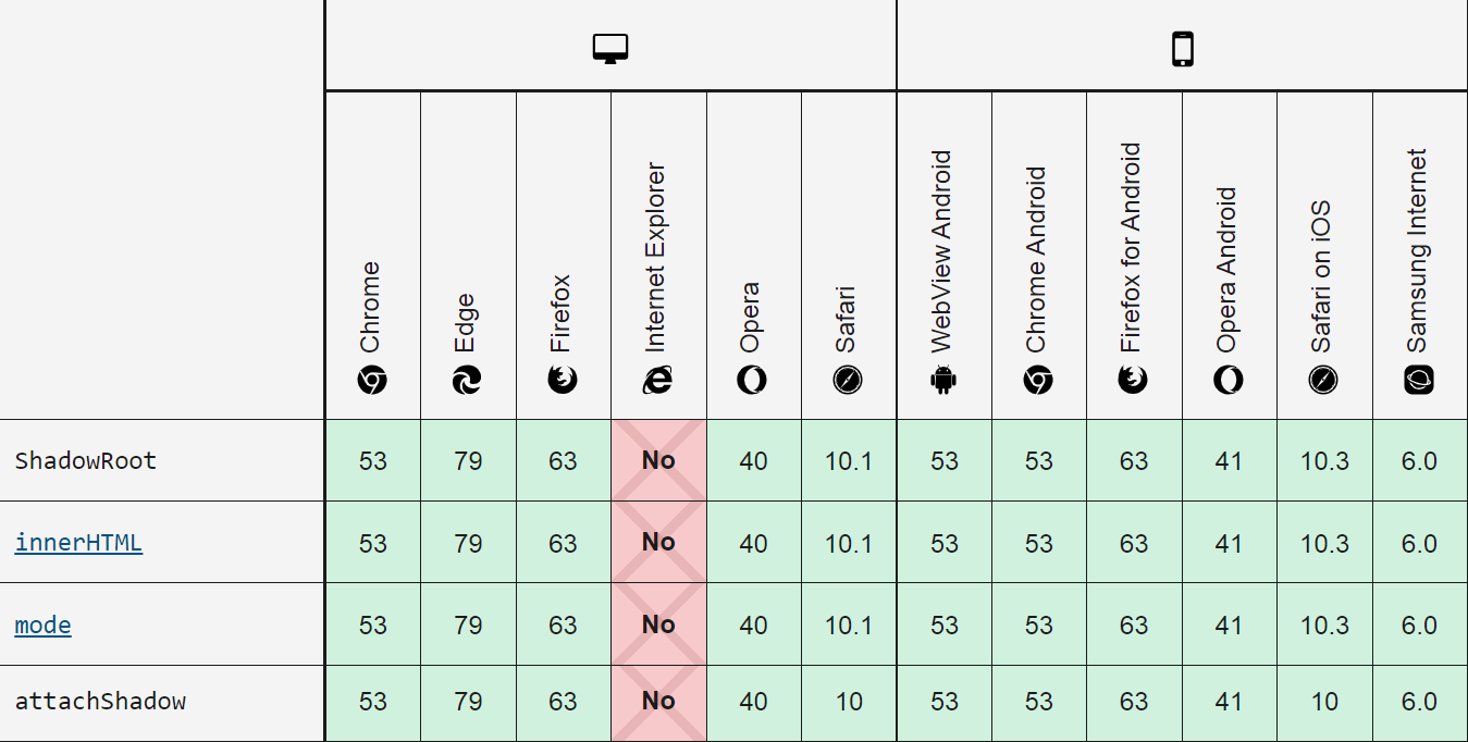
最后来看看用到的原生JS API的兼容性:
* 因此,请勿在 IE 的项目中使用。 - END - |


【本文地址】