| 【快应用】响应式布局适配横竖屏或折叠屏 | 您所在的位置:网站首页 › 华为。快应用 › 【快应用】响应式布局适配横竖屏或折叠屏 |
【快应用】响应式布局适配横竖屏或折叠屏
|
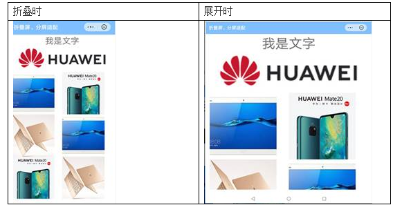
【关键词】 响应式布局、折叠屏、横竖屏 【问题背景】 当前开发者在开发快应用时,往往将designWidth设置为设备屏幕的宽度,这时,应用的内容会随着设备宽度的变大而拉伸显示,导致在大屏、横屏、折叠屏展开时显示效果不好。 在折叠屏合起和展开的效果如下,可以看出页面各元素尺寸在展开时明显变大了。
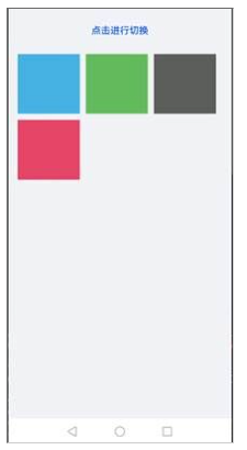
【解决方案】 通过使用快应用的响应式布局能力开发新应用或者改造已有应用,可以使快应用在手机、平板、智慧屏等各种尺寸的设备都有良好的展示效果。 一、配置manifest文件 1、将minPlatformVersion配置为1066及以上版本 2、修改config节点下的designWidth属性为device-width。 二、布局页面元素 根据常见的屏幕宽度对页面元素的尺寸和排列位置进行规划。常见屏幕宽度如下: 正常手机竖屏的宽度:360px正常手机横屏的宽度:640px、720px 等折叠屏展开的宽度:733px折叠屏合起来时的宽度:383px三、动态布局 根据屏幕的宽度来判断一行渲染几张图片,以下示例实现了根据屏幕宽度来控制list展示列数的效果。 当简单的动态布局无法实现所需效果时,可以考虑使用MediaQuery进行适配,详细参见链接: https://developer.huawei.com/consumer/cn/doc/development/quickApp-References/quickapp-mediaquery-0000001170210011 实现如下: {{$t('message.framework.screenSwitch.switchScreen')}} .container { flex-direction: column; padding-bottom: 50px; } .bg-green { background-color: #64bb5c; } .bg-blue { background-color: #46b1e3; } .bg-gray { background-color: #5d5e5d; } .bg-red { background-color: #e64566; } .orientation-btn { color: #0a59f7; font-size: 32px; font-weight: 500; } .list { margin-left: 32px; margin-right: 32px; margin-top: 30px; height: 500px; } .list-item { height: 200px; margin-right: 20px; margin-bottom: 20px; } .btn-container{ height: 100px; align-items: center; justify-content: center; } @media screen and (max-width: 599) { .list{ columns: 3; } } @media screen and (min-width: 600) { .list{ columns: 4; } } const orientationMap = { portrait: 'portrait', landscape: 'landscape' } import configuration from '@system.configuration'; module.exports = { public: { orientation: orientationMap.portrait }, onInit: function () { this.$page.setTitleBar({ text: this.$t('message.framework.screenSwitch.barTitle') }); }, switchOrientation() { if (this.orientation === orientationMap.portrait) { this.orientation = orientationMap.landscape; } else { this.orientation = orientationMap.portrait; } configuration.setScreenOrientation({ orientation: this.orientation, }) } }竖屏时效果:
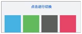
横屏时效果:
欲了解更多更全技术文章,欢迎访问https://developer.huawei.com/consumer/cn/forum/?ha_source=zzh |
【本文地址】
公司简介
联系我们