| RNA 13. SCI 文章中差异表达基因之 WGCNA | 您所在的位置:网站首页 › r语言基因差异表达分析网络 › RNA 13. SCI 文章中差异表达基因之 WGCNA |
RNA 13. SCI 文章中差异表达基因之 WGCNA
|
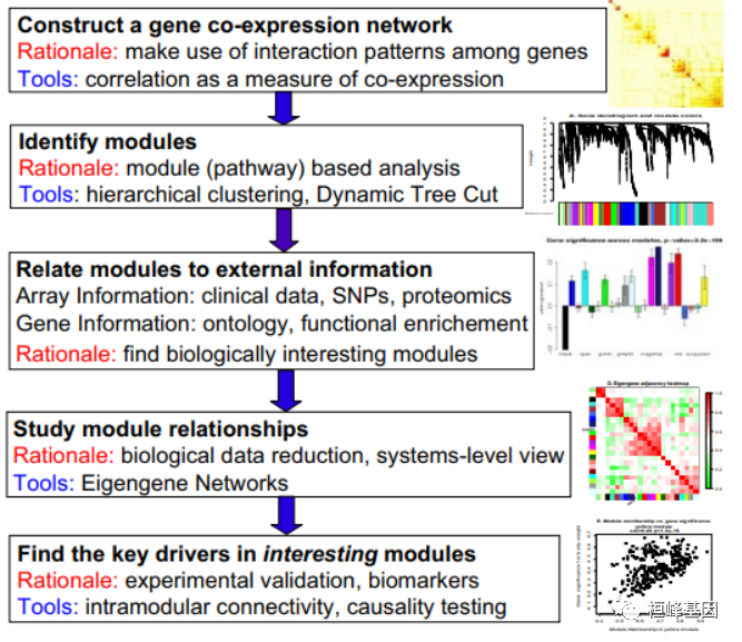
WGCNA 分析流程 2008 年发表在 BMC 之后的影响力还是很高的,先后在各大期刊都能看到,但是就其分析的过程来看,还是需要有一定 R 语言的基础才能完整的复现出来文章中的结果,这期就搞出来供大家参考,因为我自己尝试了一下结直肠癌的数据集,但是有些地方不太理想,故还是有软件包自带的数据来运行,终结起来就是输入两个文件,其他就是根据自己的数据集进行过滤,筛选,最终确定一个满意的基因集。 前言相关网络在生物信息学中的应用日益广泛。例如,加权基因共表达网络分析是一种描述微阵列样本间基因相关性模式的系统生物学方法。加权相关网络分析(Weighted correlation network analysis, WGCNA)可用于寻找高度相关基因的聚类(模块),利用模块特征基因或模块内的中心基因来总结这些聚类,利用特征基因网络方法(eigengene network methodology,WGCNA)将模块之间和模块与外部样本性状进行关联,以及用于计算模块成员度量。相关网络促进了基于网络的基因筛选方法,可用于识别候选生物标记物或治疗靶点。这些方法已成功应用于各种生物学背景,如癌症、小鼠遗传学、酵母遗传学和脑成像数据分析。虽然相关网络方法的部分内容已在单独的出版物中进行了描述,但仍需要提供一种用户友好的、全面的、一致的软件实现和辅助工具。 WGCNA软件包是一个R函数的综合集合,用于进行加权相关网络分析的各个方面。该软件包包括网络构建、模块检测、基因选择、拓扑性质计算、数据仿真、可视化以及与外部软件的接口等功能。除了R包,我们还提供了R软件教程。虽然这些方法的开发是由基因表达数据驱动的,但底层的数据挖掘方法可以应用于各种不同的设置。 WGCNA软件包为加权相关网络分析提供了R函数,如基因表达数据的共表达网络分析。计算方法较为复杂,这里略去,我们根据文献中给出来的WGCNA方法概述一步一步进行实际操作。构建基因共表达网络:使用加权的表达相关性。识别基因集:基于加权相关性,进行层级聚类分析,并根据设定标准切分聚类结果,获得不同的基因模块,用聚类树的分枝和不同颜色表示。如果有表型信息,计算基因模块与表型的相关性,鉴定性状相关的模块。研究模型之间的关系,从系统层面查看不同模型的互作网络。从关键模型中选择感兴趣的驱动基因,或根据模型中已知基因的功能推测未知基因的功能。导出TOM矩阵,绘制相关性图。
WGCNA 分析流程如下:
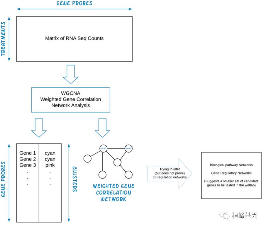
1.构建基因共表达网络:使用加权的表达相关性; 2.识别基因集:基于加权相关性,进行层级聚类分析,并根据设定标准切分聚类结果,获得不同的基因模块,用聚类树的分枝和不同颜色表示; 3.如果有表型信息,计算基因模块与表型的相关性,鉴定性状相关的模块; 4.研究模型之间的关系,从系统层面查看不同模型的互作网络; 5.从关键模型中选择感兴趣的驱动基因,或根据模型中已知基因的功能推测未知基因的功能; 6.导出TOM矩阵,绘制相关性图。 实例解析WGCNA 整个流程的输入文件为 RNA-seq 测序结果计算获得的 Count 矩阵,通常我们需要转置输入数据,这样 rows = treatments and columns = gene probes,WGCNA 输出的是聚类基因列表和加权基因相关网络文件。WGCNA 数据过滤分析流程如下:
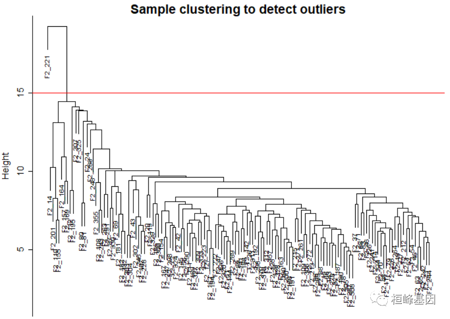
软件包安装及加载,如下: if(!require(WGCNA)){ BiocManager::install("WGCNA") } library(WGCNA)第一步,读取表达数据,并进行预处理成适合于网络分析的格式,并通过删除明显的离群样本、基因和缺失条目过多的样本来过滤数据。表达式数据包含在R包中,文件名为 LiverFemale3600.csv。 # The following setting is important, do not omit. options(stringsAsFactors = FALSE) # Read in the female liver data set femData = read.csv("./FemaleLiver-Data/LiverFemale3600.csv") # Take a quick look at what is in the data set: dim(femData) ## [1] 3600 143 head(names(femData)) ## [1] "substanceBXH" "gene_symbol" "LocusLinkID" "ProteomeID" ## [5] "cytogeneticLoc" "CHROMOSOME" datExpr0 = as.data.frame(t(femData[, -c(1:8)])) names(datExpr0) = femData$substanceBXH rownames(datExpr0) = names(femData)[-c(1:8)] gsg = goodSamplesGenes(datExpr0, verbose = 3) ## Flagging genes and samples with too many missing values... ## ..step 1 gsg$allOK ## [1] TRUE # If the last statement returns TRUE, all genes have passed the cuts. If not, # we #remove the offending genes and samples from the data: if (!gsg$allOK) { # Optionally, print the gene and sample names that were removed: if (sum(!gsg$goodGenes) > 0) printFlush(paste("Removing genes:", paste(names(datExpr0)[!gsg$goodGenes], collapse = ", "))) if (sum(!gsg$goodSamples) > 0) printFlush(paste("Removing samples:", paste(rownames(datExpr0)[!gsg$goodSamples], collapse = ", "))) # Remove the offending genes and samples from the data: datExpr0 = datExpr0[gsg$goodSamples, gsg$goodGenes] } # Next we cluster the samples (in contrast to clustering genes that will come # later) to see if there are any obvious outliers. sampleTree = hclust(dist(datExpr0), method = "average") # Plot the sample tree: Open a graphic output window of size 12 by 9 inches The # user should change the dimensions if the window is too large or too small. # sizeGrWindow(12,9) pdf(file = 'Plots/sampleClustering.pdf', width = 12, # height = 9); par(mar = c(0, 4, 2, 0), cex = 0.6) plot(sampleTree, main = "Sample clustering to detect outliers", sub = "", xlab = "", cex.lab = 1.5, cex.axis = 1.5, cex.main = 2) # Plot a line to show the cut abline(h = 15, col = "red")
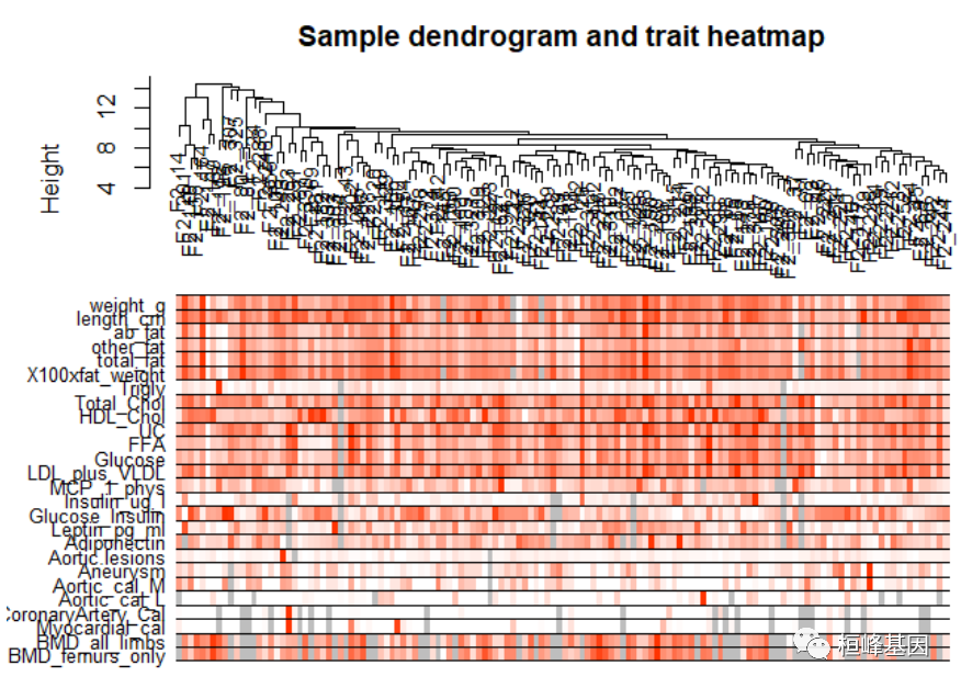
Figure 1: Clustering dendrogram of samples based on their Euclidean distance. 添加表型信息,如下: # Determine cluster under the line clust = cutreeStatic(sampleTree, cutHeight = 15, minSize = 10) table(clust) ## clust ## 0 1 ## 1 134 # clust 1 contains the samples we want to keep. keepSamples = (clust == 1) datExpr = datExpr0[keepSamples, ] nGenes = ncol(datExpr) nSamples = nrow(datExpr) traitData = read.csv("./FemaleLiver-Data/ClinicalTraits.csv") dim(traitData) ## [1] 361 38 names(traitData) ## [1] "X" "Mice" "Number" ## [4] "Mouse_ID" "Strain" "sex" ## [7] "DOB" "parents" "Western_Diet" ## [10] "Sac_Date" "weight_g" "length_cm" ## [13] "ab_fat" "other_fat" "total_fat" ## [16] "comments" "X100xfat_weight" "Trigly" ## [19] "Total_Chol" "HDL_Chol" "UC" ## [22] "FFA" "Glucose" "LDL_plus_VLDL" ## [25] "MCP_1_phys" "Insulin_ug_l" "Glucose_Insulin" ## [28] "Leptin_pg_ml" "Adiponectin" "Aortic.lesions" ## [31] "Note" "Aneurysm" "Aortic_cal_M" ## [34] "Aortic_cal_L" "CoronaryArtery_Cal" "Myocardial_cal" ## [37] "BMD_all_limbs" "BMD_femurs_only" # remove columns that hold information we do not need. allTraits = traitData[, -c(31, 16)] allTraits = allTraits[, c(2, 11:36)] dim(allTraits) ## [1] 361 27 names(allTraits) ## [1] "Mice" "weight_g" "length_cm" ## [4] "ab_fat" "other_fat" "total_fat" ## [7] "X100xfat_weight" "Trigly" "Total_Chol" ## [10] "HDL_Chol" "UC" "FFA" ## [13] "Glucose" "LDL_plus_VLDL" "MCP_1_phys" ## [16] "Insulin_ug_l" "Glucose_Insulin" "Leptin_pg_ml" ## [19] "Adiponectin" "Aortic.lesions" "Aneurysm" ## [22] "Aortic_cal_M" "Aortic_cal_L" "CoronaryArtery_Cal" ## [25] "Myocardial_cal" "BMD_all_limbs" "BMD_femurs_only" # Form a data frame analogous to expression data that will hold the clinical # traits. femaleSamples = rownames(datExpr) traitRows = match(femaleSamples, allTraits$Mice) datTraits = allTraits[traitRows, -1] rownames(datTraits) = allTraits[traitRows, 1] collectGarbage() # Re-cluster samples sampleTree2 = hclust(dist(datExpr), method = "average") # Convert traits to a color representation: white means low, red means high, # grey means missing entry traitColors = numbers2colors(datTraits, signed = FALSE) # Plot the sample dendrogram and the colors underneath. plotDendroAndColors(sampleTree2, traitColors, groupLabels = names(datTraits), main = "Sample dendrogram and trait heatmap")
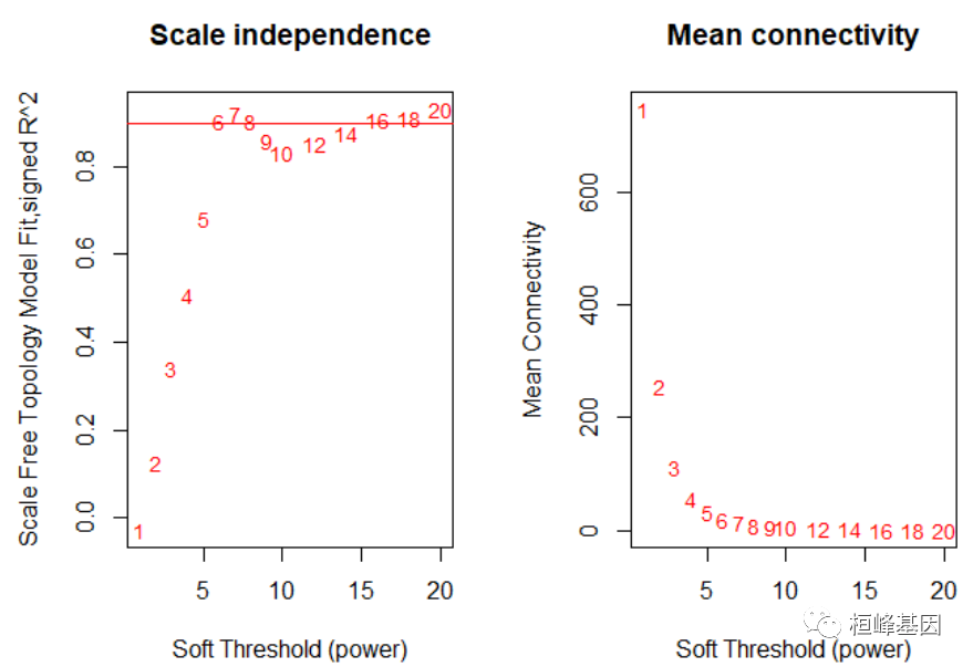
Figure 2: Clustering dendrogram of samples based on their Euclidean distance. save(datExpr, datTraits, file = "FemaleLiver-01-dataInput.RData") 2. Network construction and module detection这一步是使用WGCNA方法进行的所有网络分析的基石。有三种不同的方式构建网络并识别模块,包括:a.采用第一步网络建设和模块检测功能,适合希望到达的用户以最小的努力获得结果; b.为想要尝试定制/替代方法的用户提供分步网络建设和模块检测; c.为希望分析数据的用户提供一种全数据块网络构建和模块检测自动检测方法集太大,无法集中分析。 首先选择软阈值能力,网络拓扑分析,如下: # Choose a set of soft-thresholding powers powers = c(c(1:10), seq(from = 12, to = 20, by = 2)) # Call the network topology analysis function sft = pickSoftThreshold(datExpr, powerVector = powers, verbose = 5) ## pickSoftThreshold: will use block size 3600. ## pickSoftThreshold: calculating connectivity for given powers... ## ..working on genes 1 through 3600 of 3600 ## Warning: executing %dopar% sequentially: no parallel backend registered ## Power SFT.R.sq slope truncated.R.sq mean.k. median.k. max.k. ## 1 1 0.0278 0.345 0.456 747.00 762.0000 1210.0 ## 2 2 0.1260 -0.597 0.843 254.00 251.0000 574.0 ## 3 3 0.3400 -1.030 0.972 111.00 102.0000 324.0 ## 4 4 0.5060 -1.420 0.973 56.50 47.2000 202.0 ## 5 5 0.6810 -1.720 0.940 32.20 25.1000 134.0 ## 6 6 0.9020 -1.500 0.962 19.90 14.5000 94.8 ## 7 7 0.9210 -1.670 0.917 13.20 8.6800 84.1 ## 8 8 0.9040 -1.720 0.876 9.25 5.3900 76.3 ## 9 9 0.8590 -1.700 0.836 6.80 3.5600 70.5 ## 10 10 0.8330 -1.660 0.831 5.19 2.3800 65.8 ## 11 12 0.8530 -1.480 0.911 3.33 1.1500 58.1 ## 12 14 0.8760 -1.380 0.949 2.35 0.5740 51.9 ## 13 16 0.9070 -1.300 0.970 1.77 0.3090 46.8 ## 14 18 0.9120 -1.240 0.973 1.39 0.1670 42.5 ## 15 20 0.9310 -1.210 0.977 1.14 0.0951 38.7 # Plot the results: sizeGrWindow(9, 5) par(mfrow = c(1, 2)) cex1 = 0.9 # Scale-free topology fit index as a function of the soft-thresholding power plot(sft$fitIndices[, 1], -sign(sft$fitIndices[, 3]) * sft$fitIndices[, 2], xlab = "Soft Threshold (power)", ylab = "Scale Free Topology Model Fit,signed R^2", type = "n", main = paste("Scale independence")) text(sft$fitIndices[, 1], -sign(sft$fitIndices[, 3]) * sft$fitIndices[, 2], labels = powers, cex = cex1, col = "red") # this line corresponds to using an R^2 cut-off of h abline(h = 0.9, col = "red") # Mean connectivity as a function of the soft-thresholding power plot(sft$fitIndices[, 1], sft$fitIndices[, 5], xlab = "Soft Threshold (power)", ylab = "Mean Connectivity", type = "n", main = paste("Mean connectivity")) text(sft$fitIndices[, 1], sft$fitIndices[, 5], labels = powers, cex = cex1, col = "red")
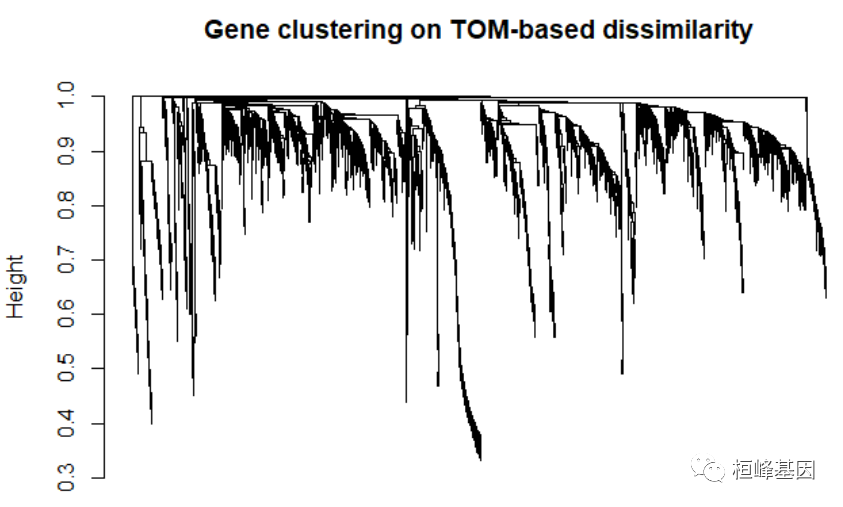
Figure 3: Analysis of network topology for various soft-thresholding powers. softPower = 6 adjacency = adjacency(datExpr, power = softPower) # Turn adjacency into topological overlap TOM = TOMsimilarity(adjacency) ## ..connectivity.. ## ..matrix multiplication (system BLAS).. ## ..normalization.. ## ..done. dissTOM = 1 - TOM # Call the hierarchical clustering function geneTree = hclust(as.dist(dissTOM), method = "average") # Plot the resulting clustering tree (dendrogram) sizeGrWindow(12,9) plot(geneTree, xlab = "", sub = "", main = "Gene clustering on TOM-based dissimilarity", labels = FALSE, hang = 0.04)
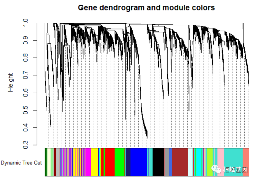
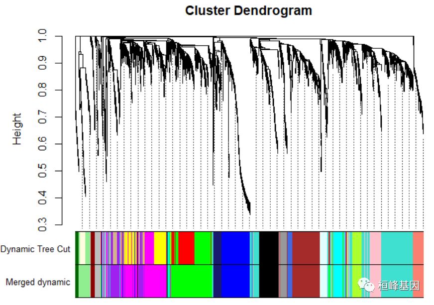
Figure 4: Clustering dendrogram of genes, with dissimilarity based on topological overlap. # We like large modules, so we set the minimum module size relatively high: minModuleSize = 30 # Module identification using dynamic tree cut: dynamicMods = cutreeDynamic(dendro = geneTree, distM = dissTOM, deepSplit = 2, pamRespectsDendro = FALSE, minClusterSize = minModuleSize) ## ..cutHeight not given, setting it to 0.996 ===> 99% of the (truncated) height range in dendro. ## ..done. table(dynamicMods) ## dynamicMods ## 0 1 2 3 4 5 6 7 8 9 10 11 12 13 14 15 16 17 18 19 ## 88 614 316 311 257 235 225 212 158 153 121 106 102 100 94 91 78 76 65 58 ## 20 21 22 ## 58 48 34 # Convert numeric lables into colors dynamicColors = labels2colors(dynamicMods) table(dynamicColors) ## dynamicColors ## black blue brown cyan darkgreen darkred ## 212 316 311 94 34 48 ## green greenyellow grey grey60 lightcyan lightgreen ## 235 106 88 76 78 65 ## lightyellow magenta midnightblue pink purple red ## 58 153 91 158 121 225 ## royalblue salmon tan turquoise yellow ## 58 100 102 614 257 # Plot the dendrogram and colors underneath sizeGrWindow(8,6) plotDendroAndColors(geneTree, dynamicColors, "Dynamic Tree Cut", dendroLabels = FALSE, hang = 0.03, addGuide = TRUE, guideHang = 0.05, main = "Gene dendrogram and module colors")
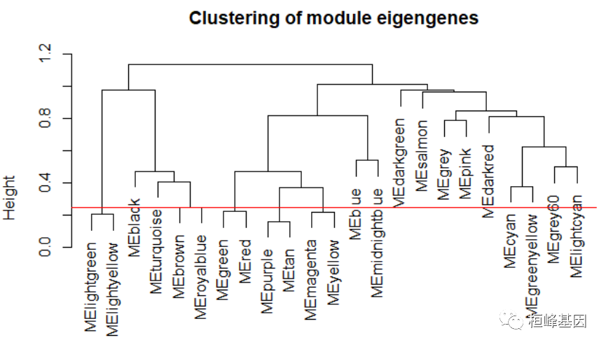
Figure 5: Clustering dendrogram of genes, with dissimilarity based on topological overlap, together with assigned module colors. # Calculate eigengenes MEList = moduleEigengenes(datExpr, colors = dynamicColors) MEs = MEList$eigengenes # Calculate dissimilarity of module eigengenes MEDiss = 1 - cor(MEs) # Cluster module eigengenes METree = hclust(as.dist(MEDiss), method = "average") # Plot the result sizeGrWindow(7, 6) plot(METree, main = "Clustering of module eigengenes", xlab = "", sub = "") MEDissThres = 0.25 # Plot the cut line into the dendrogram abline(h = MEDissThres, col = "red")
Figure 6: Clustering dendrogram of genes, with dissimilarity based on topological overlap, together with assigned merged module colors and the original module colors. # Call an automatic merging function merge = mergeCloseModules(datExpr, dynamicColors, cutHeight = MEDissThres, verbose = 3) ## mergeCloseModules: Merging modules whose distance is less than 0.25 ## multiSetMEs: Calculating module MEs. ## Working on set 1 ... ## moduleEigengenes: Calculating 23 module eigengenes in given set. ## multiSetMEs: Calculating module MEs. ## Working on set 1 ... ## moduleEigengenes: Calculating 19 module eigengenes in given set. ## Calculating new MEs... ## multiSetMEs: Calculating module MEs. ## Working on set 1 ... ## moduleEigengenes: Calculating 19 module eigengenes in given set. # The merged module colors mergedColors = merge$colors # Eigengenes of the new merged modules: mergedMEs = merge$newMEs # sizeGrWindow(12, 9) pdf(file = 'Plots/geneDendro-3.pdf', wi = 9, he = 6) plotDendroAndColors(geneTree, cbind(dynamicColors, mergedColors), c("Dynamic Tree Cut", "Merged dynamic"), dendroLabels = FALSE, hang = 0.03, addGuide = TRUE, guideHang = 0.05)
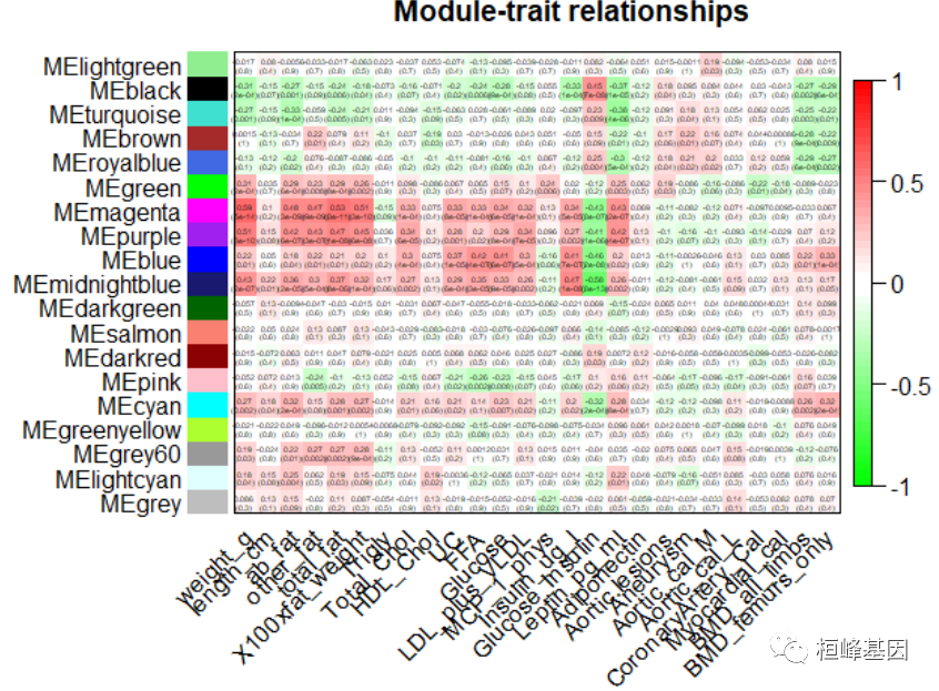
Figure 7: Clustering dendrogram of genes, with dissimilarity based on topological overlap # dev.off() 3. Relating modules to external clinical traits and identifying important genes将模块与外部临床特征相关联,如下: # Rename to moduleColors moduleColors = mergedColors # Construct numerical labels corresponding to the colors colorOrder = c("grey", standardColors(50)) moduleLabels = match(moduleColors, colorOrder) - 1 MEs = mergedMEs # Save module colors and labels for use in subsequent parts save(MEs, moduleLabels, moduleColors, geneTree, file = "FemaleLiver-02-networkConstruction-stepByStep.RData") # Define numbers of genes and samples nGenes = ncol(datExpr) nSamples = nrow(datExpr) # Recalculate MEs with color labels MEs0 = moduleEigengenes(datExpr, moduleColors)$eigengenes MEs = orderMEs(MEs0) moduleTraitCor = cor(MEs, datTraits, use = "p") moduleTraitPvalue = corPvalueStudent(moduleTraitCor, nSamples) # sizeGrWindow(10,6) Will display correlations and their p-values textMatrix = paste(signif(moduleTraitCor, 2), "\n(", signif(moduleTraitPvalue, 1), ")", sep = "") dim(textMatrix) = dim(moduleTraitCor) par(mar = c(6, 8.5, 3, 3)) # Display the correlation values within a heatmap plot labeledHeatmap(Matrix = moduleTraitCor, xLabels = names(datTraits), yLabels = names(MEs), ySymbols = names(MEs), colorLabels = FALSE, colors = greenWhiteRed(50), textMatrix = textMatrix, setStdMargins = FALSE, cex.text = 0.3, zlim = c(-1, 1), main = paste("Module-trait relationships")) ## Warning in greenWhiteRed(50): WGCNA::greenWhiteRed: this palette is not suitable for people ## with green-red color blindness (the most common kind of color blindness). ## Consider using the function blueWhiteRed instead.
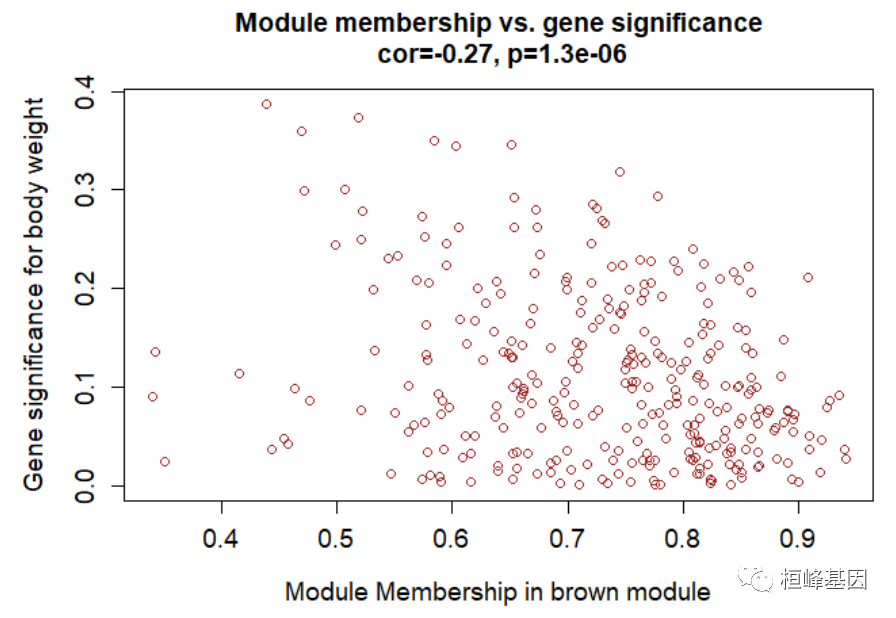
Figure 8: Module-trait associations. 模内分析:鉴定高 GS 和 MM 基因 # Define variable weight containing the weight column of datTrait weight = as.data.frame(datTraits$weight_g) names(weight) = "weight" # names (colors) of the modules modNames = substring(names(MEs), 3) geneModuleMembership = as.data.frame(cor(datExpr, MEs, use = "p")) MMPvalue = as.data.frame(corPvalueStudent(as.matrix(geneModuleMembership), nSamples)) names(geneModuleMembership) = paste("MM", modNames, sep = "") names(MMPvalue) = paste("p.MM", modNames, sep = "") geneTraitSignificance = as.data.frame(cor(datExpr, weight, use = "p")) GSPvalue = as.data.frame(corPvalueStudent(as.matrix(geneTraitSignificance), nSamples)) names(geneTraitSignificance) = paste("GS.", names(weight), sep = "") names(GSPvalue) = paste("p.GS.", names(weight), sep = "") module = "brown" column = match(module, modNames) moduleGenes = moduleColors == module # sizeGrWindow(7, 7); par(mfrow = c(1, 1)) verboseScatterplot(abs(geneModuleMembership[moduleGenes, column]), abs(geneTraitSignificance[moduleGenes, 1]), xlab = paste("Module Membership in", module, "module"), ylab = "Gene significance for body weight", main = paste("Module membership vs. gene significance\n"), cex.main = 1.2, cex.lab = 1.2, cex.axis = 1.2, col = module)
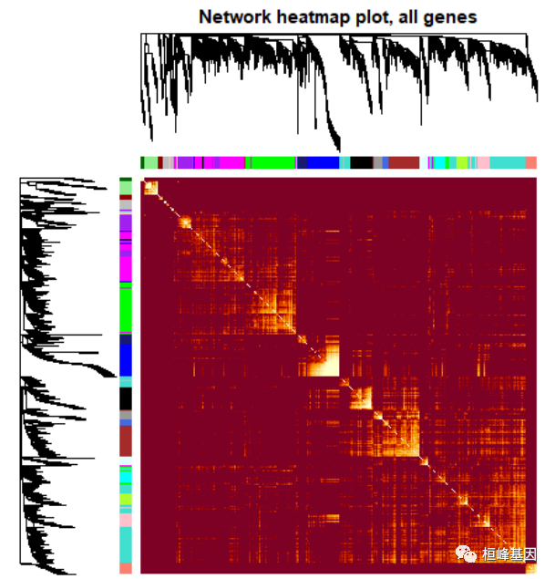
Figure 9: A scatterplot of Gene Significance (GS) for weight vs. Module Membership (MM) in the brown module head(names(datExpr)[moduleColors == "brown"]) ## [1] "MMT00000149" "MMT00000283" "MMT00000550" "MMT00000701" "MMT00001190" ## [6] "MMT00001555" annot = read.csv(file = "./FemaleLiver-Data/GeneAnnotation.csv") probes = names(datExpr) probes2annot = match(probes, annot$substanceBXH) # The following is the number or probes without annotation: sum(is.na(probes2annot)) ## [1] 0 # Should return 0. Create the starting data frame geneInfo0 = data.frame(substanceBXH = probes, geneSymbol = annot$gene_symbol[probes2annot], LocusLinkID = annot$LocusLinkID[probes2annot], moduleColor = moduleColors, geneTraitSignificance, GSPvalue) # Order modules by their significance for weight modOrder = order(-abs(cor(MEs, weight, use = "p"))) # Add module membership information in the chosen order for (mod in 1:ncol(geneModuleMembership)) { oldNames = names(geneInfo0) geneInfo0 = data.frame(geneInfo0, geneModuleMembership[, modOrder[mod]], MMPvalue[, modOrder[mod]]) names(geneInfo0) = c(oldNames, paste("MM.", modNames[modOrder[mod]], sep = ""), paste("p.MM.", modNames[modOrder[mod]], sep = "")) } # Order the genes in the geneInfo variable first by module color, then by # geneTraitSignificance geneOrder = order(geneInfo0$moduleColor, -abs(geneInfo0$GS.weight)) geneInfo = geneInfo0[geneOrder, ] write.csv(geneInfo, file = "geneInfo.csv") 4. Interfacing network analysis with other data such as functional annotation and gene ontology我们之前的分析已经确定了几个高度相关的模块(标记为 brown, red, and salmon)与重量。为了便于生物学解释,我们想知道基因的基因本体模块,它们是否在某些功能类别中显着丰富等。 # Read in the probe annotation annot = read.csv(file = # './FemaleLiver-Data/GeneAnnotation.csv'); Match probes in the data set to the # probe IDs in the annotation file probes = names(datExpr) probes2annot = match(probes, annot$substanceBXH) # Get the corresponding Locuis Link IDs allLLIDs = annot$LocusLinkID[probes2annot] # $ Choose interesting modules intModules = c("brown", "red", "salmon") for (module in intModules) { # Select module probes modGenes = (moduleColors == module) # Get their entrez ID codes modLLIDs = allLLIDs[modGenes] # Write them into a file fileName = paste("LocusLinkIDs-", module, ".txt", sep = "") write.table(as.data.frame(modLLIDs), file = fileName, row.names = FALSE, col.names = FALSE) } # As background in the enrichment analysis, we will use all probes in the # analysis. fileName = paste("LocusLinkIDs-all.txt", sep = "") write.table(as.data.frame(allLLIDs), file = fileName, row.names = FALSE, col.names = FALSE)GO 富集分析,如下: GOenr = GOenrichmentAnalysis(moduleColors, allLLIDs, organism = "mouse", nBestP = 10) ## Warning in GOenrichmentAnalysis(moduleColors, allLLIDs, organism = "mouse", : This function is deprecated and will be removed in the near future. ## We suggest using the replacement function enrichmentAnalysis ## in R package anRichment, available from the following URL: ## https://labs.genetics.ucla.edu/horvath/htdocs/CoexpressionNetwork/GeneAnnotation/ ## GOenrichmentAnalysis: loading annotation data... ## ..of the 3038 Entrez identifiers submitted, 2843 are mapped in current GO categories. ## ..will use 2843 background genes for enrichment calculations. ## ..preparing term lists (this may take a while).. ## ..working on label set 1 .. ## ..calculating enrichments (this may also take a while).. ## ..putting together terms with highest enrichment significance.. tab = GOenr$bestPTerms[[4]]$enrichment write.table(tab, file = "GOEnrichmentTable.csv", sep = ",", quote = TRUE, row.names = FALSE) keepCols = c(1, 2, 5, 6, 7, 12, 13) screenTab = tab[, keepCols] # Round the numeric columns to 2 decimal places: numCols = c(3, 4) screenTab[, numCols] = signif(apply(screenTab[, numCols], 2, as.numeric), 2) # Truncate the the term name to at most 40 characters screenTab[, 7] = substring(screenTab[, 7], 1, 40) # Shorten the column names: colnames(screenTab) = c("module", "size", "p-val", "Bonf", "nInTerm", "ont", "term name") rownames(screenTab) = NULL # Set the width of R’s output. The reader should play with this number to # obtain satisfactory output. options(width = 95) # Finally, display the enrichment table: head(screenTab) ## module size p-val Bonf nInTerm ont term name ## 1 black 167 5.9e-05 1 15 MF signaling receptor activator activity ## 2 black 167 5.9e-05 1 15 MF receptor ligand activity ## 3 black 167 1.2e-04 1 15 MF signaling receptor regulator activity ## 4 black 167 6.8e-04 1 5 BP mRNA transport ## 5 black 167 7.1e-04 1 4 BP dopamine transport ## 6 black 167 1.7e-03 1 6 BP amine transport 5. Network visualization using WGCNA functions可视化基因网络,对所有基因做图,如下: nGenes = ncol(datExpr) nSamples = nrow(datExpr) # Calculate topological overlap anew: this could be done more efficiently by saving the TOM # calculated during module detection, but let us do it again here. dissTOM = 1 - TOMsimilarityFromExpr(datExpr, power = 6) ## TOM calculation: adjacency.. ## ..will not use multithreading. ## Fraction of slow calculations: 0.396405 ## ..connectivity.. ## ..matrix multiplication (system BLAS).. ## ..normalization.. ## ..done. # Transform dissTOM with a power to make moderately strong connections more visible in the # heatmap plotTOM = dissTOM^7 # Set diagonal to NA for a nicer plot diag(plotTOM) = NA # Call the plot function sizeGrWindow(9,9) TOMplot(plotTOM, geneTree, moduleColors, main = "Network heatmap plot, all genes")
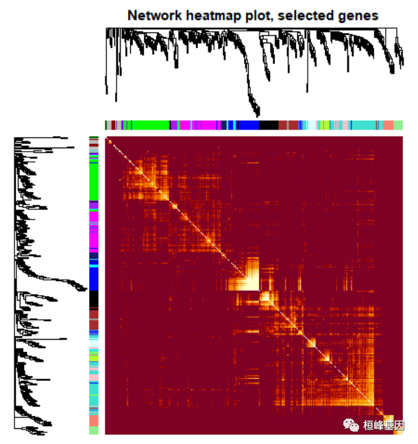
Figure 10: Visualizing the gene network using a heatmap plot. 对所有基因进行筛选,在绘制热图,如下: nSelect = 400 # For reproducibility, we set the random seed set.seed(10) select = sample(nGenes, size = nSelect) selectTOM = dissTOM[select, select] # There’s no simple way of restricting a clustering tree to a subset of genes, so we must # re-cluster. selectTree = hclust(as.dist(selectTOM), method = "average") selectColors = moduleColors[select] # Open a graphical window sizeGrWindow(9,9) Taking the dissimilarity to a power, say 10, makes # the plot more informative by effectively changing the color palette; setting the diagonal to # NA also improves the clarity of the plot plotDiss = selectTOM^7 diag(plotDiss) = NA TOMplot(plotDiss, selectTree, selectColors, main = "Network heatmap plot, selected genes")
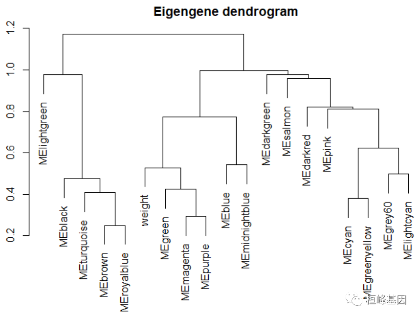
Figure 11: Visualizing the gene network using a heatmap plot 可视化特征基因网络,如下: # Recalculate module eigengenes MEs = moduleEigengenes(datExpr, moduleColors)$eigengenes # Isolate weight from the clinical traits weight = as.data.frame(datTraits$weight_g) names(weight) = "weight" # Add the weight to existing module eigengenes MET = orderMEs(cbind(MEs, weight)) # Plot the relationships among the eigengenes and the trait sizeGrWindow(5,7.5); par(cex = 1) plotEigengeneNetworks(MET, "Eigengene dendrogram", marDendro = c(0, 4, 2, 0), plotHeatmaps = FALSE)
Figure 12: Visualization of the eigengene network representing the relationships among the modules and the clinical trait weight. # Plot the heatmap matrix (note: this plot will overwrite the dendrogram plot) par(cex = 1) plotEigengeneNetworks(MET, "Eigengene adjacency heatmap", marHeatmap = c(3, 4, 2, 2), plotDendrograms = FALSE, xLabelsAngle = 90)
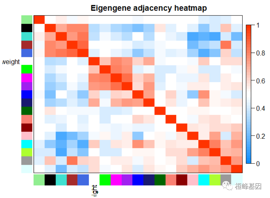
Figure 13: Visualization of the eigengene network representing the relationships among the modules and the clinical trait weight. 6. Export of networks to external software将网络数据导出到网络可视化软件中,有两种方式: 1.VisANT 2.Cytoscape 但是每种软件有自己的输入文件要求,根据代码生成就可以了,如下: 1. 输入到 VisANT 软件进行基因网络的互作绘图。 # Recalculate topological overlap TOM = TOMsimilarityFromExpr(datExpr, power = 6) ## TOM calculation: adjacency.. ## ..will not use multithreading. ## Fraction of slow calculations: 0.396405 ## ..connectivity.. ## ..matrix multiplication (system BLAS).. ## ..normalization.. ## ..done. # Read in the annotation file annot = read.csv(file = # './FemaleLiver-Data/GeneAnnotation.csv'); Select module module = "brown" # Select module probes probes = names(datExpr) inModule = (moduleColors == module) modProbes = probes[inModule] # Select the corresponding Topological Overlap modTOM = TOM[inModule, inModule] dimnames(modTOM) = list(modProbes, modProbes) # Export the network into an edge list file VisANT can read vis = exportNetworkToVisANT(modTOM, file = paste("VisANTInput-", module, ".txt", sep = ""), weighted = TRUE, threshold = 0, probeToGene = data.frame(annot$substanceBXH, annot$gene_symbol)) nTop = 30 IMConn = softConnectivity(datExpr[, modProbes]) ## softConnectivity: FYI: connecitivty of genes with less than 45 valid samples will be returned as NA. ## ..calculating connectivities.. top = (rank(-IMConn) |
【本文地址】