| 在Qt creator5.14中使用QSS 美化Qt界面 | 您所在的位置:网站首页 › qt5漂亮界面 › 在Qt creator5.14中使用QSS 美化Qt界面 |
在Qt creator5.14中使用QSS 美化Qt界面
|
QSS简介
QSS称为Qt Style Sheets也就是Qt样式表,它是Qt提供的一种用来自定义控件外观的机制,它有着与css3相似的语法,或者在某种意义上它可以说是对css3进行某些特化后的子集。 Qt控件自身的外观有时很难满足我们的需要,这时候一般会有两种常见的解决方案,第一种是通过重写paintEvent来实现控件的自绘,这种方式最灵活,然而学习和使用成本也是最高的;另一种则是使用qss,通过qss控制widgets的外观表达。而qss的强大之处在于它不仅简单易学,而且功能强大,对自定义组件也能提供良好的支持。 基本选择器
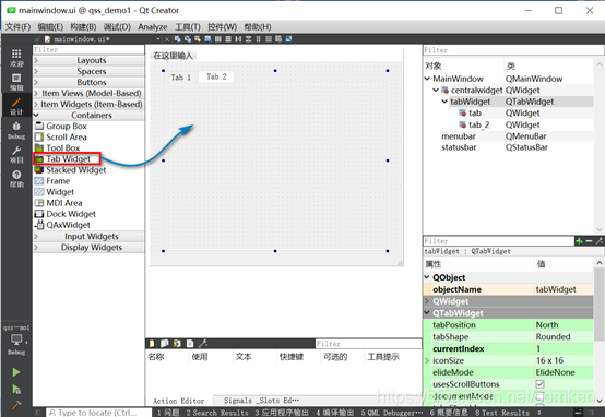
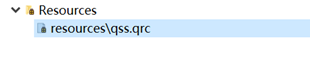
通过一个基本的示例演示qss的基本使用,对于有css基础的人来说很容易上手 新建项目新建一个Qt Widgets Application项目,在窗体上添加一个tabWidget控件,然后修改mainwindow.cpp代码在窗体上添加一下组件。 1.在项目目录下创建名称为“resource”文件夹 2.在Qt creater中新建资源文件Qt Resource File,可以点击“浏览”按钮,打开工程所在的目录下,选择“resource”文件夹。输入资源名称可为“qss”点击“下一步”->点击“完成”。
style.qss代码如下: /* 控件的背景 */ .QWidget { background-color: beige; } QToolBar { background-color: beige; } QDialog, QFileDialog { background-color: beige; } QTabWidget::pane { /* 选项卡小部件框架 */ border-top: 2px solid #C2C7CB; } QTabWidget::tab-bar { left: 5px; /* 向右移动 5px */ } QTabBar, QTabWidget { background-color: beige; } QTabBar::tab { background: qlineargradient(x1: 0, y1: 0, x2: 0, y2: 1, stop: 0 #E1E1E1, stop: 0.4 #DDDDDD, stop: 0.5 #D8D8D8, stop: 1.0 #D3D3D3); border: 1px solid darkkhaki; border-bottom-color: #C2C7CB; /*与窗格颜色相同 */ border-top-left-radius: 4px; border-top-right-radius: 4px; min-width: 8ex; padding: 2px; } QTabBar::tab:selected, QTabBar::tab:hover { background: qlineargradient(x1: 0, y1: 0, x2: 0, y2: 1, stop: 0 #fafafa, stop: 0.4 #f4f4f4, stop: 0.5 #e7e7e7, stop: 1.0 #fafafa); } QTabBar::tab:selected { border-color: #9B9B9B; border-bottom-color: #C2C7CB; /* 与窗格颜色相同 */ } QTabBar::tab:!selected { margin-top: 2px; /* 使未选定的选项卡看起来更小 */ } /* 不错的Windows XP风格的密码字符. */ QLineEdit[echoMode="2"] { lineedit-password-character: 9679; } QHeaderView::section { background-color: qlineargradient(x1:0, y1:0, x2:0, y2:1, stop:0 #616161, stop: 0.5 #505050, stop: 0.6 #434343, stop:1 #656565); color: white; padding-left: 4px; border: 1px solid #6c6c6c; } QHeaderView::section:checked { background-color: red; } /* 我们为按钮提供最小宽度和最小高度 使它们看起来优雅,不受文本宽度的影响。 */ QPushButton { background-color: palegoldenrod; border-width: 2px; border-color: darkkhaki; border-style: solid; border-radius: 5; padding: 3px; min-width: 9ex; min-height: 2.5ex; } QPushButton:hover { background-color: khaki; } /* 增加填充,这样当按下按钮时文本会移动。 */ QPushButton:pressed { padding-left: 5px; padding-top: 5px; background-color: #d0d67c; } QLabel, QAbstractButton { font: bold; } /* 用棕色标记强制字段。 */ .mandatory { color: brown; } /* 状态栏上的粗体文本看起来很糟糕。 */ QStatusBar QLabel { font: normal; } QStatusBar::item { border-width: 1; border-color: darkkhaki; border-style: solid; border-radius: 2; } QStackedWidget, QComboBox, QLineEdit, QSpinBox, QTextEdit, QListView, QWebView, QTreeView, QHeaderView { background-color: cornsilk; selection-color: #0a214c; selection-background-color: #C19A6B; } QListView { show-decoration-selected: 1; } QListView::item:hover { background-color: wheat; } /* 在填充中保留1个像素空间。当得到焦点时,就消除填充并扩大边界。 看起来像物品在发光。 */ QLineEdit, QFrame { border-width: 1px; padding: 1px; border-style: solid; border-color: darkkhaki; border-radius: 5px; } /* 消除填充并增加边框。 */ QLineEdit:focus, QFrame:focus { border-width: 3px; padding: 0px; } /* QLabel控件 */ QLabel { border: none; padding: 0; background: none; } /* QLabel 上的 QToolTip提示 */ QToolTip { border: 2px solid darkkhaki; padding: 5px; border-radius: 3px; opacity: 200; } /* 悬停时背景颜色改变*/ QRadioButton:hover, QCheckBox:hover { background-color: wheat; } /* 对话框的按钮遵循Windows样式 */ QDialogButtonBox { button-layout: 0; } 在窗体上应用qss样式修改main.cpp #include "mainwindow.h" #include #include #include int main(int argc, char *argv[]) { QApplication a(argc, argv); //加载qss文件 QFile qssFile(":/Qss/style.qss"); qssFile.open(QFile::ReadOnly); //以只读方式打开 if(qssFile.isOpen()) { QString qss = QLatin1String(qssFile.readAll()); qApp->setStyleSheet(qss); qssFile.close(); } else { qDebug() |
 mainwindow.cpp代码如下:
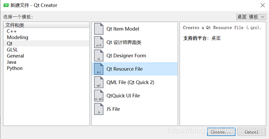 3. 添加.qss文件。 右键“*.qrc”—>选择“add prefix”—>在弹出的窗口中输入“/Qss”。操作完成后,到对应的“resource”目录下创建“Qss”文件夹,并在文件夹内创建扩展名称为".qss"。
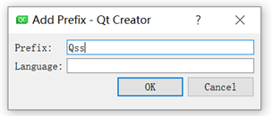
 4. 对应的“resource”目录下创建“Qss”文件夹,并在文件夹内创建扩展名称为”style.qss"的文件。
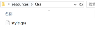
【本文地址】
公司简介
联系我们