| python爬取天气数据并做可视化分析 | 您所在的位置:网站首页 › python抓取天气数据 › python爬取天气数据并做可视化分析 |
python爬取天气数据并做可视化分析
数据采集逻辑
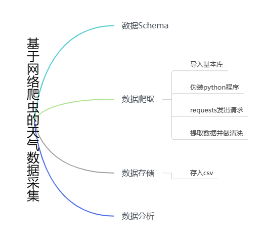 数据schema
历史天气数据schema { ‘当日信息’:'2023-01-01 星期日', '最高气温': 8℃'', '最低气温': '5℃', ‘天气’: '多云', '风向信息':'北风 3级' } 数据爬取1.导入库 import numpy as np import pandas as pd import requests from bs4 import BeautifulSoup from matplotlib import pyplot as plt from pandas import Series, DataFrame2.对程序进行伪装 headers = { 'Host': 'lishi.tianqi.com', 'user-agent': 'Mozilla/5.0 (Windows NT 10.0; Win64; x64) AppleWebKit/537.36 (KHTML, like Gecko) Chrome/110.0.0.0 Safari/537.36 Edg/110.0.1587.63' }3.抓取天气数据 url = 'https://lishi.tianqi.com/shanghai/202301.html' # 上海 2023年1月天气 res = requests.get(url, headers=headers) res.encodind = 'utf-8' html = BeautifulSoup(res.text, 'html.parser') data_all = [] tian_three = html.find("div", {"class": "tian_three"}) lishi = tian_three.find_all("li") for i in lishi: lishi_div = i.find_all("div") data = [] for j in lishi_div: data.append(j.text) data_all.append(data) print(data_all) 4.数据存储在数据存储前,对数据进行处理,便于后期的数据分析。将上面的“当天信息”字段拆分为“日期”和“星期”两个字段,“风向信息”也是如此。最后,将数据保存为csv文件中。 weather = pd.DataFrame(data_all) weather.columns = ["当日信息", "最高气温", "最低气温", "天气", "风向信息"] weather_shape = weather.shape print(weather) weather['当日信息'].apply(str) result = DataFrame(weather['当日信息'].apply(lambda x: Series(str(x).split(' ')))) result = result.loc[:, 0:1] result.columns = ['日期', '星期'] weather['风向信息'].apply(str) result1 = DataFrame(weather['风向信息'].apply(lambda x: Series(str(x).split(' ')))) result1 = result1.loc[:, 0:1] result1.columns = ['风向', '级数'] weather = weather.drop(columns='当日信息') weather = weather.drop(columns='风向信息') weather.insert(loc=0, column='日期', value=result['日期']) weather.insert(loc=1, column='星期', value=result['星期']) weather.insert(loc=5, column='风向', value=result1['风向']) weather.insert(loc=6, column='级数', value=result1['级数']) weather.to_csv("上海23年1月天气.csv", encoding="utf_8") 5.数据分析注:数据分析用的是北京2023年1月的天气数据,如下图: 
1.2023北京1月天气情况 # 数据处理 plt.rcParams['font.sans-serif'] = ['SimHei'] plt.rcParams['axes.unicode_minus'] = False weather['最高气温'] = weather['最高气温'].map(lambda x: int(x.replace('℃', ''))) weather['最低气温'] = weather['最低气温'].map(lambda x: int(x.replace('℃', ''))) dates = weather['日期'] highs = weather['最高气温'] lows = weather['最低气温'] # 画图 fig = plt.figure(dpi=128, figsize=(10, 6)) plt.plot(dates, highs, c='red', alpha=0.5) plt.plot(dates, lows, c='blue', alpha=0.5) plt.fill_between(dates, highs, lows, facecolor='blue', alpha=0.2) # 图表格式 # 设置图标的图形格式 plt.title('2023北京1月天气情况', fontsize=24) plt.xlabel('', fontsize=6) fig.autofmt_xdate() plt.ylabel('气温', fontsize=12) plt.tick_params(axis='both', which='major', labelsize=10) # 修改刻度 plt.xticks(dates[::5]) # 显示 plt.show()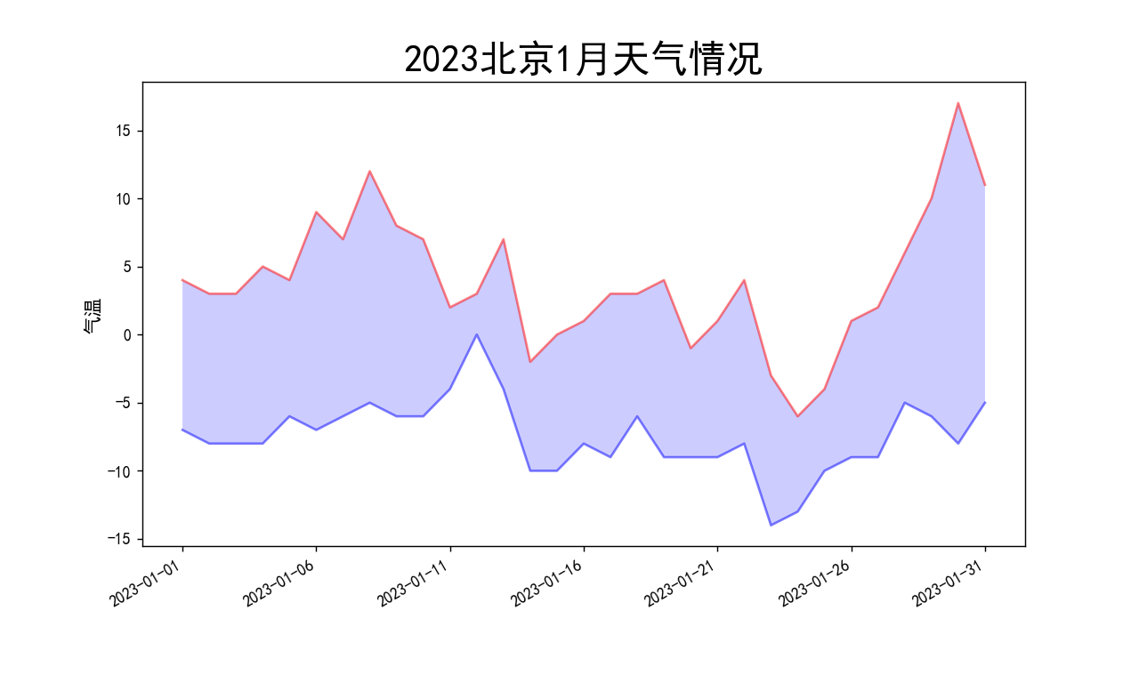
2.北京23年1月天气候分布饼图 2023年一月份有31天,循环遍历时注意循环次数。 # 天气可视化饼图 weather = list(weather['天气']) dic_wea = {} for i in range(0, 31): if weather[i] in dic_wea.keys(): dic_wea[weather[i]] += 1 else: dic_wea[weather[i]] = 1 print(dic_wea) explode = [0.01] * len(dic_wea.keys()) color = ['lightskyblue', 'silver', 'yellow', 'salmon', 'grey', 'lime', 'gold', 'red', 'green', 'pink'] plt.pie(dic_wea.values(), explode=explode, labels=dic_wea.keys(), autopct='%1.1f%%', colors=color) plt.title('北京23年1月天气候分布饼图') plt.show()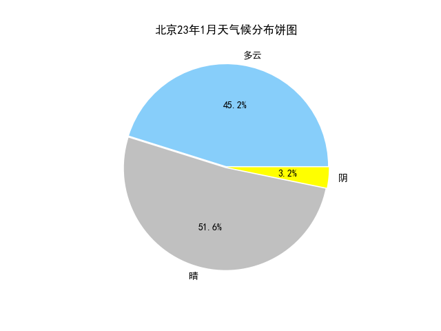
3.风级图 自定义change_wind函数,将风向信息转换为数值,并计算出各风向的风速平均值。 def change_wind(wind): """改变风向""" for i in range(0, 31): if wind[i] == "北风": wind[i] = 90 elif wind[i] == "南风": wind[i] = 270 elif wind[i] == "西风": wind[i] = 180 elif wind[i] == "东风": wind[i] = 360 elif wind[i] == "东北风": wind[i] = 45 elif wind[i] == "西北风": wind[i] = 135 elif wind[i] == "西南风": wind[i] = 225 elif wind[i] == "东南风": wind[i] = 315 return wind # 风向雷达图 wind = list(weather['风向']) weather['级数'] = weather['级数'].map(lambda x: int(x.replace('级', ''))) # weather['级数']=pd.to_numeric(weather['级数']) wind_speed = list(weather['级数']) wind = change_wind(wind) degs = np.arange(45, 361, 45) temp = [] for deg in degs: speed = [] # 获取 wind_deg 在指定范围的风速平均值数据 for i in range(0, 31): if wind[i] == deg: speed.append(wind_speed[i]) if len(speed) == 0: temp.append(0) else: temp.append(sum(speed) / len(speed)) print(temp) N = 8 theta = np.arange(0. + np.pi / 8, 2 * np.pi + np.pi / 8, 2 * np.pi / 8) # 数据极径 radii = np.array(temp) # 绘制极区图坐标系 plt.axes(polar=True) # 定义每个扇区的RGB值(R,G,B),x越大,对应的颜色越接近蓝色 colors = [(1 - x / max(temp), 1 - x / max(temp), 0.6) for x in radii] plt.bar(theta, radii, width=(2 * np.pi / N), bottom=0.0, color=colors) plt.title('风级图', x=0.2, fontsize=20) plt.show()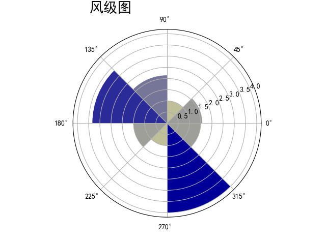
|
【本文地址】
公司简介
联系我们