| 二次元的登录界面 | 您所在的位置:网站首页 › htmlinputtype属性 › 二次元的登录界面 |
二次元的登录界面
|
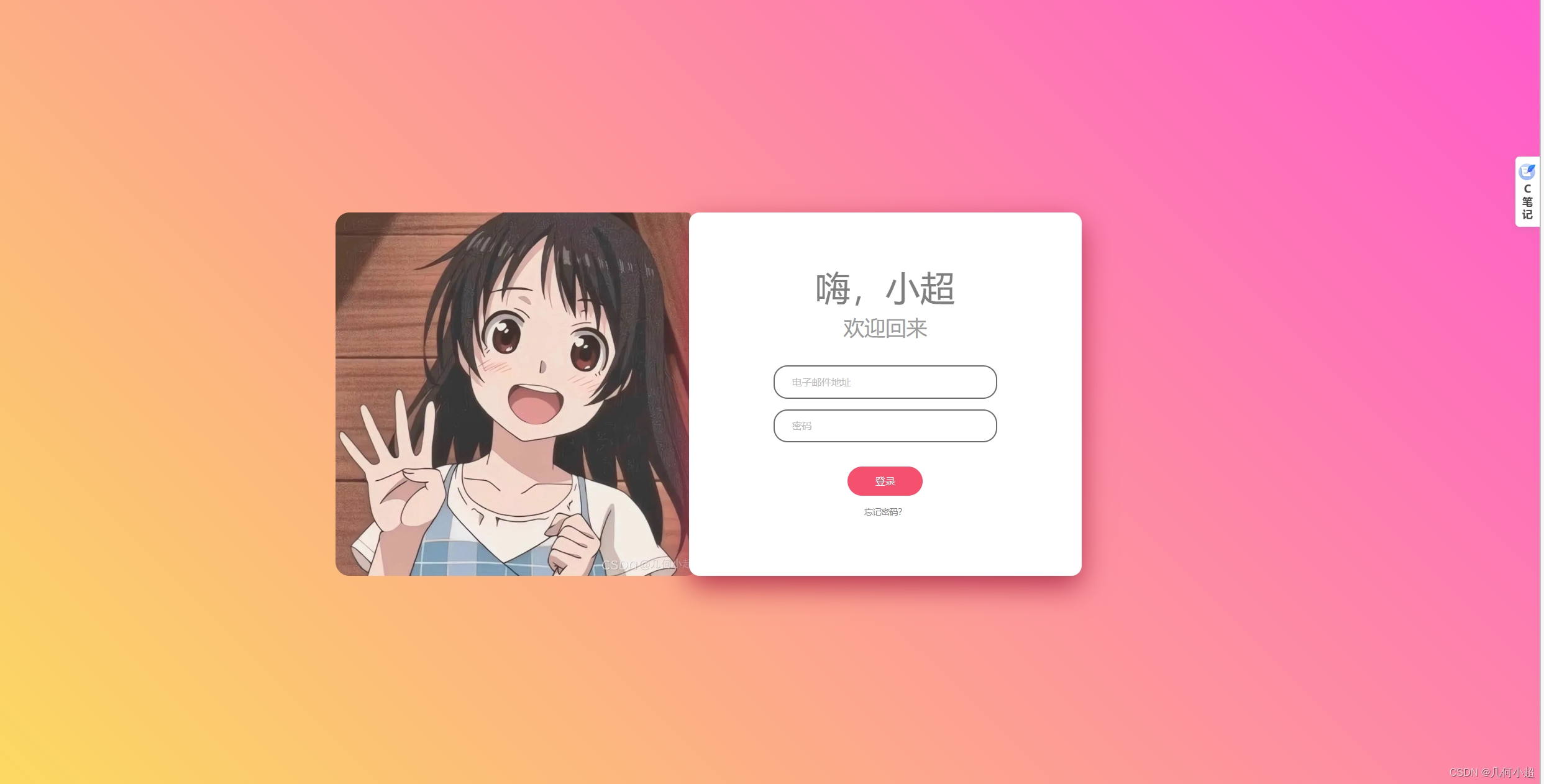
今天还是继续坚持写博客,然后今天给大家带来比较具有二次元风格的登录界面,也只是用html和css来写的,大家可以来看看! 个人名片: 😊作者简介:一名大一在校生,web前端开发专业 🤡 个人主页:几何小超 🐼座右铭:懒惰受到的惩罚不仅仅是自己的失败,还有别人的成功。 🎅**学习目标: 坚持每一次的学习打卡,掌握更多知识!虽然都说前端已死,但是就算不靠这个吃饭,学一点东西总比啥也不知道的 HTML部分 既然是制作登录界面我们可以使用表单元素,会比盒子更加简单一些,个人相信大家应该可以明白里头的啥意思吧!!! 这边就介绍一下CSS部分吧  HI,xiaochao
Welcome Back
LOGIN
Forgot password?
HI,xiaochao
Welcome Back
LOGIN
Forgot password?
CSS部分 还是给我们先清除内外边距 然后这个ountline:none;的意思是鼠标点击文本框的时候,文本的边框焦点会被去除掉 还是设置一个背景颜色,这里我们使用的是渐变色:然后在需要让盒子来正中间,需要使用弹性布局 感觉下面都挺简单的,我就着重讲一下这个伪元素吧placeholder placeholder 是HTML5 中新增的一个属性。placeholder可以用来描述输入字段预期值的简短的提示信息。提示信息会在用户输入值之前显示,一旦用户输入信息该提示就会自动消失。比如:我们在登录时需要输入用户名和密码,它会提示你什么地方输入用户名,什么地方输入密码,这个就是使用的placeholder属性。 * { padding: 0; margin: 0; outline: none; } body { background: linear-gradient(45deg, #fbda61, #ff5acd); display: flex; justify-content: center; align-items: center; height: 100vh; } .shell, form { position: relative; } .shell { display: flex; justify-content: center; } form { width: 562px; height: 520px; background-color: #fff; box-shadow: 0px 15px 40px #b6354e; border-radius: 15px; display: flex; justify-content: center; align-items: center; } #img-box { width: 330px; height: 520px; } #img-box img { height: 100%; margin-left: -175px; border-radius: 20px; } #form-body { width: 320px; display: flex; justify-content: center; align-items: center; flex-direction: column; } #welcome-lines { width: 100%; text-align: center; line-height: 1; } #w-line-1 { color: #7f7f7f; font-size: 50px; } #w-line-2 { color: #9c9c9c; font-size: 30px; margin-top: 17px; } #input-area { width: 100%; margin-top: 40px; } .f-inp { padding: 13px 25px; border: 2px solid #6e6d6d; line-height: 1; border-radius: 20px; margin-bottom: 15px; } .f-inp input { width: 100%; font-size: 14px; padding: 0; margin: 0; border: 0; } .f-inp input::placeholder { color: #b9b9b9; } #submit-button-cvr { margin-top: 20px; } #submit-button { display: block; width: 100%; color: #fff; font-size: 14px; margin: 0; padding: 14px 40px; border: 0; background-color: #f5506e; border-radius: 25px; line-height: 1; cursor: pointer; } #forgot-pass { text-align: center; margin-top: 10px; } #forgot-pass a { color: #868686; font-size: 12px; text-decoration: none; }接下来展示源码,素材图片就是封面哦 小超&&前端小窝 * { padding: 0; margin: 0; outline: none; } body { background: linear-gradient(45deg, #fbda61, #ff5acd); display: flex; justify-content: center; align-items: center; height: 100vh; } .shell, form { position: relative; } .shell { display: flex; justify-content: center; } form { width: 562px; height: 520px; background-color: #fff; box-shadow: 0px 15px 40px #b6354e; border-radius: 15px; display: flex; justify-content: center; align-items: center; } #img-box { width: 330px; height: 520px; } #img-box img { height: 100%; margin-left: -175px; border-radius: 20px; } #form-body { width: 320px; display: flex; justify-content: center; align-items: center; flex-direction: column; } #welcome-lines { width: 100%; text-align: center; line-height: 1; } #w-line-1 { color: #7f7f7f; font-size: 50px; } #w-line-2 { color: #9c9c9c; font-size: 30px; margin-top: 17px; } #input-area { width: 100%; margin-top: 40px; } .f-inp { padding: 13px 25px; border: 2px solid #6e6d6d; line-height: 1; border-radius: 20px; margin-bottom: 15px; } .f-inp input { width: 100%; font-size: 14px; padding: 0; margin: 0; border: 0; } .f-inp input::placeholder { color: #b9b9b9; } #submit-button-cvr { margin-top: 20px; } #submit-button { display: block; width: 100%; color: #fff; font-size: 14px; margin: 0; padding: 14px 40px; border: 0; background-color: #f5506e; border-radius: 25px; line-height: 1; cursor: pointer; } #forgot-pass { text-align: center; margin-top: 10px; } #forgot-pass a { color: #868686; font-size: 12px; text-decoration: none; }
HI,xiaochao
Welcome Back
LOGIN
Forgot password?
最后的效果是这样子的:
大家可以尝试敲一敲,这样一步步就会了解到这种类型的布局,然后自己在尝试几次就可以自己来写自己的专属登录界面然后后期通过js完善一下会更加完美哦!! 看到这别忘三连加关注,爱你们!!!! |
【本文地址】
公司简介
联系我们