|
需要源码和数据集请点赞关注收藏后评论区留言私信~~~
下面对学生成句和表现等数据可视化分析
1:导入模块
import pandas as pd
import numpy as np
import seaborn as sns
import matplotlib.pyplot as plt
plt.rcParams['font.sans-serif']=['simhei']
plt.rcParams['font.serif'] = ['simhei']
import warnings
warnings.filterwarnings('ignore')
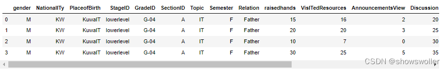
2:获取数据 并打印前四行
from matplotlib.font_manager import FontProperties
myfont=FontProperties(fname=r'C:\Windows\Fonts\SimHei.ttf',size=12)
sns.set(font=myfont.get_name())
df = pd.read_csv('.\data\StudentPerformance.csv')
df.head(4)
属性列表对应含义如下
Gender 性别
Nationality 国籍
PlaceofBirth 出生地
Stageid 学校级别
Gradeid 年级
Sectionid 班级
Topic 科目
semester 学期
ralation 孩子家庭教育负责人
raisedhands 学生上课举手的次数
announcementviews 学生浏览在线课件的次数
discussion 学生参与课堂讨论的次数
parentanswersurvey 家长是否填了学校的问卷
parentschoolsatisfaction 家长对于学校的满意度
studentabsencedays 学生缺勤天数
3:数据可视化分析
接下来线修改表列名 换成中文

df.rename(columns={'gender':'性别','NationalITy':'国籍','PlaceofBirth':'出生地',
'StageID':'学段','GradeID':'年级','SectionID':'班级','Topic':'科目',
'Semester':'学期','Relation':'监管人','raisedhands':'举手次数',
'VisITedResources':'浏览课件次数','AnnouncementsView':'浏览公告次数',
'Discussion':'讨论次数','ParentAnsweringSurvey':'父母问卷',
'ParentschoolSatisfaction':'家长满意度','StudentAbsenceDays':'缺勤次数',
'Class':'成绩'},inplace=True)
df.replace({'lowerlevel':'小学','MiddleSchool':'中学','HighSchool':'高中'},inplace=True)
df.columns
显示学期和学段的取值

然后修改数据

df.replace({'lowerlevel':'小学','MiddleSchool':'中学','HighSchool':'高中'},inplace=True)
df['性别'].replace({'M':'男','F':'女'},inplace=True)
df['学期'].replace({'S':'春季','F':'秋季'},inplace=True)
df.head(4)
查看空缺数据情况

df.isnull().sum()
查看数据统计情况

然后按成绩绘制计数柱状图

sns.countplot(x = '成绩', order = ['L', 'M', 'H'], data = df, linewidth=2,edgecolor=sns.color_palette("dark",4))
接着按性别绘制计数柱状图
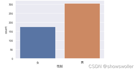
sns.countplot(x = '性别', order = ['女', '男'],data = df)
按科目绘制计数柱状图

sns.set_style('whitegrid')
sns.set(rc={'figure.figsize':(16,8)},font=myfont.get_name(),font_scale=1.5)
sns.countplot(x = '科目', data = df)
按科目绘制不同成绩的计数柱状图

按性别和成绩绘制计数柱状图

sns.countplot(x = '性别', hue = '成绩',data = df, order = ['女', '男'], hue_order = ['L', 'M', 'H'])
按班级查看成绩分布比例
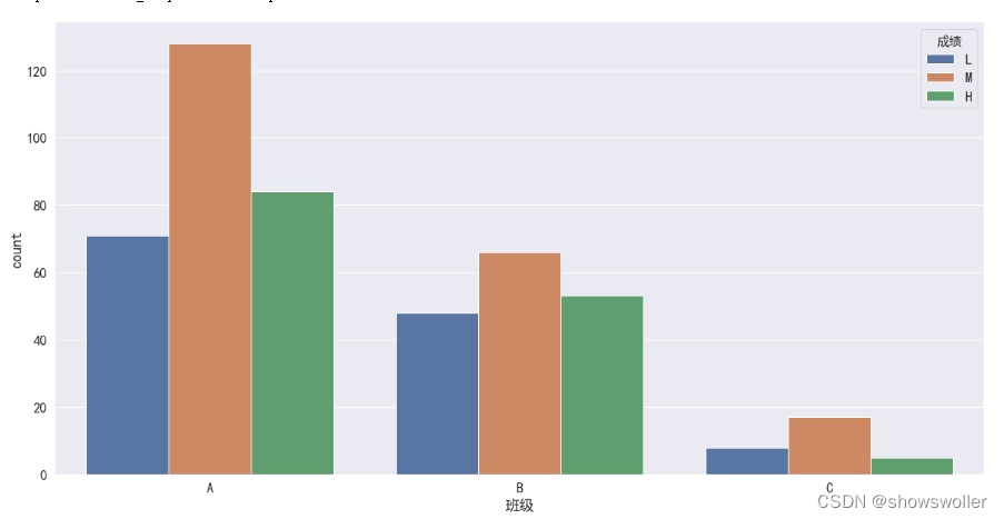
sns.countplot(x = '班级', hue='成绩', data=df, hue_order = ['L','M','H'])
# 从这里可以看出虽然每个班人数较少,但是没有那个班优秀的人数的比例比较突出,这个特征可以删除
分析4个表现和成绩的相关性

# 了解四个课堂和课后表现与成绩的相关性
fig, axes = plt.subplots(2,2,figsize=(14,10))
sns.barplot(x='成绩', y='浏览课件次数',data=df,order=['L','M','H'],ax=axes[0,0])
sns.barplot(x='成绩', y='浏览公告次数',data=df,order=['L','M','H'],ax=axes[0,1])
sns.barplot(x='成绩', y='举手次数',data=df,order=['L','M','H'],ax=axes[1,0])
sns.barplot(x='成绩', y='讨论次数',data=df,order=['L','M','H'],ax=axes[1,1])
# 在sns.barplot中,默认的计算方式为计算平均值
分析不同成绩学生的讨论情况

# 了解举手次数与成绩之间的相关性
sns.set(rc={'figure.figsize':(8,6)},font=myfont.get_name(),font_scale=1.5)
sns.boxplot(x='成绩',y='讨论次数',data=df,order=['L','M','H'])
分析举手次数和参加讨论次数的相关性

# 了解四个课堂后量化表现之间的相关性
# fig,axes = plt.subplots(2,1,figsize=(10,10))
sns.regplot(x='举手次数',y='讨论次数',order =4,data=df)
# sns.regplot(x='浏览公告次数',y='浏览课件次数',order=4,data=df,ax=axes[1]) ,ax=axes[0]
分析浏览课件次数 举手次数 浏览公告次数 讨论次数之间的相关性

# Correlation Matrix 相关性矩阵
corr = df[['浏览课件次数','举手次数','浏览公告次数','讨论次数']].corr()
corr
最后将相关矩阵用热力图可视化显示
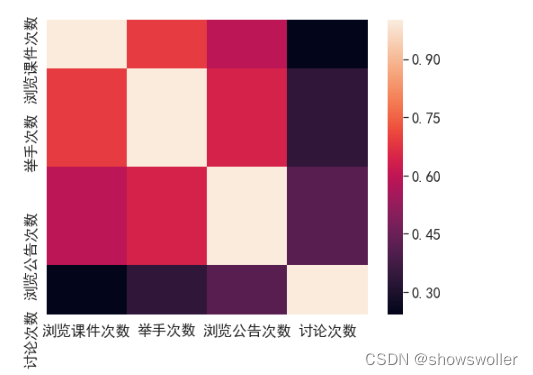
# Correlation Matrix Visualization 相关性可视化
sns.heatmap(corr,xticklabels=corr.columns,yticklabels=corr.columns)
创作不易 觉得有帮助请点赞关注收藏~~~
|