| css div中文字位置 | 您所在的位置:网站首页 › css文本位置 › css div中文字位置 |
css div中文字位置
|
作者:Yushia 链接:https://juejin.im/post/6894070137218203656 一、文本样式 1. 文字超出部分显示省略号 单行文本的溢出显示省略号(一定要有宽度) p{ width:200rpx; overflow: hidden; text-overflow:ellipsis; white-space: nowrap; } 多行文本溢出显示省略号 p { display: -webkit-box; -webkit-box-orient: vertical; -webkit-line-clamp: 3; overflow: hidden; } 2. 文字垂直居中 单行文字的垂直居中解决方案:line-height 方法 height 和 line-height 同样的高度 .box{ width:200px; height:100px; line-height:100px;} 多行文字的垂直居中解决方案:vertical-align 方法 .box{ width:500px; height:100px; vertical-align:middle; display:table-cell;} 3. 首行缩进"text-indent:2em;">这是一段内容文字,这是一段内容文字 4. 首字下沉 p:first-letter{ font-size:40px; float: left; color:red; } 5. 中英文自动换行 word-break:break-all;只对英文起作用,以字母作为换行依据word-wrap:break-word; 只对英文起作用,以单词作为换行依据white-space:pre-wrap; 只对中文起作用,强制换行white-space:nowrap; 强制不换行,都起作用 p{word-wrap: break-word;white-space: normal;word-break: break-all;} 6. 文字阴影text-shadow 为网页字体添加阴影,通过对text-shadow属性设置相关的属性值。 属性与值的说明如下:text-shadow: [X-offset,Y-offset,Blur,Color]; X-offset:指阴影居于字体水平偏移的位置。Y-offset:指阴影居于字体垂直偏移的位置。Blur:指阴影的模糊值。color:指阴影的颜色; h1{text-shadow: 5px 5px 5px #FF0000;} 7. 设置 input 中 placeholder 的字体样式 input::-webkit-input-placeholder { /* Chrome/Opera/Safari */ color: red;}input::-moz-placeholder { /* Firefox 19+ */ color: red;}input:-ms-input-placeholder { /* IE 10+ */ color: red;}input:-moz-placeholder { /* Firefox 18- */ color: red;} 二、布局样式 1. div 垂直居中 "box-wrap"> "box"> 固定高宽 div 垂直居中 .box{ position: absolute; top: 50%; left: 50%; background-color: red; width: 100px; height: 100px; margin: -50px 0 0 -50px; } 不固定高宽 div 垂直居中的方法 方法一:伪元素和 inline-block / vertical-align(兼容 IE8) .box-wrap:before { content: ''; display: inline-block; height: 100%; vertical-align: middle; margin-right: -0.25em; //微调整空格 }.box { display: inline-block; vertical-align: middle; } 方法二:flex(不兼容 ie8 以下) .box-wrap { height: 300px; justify-content:center; align-items:center; display:flex; background-color:#666; } 方法三:transform(不兼容 ie8 以下) .box-wrap { width:100%; height:300px; background:rgba(0,0,0,0.7); position:relative; }.box{ position:absolute; left:50%; top:50%; transform:translateX(-50%) translateY(-50%); -webkit-transform:translateX(-50%) translateY(-50%); } 方法四:设置 margin:auto(该方法得严格意义上的非固定宽高,而是 50%的父级的宽高。) .box-wrap { position: relative; width:100%; height:300px; background-color:#f00;}.box-content{ position: absolute; top:0; left:0; bottom:0; right:0; width:50%; height:50%; margin:auto; background-color:#ff0;} 2. 清除浮动 方法一:父级 div 定义 height原理:父级 div 手动定义 height,就解决了父级 div 无法自动获取到高度的问题。 优点:简单,代码少,容易掌握 缺点:只适合高度固定的布局,要给出精确的高度,如果高度和父级 div 不一样时,会产生问题 建议:不推荐使用,只建议高度固定的布局时使用 评分:★★☆☆☆ "div1"> "left">Left "right">Right "div2"> div2 方法二:结尾处加空 div 标签 clear:both原理:添加一个空 div,利用 css 提高的 clear:both 清除浮动,让父级 div 能自动获取到高度 优点:简单,代码少,浏览器支持好,不容易出现怪问题 缺点:不少初学者不理解原理;如果页面浮动布局多,就要增加很多空 div,让人感觉很不爽 建议:不推荐使用,但此方法是以前主要使用的一种清除浮动方法 评分:★★★☆☆ "div1 clearfloat"> "left">Left "right">Right "div2"> div2 方法三:父级 div 定义 overflow:hidden原理:必须定义 width 或 zoom:1,同时不能定义 height,使用 overflow:hidden 时,浏览器会自动检查浮动区域的高度 优点:简单,代码少,浏览器支持好 缺点:不能和 position 配合使用,因为超出的尺寸的会被隐藏。 建议:只推荐没有使用 position 或对 overflow:hidden 理解比较深的朋友使用。 评分:★★★☆☆ "div1"> "left">Left "right">Right "div2"> div2 三、CSS 常见问题 1. IOS 页面滑动卡顿 body,html{ -webkit-overflow-scrolling: touch;} 2. css 滚动条仿 ios ::-webkit-scrollbar{ width: 5px; height: 5px; }::-webkit-scrollbar-thumb{ border-radius: 1em; background-color: rgba(50,50,50,.3); }::-webkit-scrollbar-track{ border-radius: 1em; background-color: rgba(50,50,50,.1); } 3. 实现隐藏滚动条同时又可以滚动 .demo::-webkit-scrollbar { display: none; /* Chrome Safari */}.demo { scrollbar-width: none; /* firefox */ -ms-overflow-style: none; /* IE 10+ */ overflow-x: hidden; overflow-y: auto;} 4. CSS 绘制三角形 实现一个简单的三角形 div { width: 0; height: 0; border-width: 0 40px 40px; border-style: solid; border-color: transparent transparent red;}效果如下: 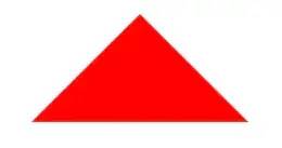 实现带边框的三角形
"blue">
#blue { position:relative; width: 0; height: 0; border-width: 0 40px 40px; border-style: solid; border-color: transparent transparent blue;}#blue:after { content: ""; position: absolute; top: 1px; left: -38px; border-width: 0 38px 38px; border-style: solid; border-color: transparent transparent yellow;}
实现带边框的三角形
"blue">
#blue { position:relative; width: 0; height: 0; border-width: 0 40px 40px; border-style: solid; border-color: transparent transparent blue;}#blue:after { content: ""; position: absolute; top: 1px; left: -38px; border-width: 0 38px 38px; border-style: solid; border-color: transparent transparent yellow;}
效果如下: 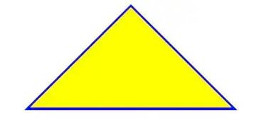
注: 如果想绘制右直角三角,则将左 border 设置为 0;如果想绘制左直角三角,将右 border 设置为 0 即可(其它情况同理)。 5. 表格边框合并 table,tr,td{ border: 1px solid #666;}table{ border-collapse: collapse;} 6. CSS 选取第 n 个标签元素first-child first-child 表示选择列表中的第一个标签。 last-child last-child 表示选择列表中的最后一个标签 nth-child(3) 表示选择列表中的第 3 个标签 nth-child(2n) 这个表示选择列表中的偶数标签 nth-child(2n-1) 这个表示选择列表中的奇数标签 nth-child(n+3) 这个表示选择列表中的标签从第 3 个开始到最后。 nth-child(-n+3) 这个表示选择列表中的标签从 0 到 3,即小于 3 的标签。 nth-last-child(3) 这个表示选择列表中的倒数第 3 个标签。 使用方法: li:first-child{} 7. onerror 处理图片异常使用 onerror 异常处理时,若 onerror 的图片也出现问题,则图片显示会陷入死循环,所以要在赋值异常图片之后,将地址置空 "this.src='url;this.onerror=null'" /> 8. 移动端软键盘变为搜索方式默认情况下软键盘上该键位为前往或者确认等文字,要使其变为搜索文字,需要在 input 上加上 type 声明: "#">type="search" placeholder="请输入..." name="search" />需要一个 form 标签套起来,并且设置 action 属性,这样写完之后输入法的右下角就会自动变成搜索 
同时,使用了 search 类型后,搜索框上会默认自带删除按钮 
如需屏蔽,可以使用如下方式: input[type="search"]::-webkit-search-cancel-button{ -webkit-appearance: none; } ❤️爱心三连击1.看到这里了就点个在看支持下吧,你的「在看」是我创作的动力。 2.关注公众号猴哥说前端,「一起玩转前端」! 3.关注公众号回复【加群】,拉你进技术交流群一起玩转前端。  “在看转发”是最大的支持 “在看转发”是最大的支持
|
【本文地址】