| R语言基础图形绘制 | 您所在的位置:网站首页 › R语言作图类型 › R语言基础图形绘制 |
R语言基础图形绘制
|
折线图
简介1. 基础函数2. ggplot()函数3. 实践参考书籍
简介
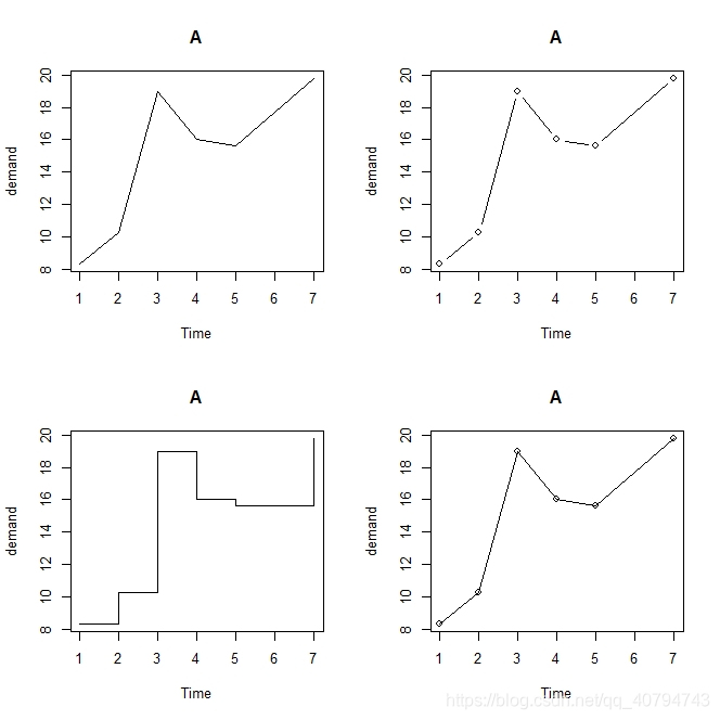
折线图通常用来对两个连续变量之间的相互依存关系进行可视化。x轴可以是连续型变量,也可以是离散型变量。生物学中,通常用来表示不同药物剂量下实验对象的变化,或者是基因在不同类型组织或细胞中的表达模式。 1. 基础函数简单示例:使用plot()函数,改变参数type,更多类型请查看帮助文档。 # 查看作图数据 BOD # Time demand # 1 1 8.3 # 2 2 10.3 # 3 3 19.0 # 4 4 16.0 # 5 5 15.6 # 6 7 19.8 op % { plot(demand ~ Time,data = .,type = "l",main = "A") plot(demand ~ Time,data = .,type = "b",main = "A") plot(demand ~ Time,data = .,type = "s",main = "A") plot(demand ~ Time,data = .,type = "o",main = "A") } par(op)
不加任何参数绘制简单折线图。 library(ggplot2) BOD %>% { ggplot(.,aes(Time,demand))+geom_line() }
|
 目前,基础函数绘制多个分组折线图,需要借助lines()函数。
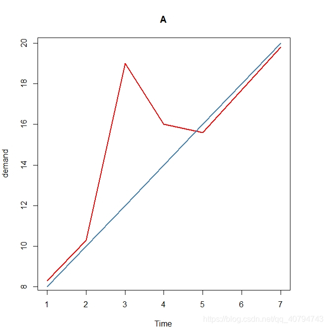 多个分组时,可以借助for循环实现。
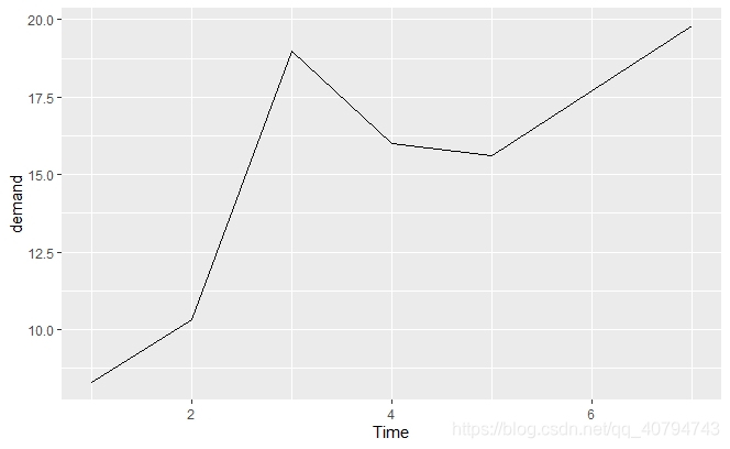
【本文地址】
公司简介
联系我们