| 制作好看又非常简单CSS样式的颜色块 | 您所在的位置:网站首页 › 色块设怎么画 › 制作好看又非常简单CSS样式的颜色块 |
制作好看又非常简单CSS样式的颜色块
|
首先,在html建立一个div块 html文件如下 我现在想要的是一个高80px,宽80px,背景色是绿色(#33cd5f)的颜色块,于是 CSS文件内容如下 .color-lump{ width: 80px; height: 80px; background-color: #33cd5f; }效果图:
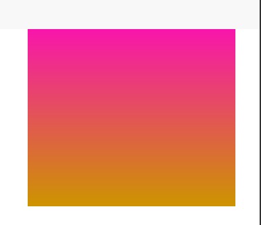
那现在,我改变主意了 我要一个高300px,宽300px,同时距离左边有40px,juli颜色块是从粉色(#ff00ca)到棕黄色(ccd9400)的渐变 CSS文件内容如下: .color-lump{ width: 300px; height: 300px; margin-top:80px; margin-left: 40px; background: -webkit-gradient(linear,left top,left bottom,from(#ff00ca),to(#cd9400)); }
我看了看,觉得这个色块不够好看 于是我让它的边缘稍微有点弧度,就弄个20px
还是觉得不够好看,于是给它加了10px的蓝色边框 .color-lump{ margin-top: 60px; width: 300px; height: 300px; margin-left: 40px; border: 10px solid rgb(0,162, 233); border-radius: 20px; background: -webkit-gradient(linear,left top,left bottom,from(#ff00ca),to(#cd9400)); }效果如下:
在这个学习中,我发现了,当边框宽度越来越大,内部的弧度将会越来越小,最后成为一个正方形,这里我给定的边框宽度是30px .color-lump{ margin-top: 60px; width: 300px; height: 300px; margin-left: 40px; border: 30px solid rgb(0,162, 233); border-radius: 20px; background: -webkit-gradient(linear,left top,left bottom,from(#ff00ca),to(#cd9400)); }效果如下:
|


【本文地址】
公司简介
联系我们