| vue自定义弹出询问框、输入框、提示框(附源码及演示视频) | 您所在的位置:网站首页 › 点击input框弹出一个选择层 › vue自定义弹出询问框、输入框、提示框(附源码及演示视频) |
vue自定义弹出询问框、输入框、提示框(附源码及演示视频)
|
涉及技术点
遮罩层样式,自定义组件,子组件套用组件,子组件调用父组件方法,组件属性监听,输入框默认获得焦点,输入框数据双向绑定 效果图询问框: 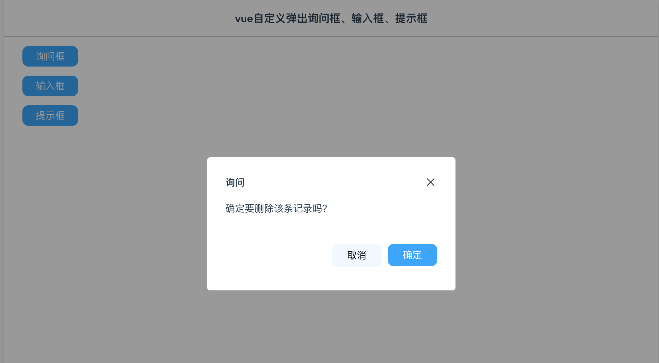
输入框: 
提示框 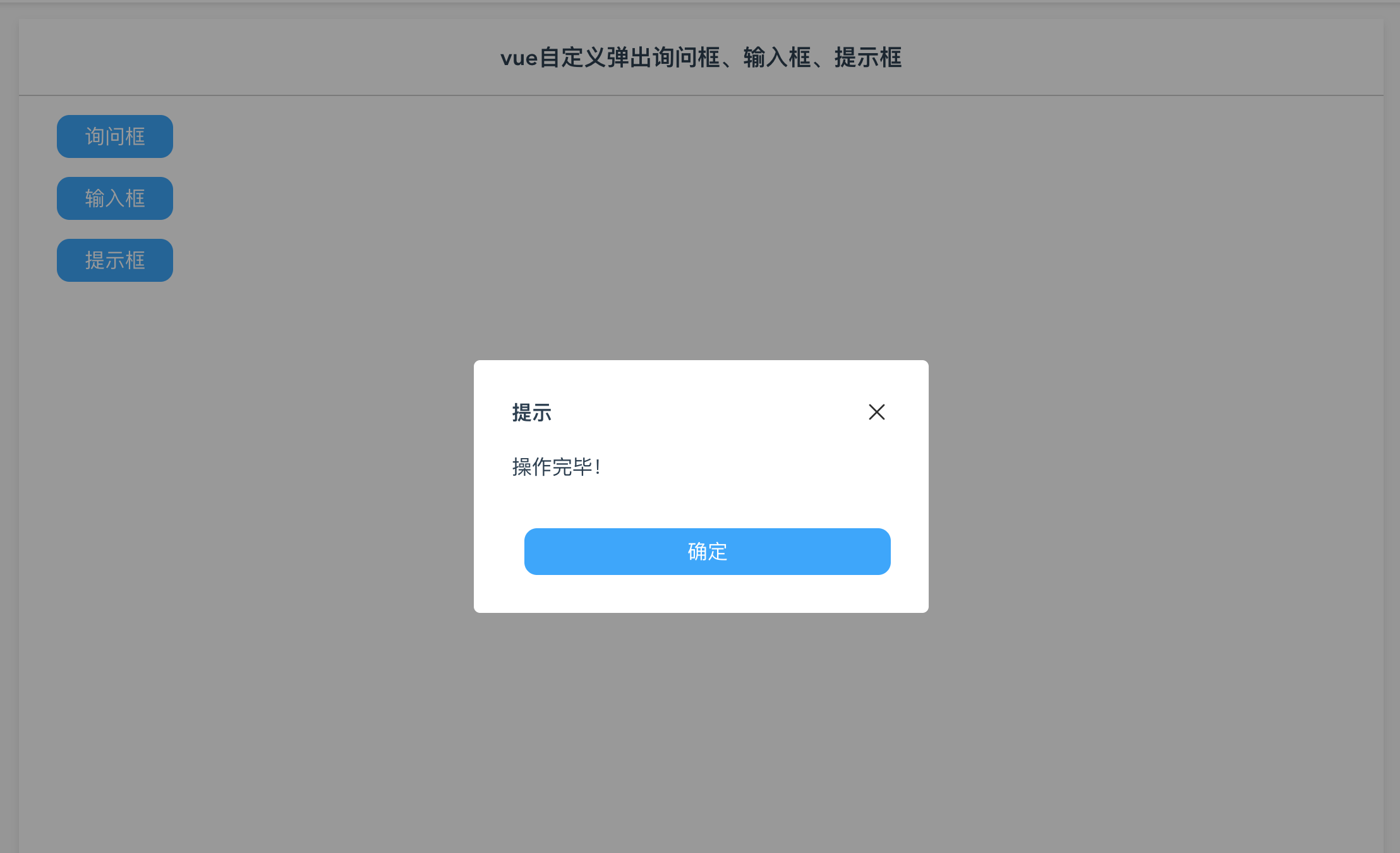 询问框组件代码
{{caption}}
询问框组件代码
{{caption}}
 {{msg}}
取消
确定
export default {
name: 'MsgBox',//组件递归必须有name属性 不然无法递归
props: {
caption:{},
show: {},
msg:{},
},
data() {
return {
}
},
methods: {
close() {
this.$emit('close');
},
confirmClick() {
this.$emit('confirm');
},
cancelClick() {
this.$emit('cancel');
}
}
}
.dlg-msg-box {
border-radius: 5px;
width: 350px;
height: 160px;
background-color: #fff;
padding: 30px;
position: absolute;
top: 0;
bottom: 0;
left: 0;
right: 0;
margin: auto;
}
输入框组件代码
{{caption}}
取消
确定
import MsgShow from '@/components/MsgShow'
export default {
name: 'InputBox',//组件递归必须有name属性 不然无法递归
props: {
caption:{},
value:{},
show: {},
},
components: {
MsgShow
},
watch: {
show(val){
if (val == true) {
this.$nextTick(() => {
this.$refs.getfocus.focus();
})
}
},
value(val){
this.inputValue = val;
}
},
data() {
return {
showMessage:false,
inputValue:'',
msgText:''
}
},
methods: {
close() {
this.$emit('close');
},
confirmClick() {
if (this.inputValue == "") {
this.msgText = "内容未填写";
this.showMessage = true;
} else {
this.$emit('confirm', this.inputValue);
}
},
cancelClick() {
this.$emit('cancel');
}
}
}
.dlg-input-box {
border-radius: 5px;
width: 350px;
height: 160px;
background-color: #fff;
padding: 30px;
position: absolute;
top: 0;
bottom: 0;
left: 0;
right: 0;
margin: auto;
}
提示框组件代码
{{caption}}
{{msg}}
确定
export default {
name: 'MsgShow',//组件递归必须有name属性 不然无法递归
props: {
caption:{},
show: {},
msg:{},
},
data() {
return {
}
},
methods: {
close() {
this.$emit('close');
},
confirmClick() {
this.$emit('close');
}
}
}
.dlg-show {
border-radius: 5px;
width: 300px;
height: 140px;
background-color: #fff;
padding: 30px;
position: absolute;
top: 0;
bottom: 0;
left: 0;
right: 0;
margin: auto;
}
父组件代码
vue自定义弹出询问框、输入框、提示框
询问框
输入框
提示框
/*
名称:vue自定义弹出询问框、输入框、提示框
功能:自定义属于自己的弹出窗,涉及到技术点:遮罩层样式,自定义组件,子组件套用组件,子组件调用父组件方法,组件属性监听,输入框默认获得焦点,输入框数据双向绑定
作者:唐赢
时间:2023-1-17
*/
import InputBox from '@/components/InputBox'
import MsgBox from '@/components/MsgBox'
import MsgShow from '@/components/MsgShow'
export default {
name: 'Main',
components: {
InputBox,MsgBox,MsgShow
},
data () {
return {
inputValue:'',
caption: '',
msgText: '',
showMsgBox : false,
showMsgShow: false,
showInput: false,
}
},
methods: {
MsgBoxClick() {
this.caption = "询问";
this.msgText = "确定要删除该条记录吗?"
this.showMsgBox = true;
},
InputBoxClick() {
this.caption = "请输入";
this.inputValue = "工作";
this.showInput = true;
},
MsgShowClick() {
this.caption = "提示";
this.msgText = "操作完毕!";
this.showMsgShow = true;
},
MsgBoxYes(){
this.showMsgBox = false;
this.caption = "提示";
this.msgText = "您选择了确定操作";
this.showMsgShow = true;
},
inputBoxYes(value){
console.log(value);
this.showInput = false;
this.caption = "提示";
this.msgText = "您输入的值是【" + value + "】";
this.showMsgShow = true;
}
},
}
.body {
display: flex;
justify-content: center;
margin-top: 73px;
width: 100%;
}
.table {
background-color: #fff;
width: 1080px;
min-height: 800px;
box-shadow: 0px 3px 6px rgba(0, 0, 0, .1);
margin-bottom: 10px;
}
.filter {
display: flex;
height: 60px;
align-items:center;
background-color: #fff;
font-size: 18px;
justify-content: center;
border-bottom: 1px solid rgba(0, 0, 0, .2);;
}
下载及演示
{{msg}}
取消
确定
export default {
name: 'MsgBox',//组件递归必须有name属性 不然无法递归
props: {
caption:{},
show: {},
msg:{},
},
data() {
return {
}
},
methods: {
close() {
this.$emit('close');
},
confirmClick() {
this.$emit('confirm');
},
cancelClick() {
this.$emit('cancel');
}
}
}
.dlg-msg-box {
border-radius: 5px;
width: 350px;
height: 160px;
background-color: #fff;
padding: 30px;
position: absolute;
top: 0;
bottom: 0;
left: 0;
right: 0;
margin: auto;
}
输入框组件代码
{{caption}}
取消
确定
import MsgShow from '@/components/MsgShow'
export default {
name: 'InputBox',//组件递归必须有name属性 不然无法递归
props: {
caption:{},
value:{},
show: {},
},
components: {
MsgShow
},
watch: {
show(val){
if (val == true) {
this.$nextTick(() => {
this.$refs.getfocus.focus();
})
}
},
value(val){
this.inputValue = val;
}
},
data() {
return {
showMessage:false,
inputValue:'',
msgText:''
}
},
methods: {
close() {
this.$emit('close');
},
confirmClick() {
if (this.inputValue == "") {
this.msgText = "内容未填写";
this.showMessage = true;
} else {
this.$emit('confirm', this.inputValue);
}
},
cancelClick() {
this.$emit('cancel');
}
}
}
.dlg-input-box {
border-radius: 5px;
width: 350px;
height: 160px;
background-color: #fff;
padding: 30px;
position: absolute;
top: 0;
bottom: 0;
left: 0;
right: 0;
margin: auto;
}
提示框组件代码
{{caption}}
{{msg}}
确定
export default {
name: 'MsgShow',//组件递归必须有name属性 不然无法递归
props: {
caption:{},
show: {},
msg:{},
},
data() {
return {
}
},
methods: {
close() {
this.$emit('close');
},
confirmClick() {
this.$emit('close');
}
}
}
.dlg-show {
border-radius: 5px;
width: 300px;
height: 140px;
background-color: #fff;
padding: 30px;
position: absolute;
top: 0;
bottom: 0;
left: 0;
right: 0;
margin: auto;
}
父组件代码
vue自定义弹出询问框、输入框、提示框
询问框
输入框
提示框
/*
名称:vue自定义弹出询问框、输入框、提示框
功能:自定义属于自己的弹出窗,涉及到技术点:遮罩层样式,自定义组件,子组件套用组件,子组件调用父组件方法,组件属性监听,输入框默认获得焦点,输入框数据双向绑定
作者:唐赢
时间:2023-1-17
*/
import InputBox from '@/components/InputBox'
import MsgBox from '@/components/MsgBox'
import MsgShow from '@/components/MsgShow'
export default {
name: 'Main',
components: {
InputBox,MsgBox,MsgShow
},
data () {
return {
inputValue:'',
caption: '',
msgText: '',
showMsgBox : false,
showMsgShow: false,
showInput: false,
}
},
methods: {
MsgBoxClick() {
this.caption = "询问";
this.msgText = "确定要删除该条记录吗?"
this.showMsgBox = true;
},
InputBoxClick() {
this.caption = "请输入";
this.inputValue = "工作";
this.showInput = true;
},
MsgShowClick() {
this.caption = "提示";
this.msgText = "操作完毕!";
this.showMsgShow = true;
},
MsgBoxYes(){
this.showMsgBox = false;
this.caption = "提示";
this.msgText = "您选择了确定操作";
this.showMsgShow = true;
},
inputBoxYes(value){
console.log(value);
this.showInput = false;
this.caption = "提示";
this.msgText = "您输入的值是【" + value + "】";
this.showMsgShow = true;
}
},
}
.body {
display: flex;
justify-content: center;
margin-top: 73px;
width: 100%;
}
.table {
background-color: #fff;
width: 1080px;
min-height: 800px;
box-shadow: 0px 3px 6px rgba(0, 0, 0, .1);
margin-bottom: 10px;
}
.filter {
display: flex;
height: 60px;
align-items:center;
background-color: #fff;
font-size: 18px;
justify-content: center;
border-bottom: 1px solid rgba(0, 0, 0, .2);;
}
下载及演示
操作演示地址:https://lusun.com/v/Szth3xngrsH 源码地址:https://download.csdn.net/download/gdgztt/87389680 |
【本文地址】
公司简介
联系我们