|
clip-path
clip-path是什么
clip-path 是一个CSS属性,允许开发者创建一个剪切区域,从而决定元素的哪些部分可见,哪些部分会被隐藏。通过定义这个剪切路径(clipping path),您可以创造出非矩形的裁剪形状,使元素内容按特定的几何形状展示。
clip-path 的工作原理
clip-path 属性通过定义裁剪路径来确定元素的可视区域。这意味着,你可以指定一个形状或路径,只有位于这个形状或路径内的部分才会被显示出来,其余部分则会被裁剪掉。这种裁剪可以是简单的几何形状,如圆形、椭圆形或多边形,也可以是复杂的 SVG 路径。
裁切示例
DOCTYPE html>
Document
.box {
width: 200px;
height: 200px;
text-align: center;
background-color: #888;
}
img {
width: 200px;
}
.item {
margin-right: 10px;
}
.text {
font-size: 14px;
color: #666;
}
.clip-path1 {
clip-path: inset(20px);
}
.clip-path2 {
clip-path: inset(0rem 0rem 0rem 1rem);
}
.clip-path3 {
clip-path: inset(0% 50px 0% 50px round 50%);
}
.clip-path4 {
clip-path: inset(1rem 0rem 0rem 1rem round 0rem 2rem 5rem 0rem);
}
.flex {
display: flex;
}
.hide {
display: none;
}
.circle1 {
clip-path: circle(50% at 50% 50%);
}
.circle2 {
clip-path: circle(20% at 50% 50%);
}
.circle3 {
clip-path: circle(50% at 0% 0%);
}
.element:hover {
clip-path: circle(75% at 50% 50%);
transition: clip-path 0.5s ease;
opacity: 0.7; /* 当鼠标悬停时,图片透明度变为0.7 */
transform: scale(1.1); /* 或放大图片 */
cursor: pointer; /* 改变鼠标指针样式为手型 */
}
.ellipse1 {
clip-path: ellipse(20% 50% at 50% 50%);
}
.polygon1 {
clip-path: polygon(0 0, 50% 20%, 100% 0, 100% 100%, 0 100%);
}
.shape {
width: 200px;
height: 200px;
background-color: red;
/* transition: clip-path 1s ease-in-out; */
}
.shape:hover {
/* clip-path: circle(50% at 50% 50%); */
}
/* 动画实现从方形到圆形的变化 */
@keyframes shape-transform {
0% {
clip-path: polygon(0 0, 100% 0, 100% 100%, 0 100%);
}
100% {
clip-path: circle(50% at 50% 50%);
}
}
/* 如果你想在悬停时使用动画而不是直接转换,取消上面:hover的直接样式,改为下面这一行 */
.shape:hover { animation: shape-transform 1s forwards; }
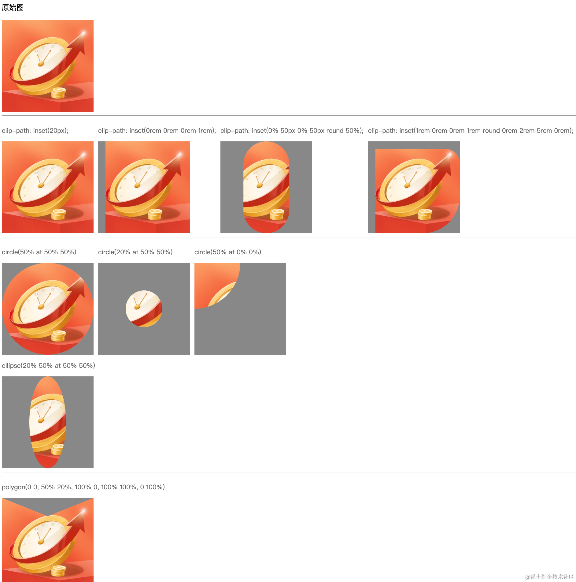
原始图
clip-path: inset(20px);
clip-path: inset(0rem 0rem 0rem 1rem);
clip-path: inset(0% 50px 0% 50px round 50%);
clip-path: inset(1rem 0rem 0rem 1rem round 0rem 2rem 5rem 0rem);
circle(50% at 50% 50%)
circle(20% at 50% 50%)
circle(50% at 0% 0%)
ellipse(20% 50% at 50% 50%)
polygon(0 0, 50% 20%, 100% 0, 100% 100%, 0 100%)
支持的基本形状
内嵌 (inset)
这创建了一个内嵌的剪裁区域,其中的四个值分别对应上、右、下、左的剪裁量。
参数:
inset( top right bottom left round )
例如参数最多的设置写法:
.clip-path4 {
clip-path: inset(1rem 0rem 0rem 1rem round 0rem 2rem 5rem 0rem);
}
圆形 (circle)
这将创建一个圆形剪裁区域,其中50%是圆的半径,at 50% 50%指定了圆心的位置(相对于元素的宽高)。
参数:clip-path: circle(radius at x-axis y-axis);
第一个参数是必需的,表示圆形裁剪区域的半径。
第二个参数是可选的,用于指定圆形裁剪区域的圆心位置。如果省略这个参数,默认圆心位于元素的中心
.circle2 {
clip-path: circle(20% at 50% 50%);
}
椭圆 (ellipse)
这里创建了一个椭圆形剪裁区域,其中第一个值和第二个值分别是椭圆的水平半径和垂直半径,at 50% 50%指定了椭圆中心的位置。
参数:clip-path: ellipse(rx ry at x-axis y-axis);
第一个和第二个参数是必需的,分别表示椭圆的水平半径(X轴半径)和垂直半径(Y轴半径)。
.ellipse1 {
clip-path: ellipse(20% 50% at 50% 50%);
}
多边形 (polygon)
函数用于创建一个任意多边形裁剪区域,它接受一系列坐标对作为参数,每个坐标对代表多边形的一个顶点。
参数:clip-path: polygon(x1 y1, x2 y2, ..., xn yn);
.polygon1 {
clip-path: polygon(0 0, 50% 20%, 100% 0, 100% 100%, 0 100%);
}
实践示例
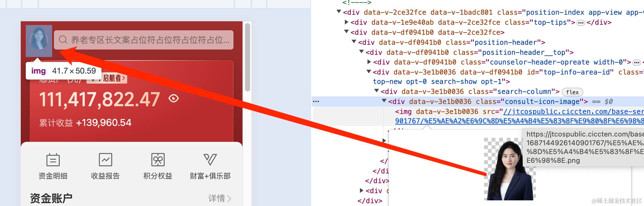
投顾的图片很大(为什么投顾头像很大,有其他展示需求,想复用同一个图片),但是仅需要裁切展示上半部分。,塞进背景后面的小黄圈里面。做法是使用clip-path属性来裁切图片,仅展示想要展示的那部分。简略代码如下:
![]() .consult-icon-image {
position: relative;
top: 2px;
display: inline-block;
width: 60px !important;
height: 60px !important;
border-radius: 50%;
-webkit-backface-visibility: hidden;
-webkit-transform: translate3d(0, 0, 0);
background: linear-gradient(137.97deg, #fff3ea 0%, #f5b39b 120.86%);
border: 2px solid #f9e2c7;
box-sizing: border-box;
vertical-align: top;
img {
// 需要放大投顾头像
clip-path: inset(0 0.6rem 1.3rem 0.6rem round 100% 100% 90% 90%);
position: absolute;
width: 150%;
top: -34%;
left: 50%;
transform: rotateY(-180deg) translateX(50%);
}
}
优势与局限性
设计自由度:极大地提高了网页设计的灵活性,摆脱了传统的矩形框架约束。性能优化:相比于直接使用图片遮罩,clip-path 的渲染效率更高,减轻服务器负担,提高页面加载速度。响应式设计:结合CSS媒体查询,可以轻松实现不同屏幕尺寸下的响应式裁剪效果。复用性与易维护性:尤其是当配合SVG路径引用时,裁剪路径可以独立管理,便于复用和修改。
.consult-icon-image {
position: relative;
top: 2px;
display: inline-block;
width: 60px !important;
height: 60px !important;
border-radius: 50%;
-webkit-backface-visibility: hidden;
-webkit-transform: translate3d(0, 0, 0);
background: linear-gradient(137.97deg, #fff3ea 0%, #f5b39b 120.86%);
border: 2px solid #f9e2c7;
box-sizing: border-box;
vertical-align: top;
img {
// 需要放大投顾头像
clip-path: inset(0 0.6rem 1.3rem 0.6rem round 100% 100% 90% 90%);
position: absolute;
width: 150%;
top: -34%;
left: 50%;
transform: rotateY(-180deg) translateX(50%);
}
}
优势与局限性
设计自由度:极大地提高了网页设计的灵活性,摆脱了传统的矩形框架约束。性能优化:相比于直接使用图片遮罩,clip-path 的渲染效率更高,减轻服务器负担,提高页面加载速度。响应式设计:结合CSS媒体查询,可以轻松实现不同屏幕尺寸下的响应式裁剪效果。复用性与易维护性:尤其是当配合SVG路径引用时,裁剪路径可以独立管理,便于复用和修改。
|