| matlab使用教程(88) | 您所在的位置:网站首页 › 四维立方体 › matlab使用教程(88) |
matlab使用教程(88)
|
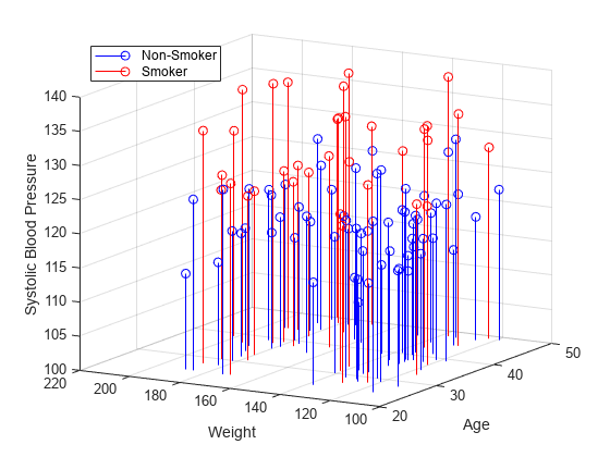
以下示例演示在 MATLAB® 中以可视方式呈现四维 (4-D) 数据的几种方法。 1.以可视化形式呈现具有离散变量的四维数据有时数据含有一个离散变量,即该变量仅有几个可能的值。您可以对每个离散组中的数据创建多个具有相同类型的绘图。例如,使用 stem3 函数查看三个变量之间的关系,第四个变量则将总体数据划分为若干个离散组。 load patients Smoker Age Weight Systolic % load data nsIdx = Smoker == 0; smIdx = Smoker == 1; figure stem3(Age(nsIdx), Weight(nsIdx), Systolic(nsIdx), 'Color', 'b') % stem plot for non-smokers hold on stem3(Age(smIdx), Weight(smIdx), Systolic(smIdx), 'Color', 'r') % stem plot for smokers hold off view(-60,15) zlim([100 140]) xlabel('Age') % add labels and a legend ylabel('Weight') zlabel('Systolic Blood Pressure') legend('Non-Smoker', 'Smoker', 'Location', 'NorthWest')
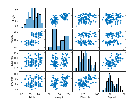
有了大型数据集,您可能想要查看各个变量是否相互关联。您可以使用 plotmatrix 函数创建绘图的 n x n 矩阵,以查看变量之间的成对关系。plotmatrix 函数返回两个输出。第一个输出是散点图中使用的线条对象的矩阵。第二个输出是所创建的坐标区对象的矩阵。 plotmatrix 函数还可用于更高阶数据集。 load patients Height Weight Diastolic Systolic % load data labels = {'Height' 'Weight' 'Diastolic' 'Systolic'}; data = [Height Weight Systolic Diastolic]; [h,ax] = plotmatrix(data); % create a 4 x 4 matrix of plots for i = 1:4 % label the plots xlabel(ax(4,i), labels{i}) ylabel(ax(i,1), labels{i}) end
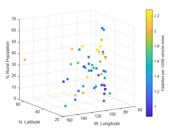
对于许多类型的四维数据,您可以使用颜色来表示第四维度。如果您有一个三变量函数,这通常会很有效。 例如,将美国高速公路死亡数据表示为经度、纬度以及位置是在农村还是城市的函数。绘图中的 x、y 和 z 值表示这三个变量。颜色表示高速公路死亡人数。 cla load accidents hwydata % load data long = -hwydata(:,2); % longitude data lat = hwydata(:,3); % latitude data rural = 100 - hwydata(:,17); % percent rural data fatalities = hwydata(:,11); % fatalities data scatter3(long,lat,rural,40,fatalities,'filled') % draw the scatter plot ax = gca; ax.XDir = 'reverse'; view(-31,14) xlabel('W. Longitude') ylabel('N. Latitude') zlabel('% Rural Population') cb = colorbar; % create and label the colorbar cb.Label.String = 'Fatalities per 100M vehicle-miles';
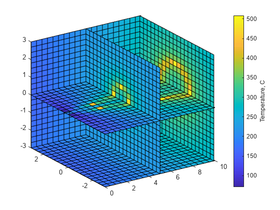
您的数据可能包含测量物理对象所得的值,如管道内的温度。在此情况下,物理维度可以表示为一个空间体,用颜色表示测量的幅值。例如,使用 slice 函数显示在空间体横截面处所测得的变量的值。 load fluidtemp x y z temp % load data xslice = [5 9.9]; % define the cross sections to view yslice = 3; zslice = ([-3 0]); slice(x, y, z, temp, xslice, yslice, zslice) % display the slices ylim([-3 3]) view(-34,24) cb = colorbar; % create and label the colorbar cb.Label.String = 'Temperature, C';
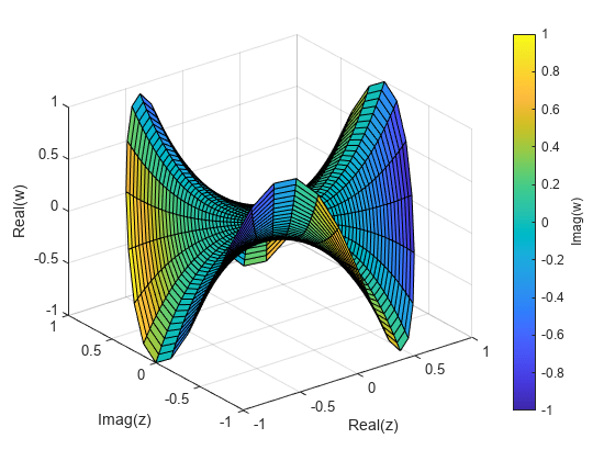
复函数的输入和输出都含有实部和虚部。您可以使用带有颜色的三维绘图表示复函数。在此情况下,x 和 y 轴表示输入的实部和虚部。z 轴表示输出的实部,颜色表示输出的虚部。 r = (0:0.025:1)'; % create a matrix of complex inputs theta = pi*(-1:0.05:1); z = r*exp(1i*theta); w = z.^3; % calculate the complex outputs surf(real(z),imag(z),real(w),imag(w)) % visualize the complex function using surf xlabel('Real(z)') ylabel('Imag(z)') zlabel('Real(w)') cb = colorbar; cb.Label.String = 'Imag(w)';
|
【本文地址】
公司简介
联系我们