| Seaborn | 您所在的位置:网站首页 › 十二色调色盘 › Seaborn |
Seaborn
|
Catalogue
1. 写在前面2. seaborn风格设置2.1. 导入模块2.2. set2.3. set_style2.4. despine2.5. axes_style2.6. set_context3. 调色盘3.1. color_palette3.2. husl_palette3.3. cubehelix_palette3.4. dark_palette / light_palette3.5. diverging_palette3.6. 应用3.6.1. 热力图3.6.2. 风格演示4. 总结
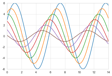
摘要 Seaborn库的使用,包括一些基础风格的参数设置,以及调色盘(各色系的设置)~ 写在前面Matplotlib试着让简单的事情更加简单,困难的事情变得可能,而Seaborn就是让困难的东西更加简单。 实际上,Seaborn 是在matplotlib的基础上进行了更高级的 API 封装,从而使得作图更加容易 用Matplotlib最大的困难是其默认的各种参数,而Seaborn则完全避免了这一问题。 seaborn是针对统计绘图的,一般来说,seaborn能满足数据分析大部分的基本绘图需求,就能做出很具有吸引力的图,如果需要复杂的自定义图形,还是要Matplotlib。 官网:http://seaborn.pydata.org/index.html 安装:直接 pip3 install seaborn 即可 seaborn风格设置Seaborn模块自带许多定制的主题和高级的接口,包括对图表整体颜色、比例等进行风格设置,包括颜色色板等,调用其系统风格即可实现各种不同风格的数据可视化 导入模块本文基于jupyter notebook环境,先导入使用到的python模块,并创建一个正弦函数及绘制图表 12345import pandas as pdimport numpy as npimport matplotlib.pyplot as pltimport seaborn as sns%matplotlib inline 1234567# 创建正弦函数及图表def sinplot(flip = 1): x = np.linspace(0,14,100) for i in range(1,7): plt.plot(x,np.sin(x + i * .5) * (7 - i) * flip)sinplot()
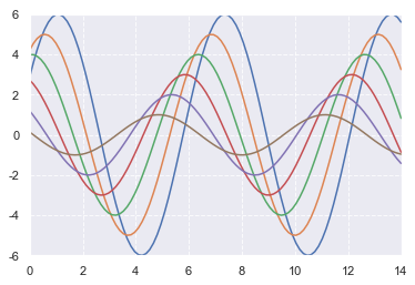
set( ) :通过设置参数可以用来设置背景,调色板等,最为常用。 123456# tips:在jupyter notebook中,一旦设定了风格,所有图表的创建均自动带有风格,重启服务后才会重置为无风格状态# 使用默认设置sns.set()sinplot()plt.grid(linestyle = '--')
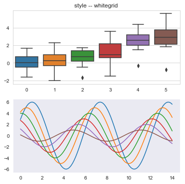
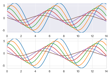
set_style() :设置主题,即切换seaborn图表风格 Seaborn有五个预设好的主题: darkgrid , whitegrid , dark , white ,和 ticks 默认: darkgrid 12345678910111213141516fig = plt.figure(figsize = (6,6))# whitegrid主题sns.set_style('whitegrid')ax1 = fig.add_subplot(2,1,1)data = np.random.normal(size = (20,6)) + np.arange(6) / 2sns.boxplot(data = data)plt.title('style -- whitegrid')# dark主题sns.set_style('dark')ax2 = fig.add_subplot(2,1,2)sinplot()
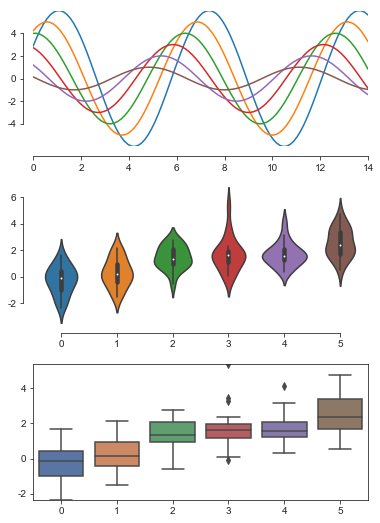
despine() :设置图表坐标轴,可以根据需求将坐标轴的展现与否进行设置,更好的讲故事~ 12345678910111213141516171819202122232425262728293031# despine() -- 设置图表坐标轴# sns.despine('fig=None', 'ax=None', 'top=True', 'right=True', 'left=False', 'bottom=False', 'offset=None', 'trim=False')sns.set_style('ticks')fig = plt.figure(figsize = (6,9))plt.subplots_adjust(hspace=0.3)ax1 = fig.add_subplot(3,1,1)sinplot()# 删除上、右坐标轴sns.despine()# 创建小提琴图ax2 = fig.add_subplot(3,1,2)sns.violinplot(data = data)# sns.despine(offset = 10,trim = True)# offset: 与坐标轴之间的偏移# trim:为True时,将坐标轴限制在数据最大值最小值ax3 = fig.add_subplot(3,1,3)sns.boxplot(data = data,palette='deep')# sns.despine(left = True,right = False)# top,right,left,bottom: 布尔型,为True时不显示 1
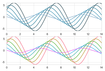
axes_style() :设置局部图表风格,配合with使用可以很方便的将想要表达的图表更加凸显出来 1234567891011121314# with:只在sns这个图表中设置风格,其他图表风格还是与之前设置的一致# 设置局部图表风格,用with做代码块区分with sns.axes_style('darkgrid'): plt.subplot(211) sinplot()# 设置外部表格风格sns.set_style('whitegrid')plt.subplot(212)sinplot()
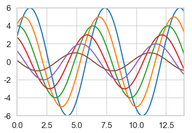
set_context() :设置显示的比例尺度,方便在不用显示器或不同分辨率下设置不同的显示比例 seaborn内置四种显示比例:‘paper’ ‘notebook’ ‘talk’ ‘poster’,左往右依次 变大 1234# 默认为notebooksns.set_context('talk')sinplot()
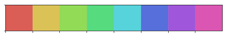
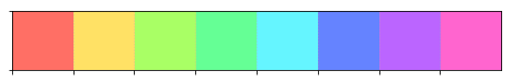
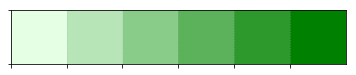
seaborn.color_palette(palette=None, n_colors =None, desat =None) **palette:None,string或sequence,可选,默认有6种主题:**deep,muted, pastel, bright, dark, colorblind n_colors:颜色个数 desat:每种颜色去饱和的比例 12current_palette = sns.color_palette()sns.palplot(current_palette)
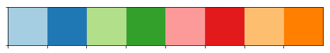
设置亮度和饱和度 1234567# 设置亮度、饱和度# 1、husl_palette([n_colors,h,s,l])# 2、hls_palette([n_colors,h,s,l])# l - 亮度、s - 饱和度sns.palplot(sns.hls_palette(8,l = .7,s =1))
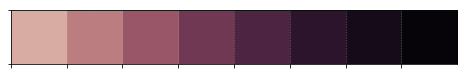
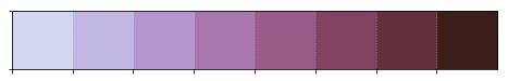
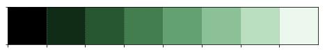
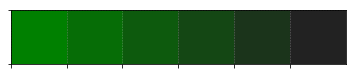
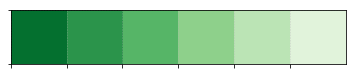
按照线性增长计算,设置颜色 123456789101112131415# sns.cubehelix_palette('n_colors=6', 'start=0', 'rot=0.4', 'gamma=1.0', 'hue=0.8', # 'light=0.85', 'dark=0.15', 'reverse=False', 'as_cmap=False')sns.palplot(sns.cubehelix_palette(8,gamma = 2))sns.palplot(sns.cubehelix_palette(8,start = 1.2,rot = -.5))sns.palplot(sns.cubehelix_palette(8,start = 2,rot = 0,dark = 0,light = .95,reverse = True))# 参数解析:# n_colors:颜色个数# start:值区间在0 - 3 , 开始颜色# rot:颜色旋转角度# gamma:颜色伽马值,值越大颜色越暗# dark,light:值区间在0 - 1,颜色深浅# reverse:布尔值,默认为False,由浅到深
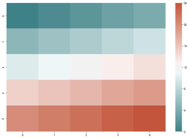
diverging_palette :创建分散颜色 1234567891011121314# 创建分散颜色# sns.diverging_palette('h_neg', 'h_pos', 's=75', 'l=50', 'sep=10', 'n=6', # "center='light'", 'as_cmap=False')sns.palplot(sns.diverging_palette(145,280,s = 85,l = 25,n = 7))# 参数解析:# h_neg, h_pos:起始/终止颜色值# s :值区间0 - 100,饱和度# l :值区间0 - 100,亮度# n :颜色个数# center :中心颜色为浅色还是深色'light' , 'dark' ,默认为light
本文介绍了python的绘图模块seaborn的基础认知,也就是绘图的基础风格设置与调色盘的基础知识,感谢阅读 本文版权归作者所有,欢迎转载,转载请注明出处和链接来源。 |


【本文地址】