| 纯css实现实心三角形,向右箭头 | 您所在的位置:网站首页 › 三角形代码怎么写 › 纯css实现实心三角形,向右箭头 |
纯css实现实心三角形,向右箭头
|
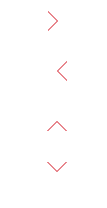
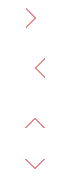
效果如下
实现之前先了解一下css的一个属性:
也就是说 这个属性可以设置透明的色值, 举个例子:
看这个形状是如何实现的 Document .div-box { width: 0; height: 0; border: 30px solid red; border-right: 30px solid transparent; }可以看出其实div-box并没有宽高,而是被边框撑起来的一个正方形,由于边框是 30px 所以原本应是60px*60px的红色正方形,经过了对 有边框的透明设置,导致有边框的颜色没有了,但是上边框和下边框并不受影响,所以出现了右侧被掏空了一个三角形的形状。 而实心三角形只需要这个属性就可以实现了: Document .arrow_top { width: 0; height: 0; border-bottom: 30px solid #ff7f0b; /* border: 30px solid #ff7f0b; */ border-left: 30px solid transparent; border-right: 30px solid transparent; font-size: 0; line-height: 0; } .arrow_right { width: 0; height: 0; border-left: 30px solid transparent; border-right: 30px solid transparent; border-bottom: 30px solid #ff7f0b; font-size: 0; line-height: 0; transform: rotate(90deg); } .arrow_bottom { width: 0; height: 0; border-left: 30px solid transparent; border-right: 30px solid transparent; border-bottom: 30px solid #ff7f0b; font-size: 0; line-height: 0; transform: rotate(180deg); } .arrow_left { width: 0; height: 0; border-left: 30px solid transparent; border-right: 30px solid transparent; border-bottom: 30px solid #ff7f0b; font-size: 0; line-height: 0; transform: rotate(270deg); }
这里 使用了 transform让 三角形旋转的方式,也可以使用四条边组合的形式来设置 三角形的角度。 向上箭头 向下箭头 向左箭头 向右箭头如何实现? 实现思路是先实现一个三角形出来 然后在它的同级放一个兄弟元素,这个元素是白色的边,完全盖住这个三角形,然后通过定位移动1px,就实现了。
完整代码: css制作空心的上下左右的箭头 .box { width: 100px; height: 500px; margin: 0 auto; background: white; } .arrow-box { width: 30px; height: 30px; margin: 20px auto; position: relative; } /*右箭头*/ .right { width: 20px; height: 20px; position: absolute; left: 0; top: 0; } .right-arrow1, .right-arrow2 { width: 0; height: 0; display: block; position: absolute; left: 0; top: 0; border-top: 10px transparent dashed; border-right: 10px transparent dashed; border-bottom: 10px transparent dashed; border-left: 10px white solid; overflow: hidden; } .right-arrow1 { left: 1px; /*重要*/ border-left: 10px red solid; } .right-arrow2 { border-left: 10px white solid; } /*左箭头*/ .left { width: 20px; height: 20px; position: absolute; left: 0; top: 0; z-index: 2; /*兼容ie8-*/ } .left-arrow1, .left-arrow2 { width: 0; height: 0; display: block; position: absolute; left: 0; top: 0; z-index: 5; /*兼容ie8-*/ border-top: 10px transparent dashed; border-left: 10px transparent dashed; border-bottom: 10px transparent dashed; border-right: 10px white solid; overflow: hidden; } .left-arrow1 { border-right: 10px red solid; } .left-arrow2 { left: 1px; /*重要*/ border-right: 10px white solid; } /*上箭头*/ .top { width: 20px; height: 20px; position: absolute; left: 0; top: 0; z-index: 2; /*兼容ie8-*/ } .top-arrow1, .top-arrow2 { width: 0; height: 0; display: block; position: absolute; left: 0; top: 0; z-index: 5; /*兼容ie8-*/ border-top: 10px transparent dashed; border-left: 10px transparent dashed; border-right: 10px transparent dashed; border-bottom: 10px white solid; overflow: hidden; } .top-arrow1 { border-bottom: 10px red solid; } .top-arrow2 { top: 1px; /*重要*/ border-bottom: 10px white solid; } /*下箭头*/ .bottom { width: 20px; height: 20px; position: absolute; left: 0; top: 0; z-index: 2; /*兼容ie8-*/ } .bottom-arrow1, .bottom-arrow2 { width: 0; height: 0; display: block; position: absolute; left: 0; top: 0; z-index: 5; /*兼容ie8-*/ border-bottom: 10px transparent dashed; border-left: 10px transparent dashed; border-right: 10px transparent dashed; border-top: 10px white solid; overflow: hidden; } .bottom-arrow1 { top: 1px; /*重要*/ border-top: 10px red solid; } .bottom-arrow2 { border-top: 10px white solid; }
|


【本文地址】
公司简介
联系我们
| 今日新闻 |
| 推荐新闻 |
| 专题文章 |