|
1.通用
1.控件属性 - GUILayoutOption
GUILayout.Width(float width) - 设置控件的宽度GUILayout.Height(float height) - 设置控件的高度GUILayout.MinWidth(float width) - 设置控件的最小宽度GUILayout.MinHeight(float height) - 设置控件的最小高度GUILayout.MaxWidth(float width) - 设置控件的最大宽度GUILayout.MaxHeight(float width) - 设置控件的最大高度
每GUILayout控件或EditorGUILayout控件都有这个重载接口,通常在倒数第一个参数,可以是传入一个数组,也可以是单独一个:
// 数组模式
GUILayout.Label("测试1", new []{GUILayout.Width(100), GUILayout.Height(100)})
// 单个
GUILayout.Label("测试2", GUILayout.Width(100))
2.内容控件 - GUIContent
GUIContent() - 无参构造函数GUIContent(string text) - 带标签GUIContent(Texture image) - 带图片GUIContent(GUIContent src) - 使用其他内容控件GUIContent(string text, Texture image) - 带标签及图片GUIContent(string text, string tooltip) - 带标签及悬停tipsGUIContent(Texture image, string tooltip) - 带图片及悬停tipsGUIContent(string text, Texture image, string tooltip) - 带标签及图片及悬停tips
根据自己的需求选择使用哪种重载方式
3.样式 - GUIStyle
每个空间的重载方式中都会有一个带有GUIStyle的参数,通常在接口的倒数第二个参数,使用时我们可以new一个GUIStyle对象出来设置,也可以使用Unity内置的样式字符串进行设置;
Unity有一套内置的GUIStyle集合可以进行参考:
public class GUIStyleViewer : EditorWindow
{
Vector2 scvPos = Vector2.zero;
string search = "";
private static GUIStyleViewer window;
[MenuItem("Demo/GUIStyleViewer", false, 100)]
public static void OpenWindow()
{
window = GetWindow(true, "Unity内置GUIStyle查看器");
}
public void OnGUI()
{
GUILayout.BeginHorizontal("HelpBox");
GUILayout.Space(30);
search = EditorGUILayout.TextField("", search, "SearchTextField", GUILayout.MaxWidth(position.x));
GUILayout.Label("", "SearchCancelButtonEmpty");
GUILayout.EndHorizontal();
scvPos = GUILayout.BeginScrollView(scvPos);
foreach (GUIStyle style in GUI.skin.customStyles)
{
if (style.name.ToLower().Contains(search.ToLower()))
{
DrawStyleItem(style);
}
}
GUILayout.EndScrollView();
}
void DrawStyleItem(GUIStyle style)
{
GUILayout.BeginHorizontal("box");
GUILayout.Space(40);
EditorGUILayout.SelectableLabel(style.name);
GUILayout.Box("", style, GUILayout.Width(100));
GUILayout.FlexibleSpace();
if (GUILayout.Button("复制到剪贴板"))
{
EditorGUIUtility.systemCopyBuffer = style.name;
}
GUILayout.EndHorizontal();
GUILayout.Space(10);
}
}

代码参考:https://www.jianshu.com/p/6571b70f3ab6
2.布局控件
1.横向/纵向布局控件
EditorGUILayout.BeginHorizontal()/EditorGUILayout.EndHorizontal() - 横向布局控件EditorGUILayout.BeginVertical()/EditorGUILayout.EndVertical() - 纵向布局控件
通常情况下我们编写的控件代码都是从上往下按顺序排列显示的(前提是你没有使用Rect来控制控件的显示),而布局控件则是可以让你的控件横向排列或者纵向排列:
EditorGUILayout.BeginVertical();
EditorGUILayout.LabelField("Label 标签1", " - Label");
EditorGUILayout.LabelField("Label 标签2", " - Label");
EditorGUILayout.EndVertical();

// 使用布局控件
EditorGUILayout.BeginHorizontal();
EditorGUILayout.LabelField("Label 标签1", " - Label");
EditorGUILayout.LabelField("Label 标签2", " - Label");
EditorGUILayout.EndHorizontal();

2.FadeGroup
EditorGUILayout.BeginFadeGroup(float value) - FadeGroup(1.控制值)EditorGUILayout.EndFadeGroup()
这两个是成对出现的,有开始就有结束,在这两个函数范围内的控件都将受到影响
public float fadeGroupValue = 0;
public void OnGUI(){
// FadeGroup 组件由一个float值进行控制,
// value 的取值范围为 0~1
// value = 0的时候,组内的所有内容不会显示
// value = 1的时候,组内的所有内容都会显示
// 组件的范围会跟随value的变化而变化,如果底部有其他控件,这个控件会跟随紧贴组的底部
fadeGroupValue = EditorGUILayout.Slider("控制FadeGroup:", fadeGroupValue, 0, 1);
if (EditorGUILayout.BeginFadeGroup(fadeGroupValue))
{
GUILayout.Label("文本1");
GUILayout.Label("文本2");
GUILayout.Label("文本3");
GUILayout.Label("文本4");
GUILayout.Label("文本5");
GUILayout.Label("文本6");
}
EditorGUILayout.EndFadeGroup();
GUILayout.Label("底部");
}

3.滚动界面
EditorGUILayout.BeginScrollView(Vector pos, bool isAlwaysHor, bool isAlwaysVer, GUIStyle horStyle, GUIStyle verStyle) - (1.滚动界面位置,2.总是显示横向滚动条,3.总是显示纵向滚动条,4.横向滚动条样式,5.纵向滚动条样式)EditorGUILayout.EndScrollView()
这两个是成对出现的,有开始就有结束,在这两个函数范围内的控件都将受到影响
// 滚动界面位置,x代表横向位置,y代表纵向位置
public Vector2 scrollViewPos = Vector2.zero;
public void OnGUI(){
// isAlwaysHor/isAlwaysVer 默认为false
// 有其他重载接口没有这两个值
// 滚动条的样式可以自定义,通过使用GUIStyle类
scrollViewPos = EditorGUILayout.BeginScrollView(scrollViewPos, true, true);
EditorGUILayout.LabelField("**1********2*********3**");
EditorGUILayout.LabelField("**1********2*********3**---------------");
EditorGUILayout.EndScrollView();
}

4.目标平台设置
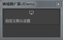
EditorGUILayout.BeginBuildTargetSelectionGrouping()/EditorGUILayout.EndBuildTargetSelectionGrouping()
Unity必须有对应的目标平台,否则只会显示默认的平台
public BuildTargetGroup buildTargetGroup = BuildTargetGroup.Standalone;
public void OnGUI(){
buildTargetGroup = EditorGUILayout.BeginBuildTargetSelectionGrouping();
if (buildTargetGroup == BuildTargetGroup.Standalone) { EditorGUILayout.LabelField("自定义默认设置"); }
if (buildTargetGroup == BuildTargetGroup.Android) { EditorGUILayout.LabelField("自定义Android设置"); }
EditorGUILayout.EndBuildTargetSelectionGrouping();
}
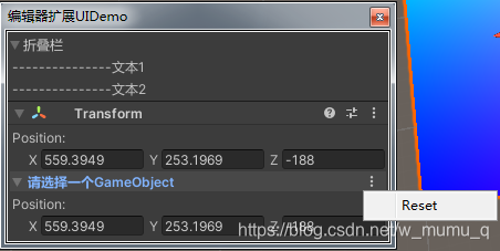
5.折叠栏
EditorGUILayout.Foldout(bool state, string label, bool toggleOnLabelClick) - 折叠栏(1.状态,2.标签,3.点击标签是否触发状态切换(貌似在2019中true/false都能响应))EditorGUILayout.InspectorTitlebar(bool state, Object[] objects) - 检视面板折叠栏(1.状态,2.游戏物体)EditorGUILayout.BeginFoldoutHeaderGroup(bool state, string label, GUIStyle style, Action
menuAction, GUIStyle menuIcon)
- 折叠栏组(1.状态,2.标签,3.样式,4.菜单回调,5.菜单样式)EditorGUILayout.EndFoldoutHeaderGroup()
public bool foldoutState = false;
public bool inspactorFoldoutState = true;
public Transform selectTransform = null;
public bool foldoutHeaderState = true;
public Transform selectTransform_Header = null;
public string label_Header = "Option";
public void OnGUI(){
// 普通折叠栏(不可以添加菜单)
foldoutState = EditorGUILayout.Foldout(foldoutState, "折叠栏", true);
if (foldoutState)
{
EditorGUILayout.LabelField("---------------文本1");
EditorGUILayout.LabelField("---------------文本2");
}
// 将所选GameObject上的某个组件的检视面板拿到自定义的窗口中显示
GameObject obj = Selection.activeGameObject;
if (obj)
{
selectTransform = obj.transform;
inspactorFoldoutState = EditorGUILayout.InspectorTitlebar(inspactorFoldoutState, selectTransform);
if (inspactorFoldoutState)
{
selectTransform.position = EditorGUILayout.Vector3Field("Position:", selectTransform.position);
}
}
// 可以在折叠栏中设置菜单栏,添加菜单选项做特殊操作
foldoutHeaderState = EditorGUILayout.BeginFoldoutHeaderGroup(foldoutHeaderState, label_Header, null, FoldoutHeaderGroupMenuList);
if (obj)
{
selectTransform_Header = obj.transform;
if (foldoutHeaderState)
{
EditorGUILayout.Vector3Field("Position:", selectTransform_Header.position);
}
}
else
{
foldoutHeaderState = false;
label_Header = "请选择一个GameObject";
}
EditorGUILayout.EndFoldoutHeaderGroup();
}
// 菜单
public void FoldoutHeaderGroupMenuList(Rect rect)
{
var menu = new GenericMenu();
menu.AddItem(new GUIContent("Reset"), false, OnItemClicked);
menu.DropDown(rect);
}
// 菜单点击事件
public void OnItemClicked()
{
if (Selection.activeTransform == null) return;
Undo.RecordObject(Selection.activeTransform, "Moving to center of world");
Selection.activeTransform.position = Vector3.zero;
}
6.Area
GUILayout.BeginArea(Rect rect)/GUILayout.EndArea() - Area(1.区域范围及位置)
public void OnGUI(){
GUILayout.BeginArea(new Rect(position.width - 100, position.height - 100, 100, 100));
GUILayout.Box("测试Box", new[] { GUILayout.Width(100), GUILayout.Height(100)});
GUILayout.EndArea();
}

3.文本类控件
EditorGUILayout.LabelField(string label, string str) - 标签控件(1.标签,2.标签内容(可不填写))EditorGUILayout.SelectableLabel(string str) - 标签控件(1.内容)
EditorGUILayout.LabelField("Label 标签");
EditorGUILayout.LabelField("Label 标签", "标签内容");
EditorGUILayout.SelectableLabel("可复制的只读文本内容。");

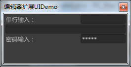
4.输入框
1.文本输入框
EditorGUILayout.TextField(string label, string str) - 单行文本输入框(1.标签,2.内容)EditorGUILayout.DelayedTextField(string label, string str) - 单行文本输入框(1.标签,2.内容)(与TextField相同,只是在回车/失去焦点的时候才会保存数据)EditorGUILayout.TextArea(string str) - 多行文本输入框(1.内容)(输入的时候按回车换行)EditorGUILayout.PasswordField(string label, string password) - 密码输入框(1.标签,2.密码)(输入的内容会显示为*)
public string tempFiled = "";
public string tempArea = "";
public string passwordFiled = "";
public void OnGUI(){
tempFiled = EditorGUILayout.TextField("单行输入:", tempFiled);
tempArea = EditorGUILayout.TextArea(tempArea);
passwordFiled = EditorGUILayout.PasswordField("密码输入:", passwordFiled);
}
2.数值输入框
EditorGUILayout.IntField(string label, int value) - 整数输入框(1.标签,2.内容)EditorGUILayout.DelayedIntField(string label, int value) - 整数输入框(1.标签,2内容) - (与IntField相同,只是在回车/失去焦点的时候才会保存数据)EditorGUILayout.FloatField(string label, float value) - Float输入框(1.标签,2内容)EditorGUILayout.DelayedFloatField(string label, float value) - Float输入框(1.标签,2内容) - (与FloatField相同,只是在回车/失去焦点的时候才会保存数据)EditorGUILayout.DoubleField(string label, double value) - Double输入框(1.标签,2内容)EditorGUILayout.DelayedDoubleField(string label, double value) - Double输入框(1.标签,2内容) - (与DoubleField相同,只是在回车/失去焦点的时候才会保存数据)EditorGUILayout.Vector3Field(string label, Vector3 value) - 3维向量输入框(1.标签,2内容)EditorGUILayout.Vector3IntField(string label, Vector3Int value) - 3维整数向量输入框(1.标签,2内容)EditorGUILayout.Vector2Field(string label, Vector2 value) - 2维向量输入框(1.标签,2内容)EditorGUILayout.Vector2IntField(string label, Vector2Int value) - 2维整数向量输入框(1.标签,2内容)EditorGUILayout.Vector4Field(string label, Vector4 value) - 4维向量输入框(1.标签,2内容)EditorGUILayout.BoundsField(string label, Bounds value) - 4维向量输入框(1.标签,2内容(Center - 中心点坐标,Extent - 边界框的范围,它总是边界大小的一半))EditorGUILayout.BoundsIntField(string label, BoundsInt value) - 4维向量输入框(1.标签,2内容(Center - 中心点,Size - 包围盒的大小))
public int intFiled = 0;
public float floatFiled = 0.0f;
public double doubleFiled = 0;
public Vector3 vector3Filed = Vector3.zero;
public Vector3Int vector3IntFiled = Vector3Int.zero;
public Vector2 vector2Filed = Vector2.zero;
public Vector2Int vector2IntFiled = Vector2Int.zero;
public Vector4 vector4Filed = Vector4.zero;
public Bounds boundFiled = new Bounds(Vector3.zero, Vector3.zero);
public BoundsInt boundIntFiled = new BoundsInt(Vector3Int.zero, Vector3Int.zero);
public void OnGUI(){
intFiled = EditorGUILayout.IntField("输入一个整数:", intFiled);
floatFiled = EditorGUILayout.FloatField("输入一个Float:", floatFiled);
doubleFiled = EditorGUILayout.DoubleField("输入一个Double:", doubleFiled);
vector3Filed = EditorGUILayout.Vector3Field("输入一个3维向量:", vector3Filed);
vector3IntFiled = EditorGUILayout.Vector3IntField("输入一个3维整数向量:", vector3IntFiled);
vector2Filed = EditorGUILayout.Vector2Field("输入一个2维向量:", vector2Filed);
vector2IntFiled = EditorGUILayout.Vector2IntField("输入一个2维整数向量:", vector2IntFiled);
vector4Filed = EditorGUILayout.Vector4Field("输入一个4维向量:", vector4Filed);
boundFiled = EditorGUILayout.BoundsField("输入一个包围盒:", boundFiled);
boundIntFiled = EditorGUILayout.BoundsIntField("输入一个整数包围盒:", boundIntFiled);
}

5.选择框
1.多选枚举框
EditorGUILayout.EnumFlagsField(string label, Enum enumValue) - 多选枚举框(1.标签,2.枚举变量)
public enum TempEnum
{
None = 0, // 0 表示全都不选,这里可以自定义名称(覆盖None)
Everything = ~0, // ~0 表示全选,这里可以自定义名称(覆盖Everything)
OneAndTwo = One|Two, // 如果需要一个选项包含两个/多个选项 名称 | 名称... (中间用|间隔)
One = 1
int temp = 1
Debug.Log("没有被选中 = " + i);
}
}

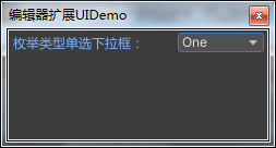
2.单选枚举框
EditorGUILayout.EnumPopup(string label, Enum enumValue) - 单选枚举框.标签,2.枚举变量)
public enum TempEnum2
{
One = 0,
Two = 1,
Three = 2,
}
public TempEnum2 enumPopup = TempEnum2.One;
public void OnGUI(){
// 返回值是一个二进制的数,需要使用强制转换
enumPopup = (TempEnum2)EditorGUILayout.EnumPopup("枚举类型单选下拉框:", enumPopup);
}
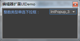
3.整型单选框
EditorGUILayout.IntPopup(string label, int selectValue, string[] nameArrery, int[] indexArray) - 整型单选框(1.标签,2.选择的索引值变量,3.名称数组,4.索引数组)(名称数组与索引数组是一一对应的)
public int intPopupValue = 0;
public TempEnum2 enumPopup = TempEnum2.One;
public void OnGUI(){
intPopupValue = EditorGUILayout.IntPopup("整数类型单选下拉框:", intPopupValue, new[] { "IntPopup_1", "IntPopup_2", "IntPopup_3" }, new[] { 1, 2, 3});
}
4.整型多选框
EditorGUILayout.IntPopup(string label, int selectValue, string[] nameArrery) - 整型多选框(1.标签,2.选择的索引值变量,3.名称数组)(Unity会添加None和Everything)
public string[] intMaskFiledStrs = new string[] { "IntPopup_1", "IntPopup_2", "IntPopup_3" };
public int intMaskFiled = 0;
public void OnGUI(){
intMaskFiled = EditorGUILayout.MaskField("整数类型多选下拉框:", intMaskFiled, intMaskFiledStrs);
}
...
// 多选框获取选择的索引
for (int i = 0; i
Debug.Log($"{intMaskFiledStrs[i]} 被选中");
}
else
{
Debug.Log($"{intMaskFiledStrs[i]} 没有被选中");
}
}

5.Layer/Tag选择框
EditorGUILayout.LayerField(string label, int layer) - Layer选择框(1.选择框标签,2.层级)EditorGUILayout.TagField(string label, string tag) - Tag选择框(1.选择框标签,2.标签名称)
public LayerMask layerFiled = 0;
public string tagFiled = "Player";
public void OnGUI(){
layerFiled = EditorGUILayout.LayerField("选择一个Layer:", layerFiled);
tagFiled = EditorGUILayout.TagField("选择一个Tag:", tagFiled);
}

6.颜色框
EditorGUILayout.LayerField(string label, Color color) - 颜色框(1.颜色框标签,2.颜色对象)
public Color colorFiled = Color.white;
public void OnGUI(){
colorFiled = EditorGUILayout.ColorField("颜色框", colorFiled);
}

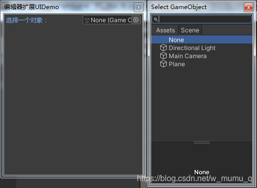
7.对象选择框
EditorGUILayout.ObjectField(string label, Object obj, Type type, bool allowSceneObj) - 对象选择框(1.标签,2.对象(Unity内的所有对象),3.对象类型,4.是否允许场景中的游戏物体(即GameObject))
public Object objectFiled = null;
public void OnGUI(){
objectFiled = EditorGUILayout.ObjectField("选择一个对象:", objectFiled, typeof(GameObject), true);
}
8.动画曲线框
EditorGUILayout.CurveField(string label, AnimationCurve curve) - 动画曲线框(1.标签,2.曲线对象)
public AnimationCurve animCurveFiled = AnimationCurve.Linear(0, 0, 1, 1);
public void OnGUI(){
animCurveFiled = EditorGUILayout.CurveField("曲线", animCurveFiled);
}

6.按钮控件
1.单个按钮控件
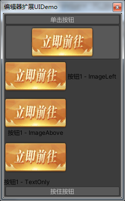
GUILayout.Button(string str) - 默认样式按钮(文字)(1.按钮文字)(按下抬起后改变值)GUILayout.Button(Texture tex) - 默认样式按钮(图片)(1.按钮图片)(按下时就改变值)
public void OnGUI(){
// 默认文字按钮样式 - 最常见的样式(默认背景图 + 文字)
GUILayout.Button("单击按钮");
// 默认图片按钮样式 - 默认背景图 + 自定义图片
Texture btnSp = Resources.Load("btn_ljqw");
GUILayout.Button(btnSp);
// 新定义一个GUIStyle,设置自定义样式
// imagePosition字段有4种模式:
GUIStyle tempGUIStyle = new GUIStyle();
tempGUIStyle.imagePosition = ImagePosition.ImageLeft;
// 1.ImageLeft - 图片在文字的左边(不会有默认背景图)
GUILayout.Button(new GUIContent("按钮1 - ImageLeft", btnSp), tempGUIStyle);
GUILayout.Space(10);
// 2.ImageAbove - 图片在文字的上方(不是盖在上边)(不会有默认背景图)
tempGUIStyle.imagePosition = ImagePosition.ImageAbove;
GUILayout.Button(new GUIContent("按钮1 - ImageAbove", btnSp), tempGUIStyle);
GUILayout.Space(10);
// 3.ImageOnly - 仅显示图片(不会有默认背景图)
tempGUIStyle.imagePosition = ImagePosition.ImageOnly;
GUILayout.Button(new GUIContent("按钮1 - ImageOnly", btnSp), tempGUIStyle);
GUILayout.Space(10);
// 4.TextOnly - 仅显示文字(不会有默认背景图)
tempGUIStyle.imagePosition = ImagePosition.TextOnly;
GUILayout.Button(new GUIContent("按钮1 - TextOnly", btnSp), tempGUIStyle);
// 按住按钮 - 接口同GUILayout.Button
GUILayout.RepeatButton("按住按钮");
}
2.按钮网格控件
GUILayout.SelectionGrid(int idx, string[] strs, int xCount) - 按钮网格(1.按钮索引,2.按钮显示文本数组,3.一行多少列)GUILayout.SelectionGrid(int idx, Texture[] textures, int xCount) - 按钮网格(1.按钮索引,2.按钮显示图片数组,3.一行多少列)
public int selectGridIdx = 0;
public string[] selectGridStrs = new string[] { "按钮1", "按钮2", "按钮3", "按钮4" };
public string selectGridShowStr = "";
public void OnGUI(){
GUILayout.BeginVertical();
selectGridIdx = GUILayout.SelectionGrid(selectGridIdx, selectGridStrs, 2);
if (GUILayout.Button("打印"))
{
selectGridShowStr = string.Format("你选择了{0}, 索引是{1}", selectGridStrs[selectGridIdx], selectGridIdx);
}
GUILayout.Label(selectGridShowStr);
GUILayout.EndVertical();
}

3.工具栏控件
GUILayout.Toolbar(int idx, string[] strs) - 工具栏(1.按钮索引,2.按钮显示文本数组)GUILayout.Toolbar(int idx, Texture[] textures) - 工具栏(1.按钮索引,2.按钮显示图片数组)
public int selectGridIdx = 0;
public string[] selectGridStrs = new string[] { "按钮1", "按钮2", "按钮3", "按钮4" };
public string selectGridShowStr = "";
public void OnGUI(){
GUILayout.BeginVertical();
selectGridIdx = GUILayout.Toolbar(selectGridIdx, selectGridStrs);
if (GUILayout.Button("打印"))
{
selectGridShowStr = string.Format("你选择了{0}, 索引是{1}", selectGridStrs[selectGridIdx], selectGridIdx);
}
GUILayout.Label(selectGridShowStr);
GUILayout.EndVertical();
}

7.开关控件
1.Toggle
EditorGUILayout.Toggle(string label, bool value) - 开关(1.标签,2.开关值)EditorGUILayout.ToggleLeft(string label, bool value) - 开关(1.标签,2.开关值)
public bool toggleValue = false;
public void OnGUI(){
// 两个接口只是样式不同而已,这里就用同一个字段展示一下
toggleValue = EditorGUILayout.Toggle("开关", toggleValue);
toggleValue = EditorGUILayout.ToggleLeft("开关", toggleValue);
}

2.ToggleGroup
EditorGUILayout.BeginToggleGroup(string label, bool value) - 开始开关组(1.标签,2.开关值)EditorGUILayout.EndToggleGroup() - 结束开关组
public bool toggleGroupValue_1 = true;
public bool toggleGroupValue_2 = false;
public void OnGUI(){
// 开关组内的东西需要在BeginToggleGroup和EndToggleGroup之间
// 当开关组的值为false时,组内的空间皆不可操作更改
toggleGroupValue_1 = EditorGUILayout.BeginToggleGroup("Pos", toggleGroupValue_1);
vector3Filed = EditorGUILayout.Vector3Field("位置修改:", vector3Filed);
EditorGUILayout.EndToggleGroup();
toggleGroupValue_2 = EditorGUILayout.BeginToggleGroup("Scale", toggleGroupValue_2);
vector3IntFiled = EditorGUILayout.Vector3IntField("缩放修改:", vector3IntFiled);
EditorGUILayout.EndToggleGroup();
}

8.滑/滚动条
1.滑动条
EditorGUILayout.Slider(string label, float value, float minLimit, float maxLimit) - 普通滑动条(1.标签,2.滑动条的值,3.滑动条最小值,4.滑动条最大值)EditorGUILayout.IntSlider(string label, int value, int minLimit, int maxLimit) - 整数滑动条(1.标签,2.滑动条的值,3.滑动条最小值,4.滑动条最大值)EditorGUILayout.MinMaxSlider(string label, ref float minValue, ref float maxValue, float minLimit, float maxLimit) - 双滑块滑动条(1.标签,2.滑块左端值,3.滑块右端值,4.滑动条最小值,5.滑动条最大值)GUILayout.HorizontalSlider(float value, float minLimit, float maxLimit) - 水平滑动条(1.滑动条的值,2.滑动条最左值,3.滑动条最右值)GUILayout.VerticalSlider(float value, float minLimit, float maxLimit) - 垂直滑动条(1.滑动条的值,2.滑动条顶值,3.滑动条底值)
public float sliderValue = 0;
public int intSliderValue = 0;
public float leftSliderValue = 0;
public float rightSliderValue = 1;
public float horizontalSliderValue = 0;
public float verticalSliderValue = 0;
public void OnGUI(){
sliderValue = EditorGUILayout.Slider("普通滑动条:", sliderValue, -5, 5);
intSliderValue = EditorGUILayout.IntSlider("整数滑动条:", intSliderValue, -5, 5);
// 按住中间,滑动不会改变min和max的差值
// 按住左边/右边滑块,分别改变min和max值
EditorGUILayout.MinMaxSlider("双滑块滑动条:", ref minSliderValue, ref maxSliderValue, -5, 5);
EditorGUILayout.BeginHorizontal();
EditorGUILayout.LabelField("Min = ", minSliderValue.ToString());
EditorGUILayout.LabelField("Max = ", maxSliderValue.ToString());
EditorGUILayout.EndHorizontal();
horizontalSliderValue = GUILayout.HorizontalSlider(horizontalSliderValue, 0, 100);
EditorGUILayout.Space(20);
verticalSliderValue = GUILayout.VerticalSlider(verticalSliderValue, 0, 100, GUILayout.Height(100));
EditorGUILayout.LabelField("水平滑动条的值:", horizontalSliderValue.ToString());
EditorGUILayout.LabelField("垂直滑动条的值:", verticalSliderValue.ToString());
}

2.滚动条
GUILayout.HorizontalScrollbar(float value, float min, float max) - 水平滚动条(1.滚动条的值,2.滚动条左值,3滚动条右值)GUILayout.VerticalScrollbar(float value, float min, float max) - 垂直滚动条(1.滚动条的值,2.滚动条左值,3滚动条右值)
public float horizontalScrollBarValue = 0;
public float verticalScrollBarValue = 0;
public void OnGUI(){
horizontalScrollBarValue = GUILayout.HorizontalScrollbar(horizontalScrollBarValue, 0, 0, 100, GUILayout.Width(200));
GUILayout.BeginHorizontal();
verticalScrollBarValue = GUILayout.VerticalScrollbar(verticalScrollBarValue, 0, 0, 100, GUILayout.Height(200));
GUILayout.Label(string.Format("水平滚动条值:{0}\n垂直滚动条值:{1}", horizontalScrollBarValue, verticalScrollBarValue));
GUILayout.EndHorizontal();
}

9.其他
1.Box
GUILayout.Box(GUIContent content, GUILayout[] layout) - Box(1.box内容,2.布局)
public void OnGUI(){
Texture btnSp = Resources.Load("btn_ljqw");
GUIStyle boxStyle = new GUIStyle();
boxStyle.imagePosition = ImagePosition.ImageAbove;
GUILayout.Box(new GUIContent("测试Box", btnSp, "ToolTips" ), new[] { GUILayout.Width(200), GUILayout.Height(200)});
}

2.HelpBox
EditorGUILayout.HelpBox(string tips, MessageType type, bool wide) - 帮助tips(1.内容,2.提示框类型(分别为:None/Info/Warning/Error),3.是否覆盖整个窗口(貌似没什么用))
public void OnGUI(){
EditorGUILayout.HelpBox("这是tips内容 - Warning", MessageType.Warning);
EditorGUILayout.HelpBox("这是tips内容 - Info", MessageType.Info);
EditorGUILayout.HelpBox("这是tips内容 - None", MessageType.None);
EditorGUILayout.HelpBox("这是tips内容 - Error", MessageType.Error);
EditorGUILayout.HelpBox("这是tips内容 - Error - wide", MessageType.Error, true);
}

3.间隔控件
EditorGUILayout.Space(float width) - 间隔(1.间隔的距离(可以不填,不填则使用Unity默认的值进行间隔))
public void OnGUI(){
EditorGUILayout.Space(10);
}
4.FlexibleSpace
GUILayout.FlexibleSpace() - 紧贴窗口边缘
如果在BeginHorizontal组内使用,则表示左右对齐窗口边缘, 如果在BeginVertical组内使用,则表示上下对齐窗口边缘。
public void OnGUI(){
GUILayout.BeginHorizontal();
GUILayout.BeginVertical();
GUILayout.Button("按钮左上角", GUILayout.Width(100));
GUILayout.FlexibleSpace(); //上下对齐
GUILayout.Button("按钮左下角", GUILayout.Width(100));
GUILayout.EndVertical();
GUILayout.FlexibleSpace(); // 左右对齐
GUILayout.BeginVertical();
GUILayout.Button("按钮右上角", GUILayout.Width(100));
GUILayout.FlexibleSpace(); //上下对齐
GUILayout.Button("按钮右下角", GUILayout.Width(100));
GUILayout.EndVertical();
GUILayout.EndHorizontal();
}

暂时就这么多了,如果有错误的,欢迎各位大佬前来指正!!!
参考:
https://docs.unity3d.com/ScriptReference/EditorGUILayout.htmlhttps://blog.csdn.net/qq_38275140/article/details/84778344
|