| Python | 您所在的位置:网站首页 › excel坐标轴图的数字怎么调整位置和方向 › Python |
Python
|
一、默认情况下绘图
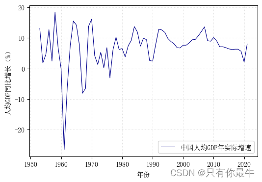
本例使用我国1953-2021年的“人均GDP同比增长率(%)”来进行演示,数据来源于wind,数据概况如下: GDP = [13.1, 1.8, 4.6, 12.7, 2.4, 18.4, 6.9, -0.2, -26.5, -6.3, 7.6, 15.5, 14.2, 7.6, -8.1, -6.5, 13.8, 16.1, 4.2, 1.3, 5.3, 0.2, 6.8, -3.1, 6.1, 10.2, 6.2, 6.5, 3.8, 7.4, 9.2, 13.7, 11.9, 7.3, 9.9, 9.4, 2.6, 2.4, 7.8, 12.8, 12.6, 11.8, 9.8, 8.8, 8.1, 6.8, 6.7, 7.6, 7.6, 8.4, 9.4, 9.5, 10.7, 12.1, 13.6, 9.1, 8.9, 10.1, 9.0, 7.1, 7.1, 6.8, 6.4, 6.2, 6.3, 6.3, 5.6, 2.1, 8.0] Year = [1953, 1954, 1955, 1956, 1957, 1958, 1959, 1960, 1961, 1962, 1963, 1964, 1965, 1966, 1967, 1968, 1969, 1970, 1971, 1972, 1973, 1974, 1975, 1976, 1977, 1978, 1979, 1980, 1981, 1982, 1983, 1984, 1985, 1986, 1987, 1988, 1989, 1990, 1991, 1992, 1993, 1994, 1995, 1996, 1997, 1998, 1999, 2000, 2001, 2002, 2003, 2004, 2005, 2006, 2007, 2008, 2009, 2010, 2011, 2012, 2013, 2014, 2015, 2016, 2017, 2018, 2019, 2020, 2021]简单参数情况下,绘图代码如下: plt.figure(figsize=(6,4),dpi=100) plt.plot(Year, GDP, color='darkblue', linewidth='0.8', label='中国人均GDP年实际增速') plt.xlabel('年份') plt.ylabel('人均GDP同比增长(%)') plt.legend(loc='lower right') plt.grid(alpha=0.4,linestyle=':') plt.show()代码执行效果如下图:
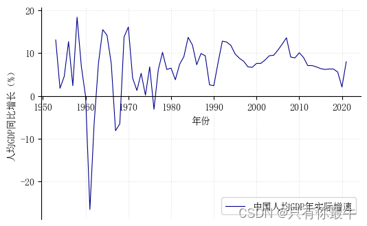
调整要求: 1、调整坐标上方和右方坐标轴; 2、将X轴调整至y=0处; 3、将y轴标签“人均GDP同比增长(%)”调整至y轴上方,并调整方向为水平; 4、将x轴调整后,刻度标签跟随移动,我们将x轴刻度标签保留在图表最下方。 (一)调整坐标轴去掉坐标的上方和右方坐标轴,再将X轴移动到y=0处。 plt.figure(figsize=(6,4),dpi=100) plt.plot(Year, GDP, color='darkblue', linewidth='0.8', label='中国人均GDP年实际增速') ax = plt.subplot() ax.spines['top'].set_visible(False) #设置坐标轴,下同 ax.spines['right'].set_visible(False) ax.spines['bottom'].set_position(('data',0)) plt.xlabel('年份') plt.ylabel('人均GDP同比增长(%)') plt.legend(loc='lower right') plt.grid(alpha=0.4,linestyle=':') plt.show()调整坐标轴和调整X轴的效果如下:
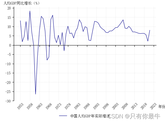
下面请看代码,代码中的参数的相关数据可以根据实际需要进行调整: plt.figure(figsize=(6,4),dpi=100) plt.plot(Year, GDP, color='darkblue', linewidth='0.8', label='中国人均GDP年实际增速') ax = plt.subplot() ax.spines['top'].set_visible(False) #设置坐标轴,下同 ax.spines['right'].set_visible(False) ax.spines['bottom'].set_position(('data',0)) plt.xlabel('年份', labelpad=-12, #调整x轴标签与x轴距离 x=1.04, #调整x轴标签的左右位置 fontsize=9) plt.ylabel('人均GDP同比增长(%)', labelpad=-40, #调整y轴标签与y轴的距离 y=1.02, #调整y轴标签的上下位置 rotation=0,fontsize=9) plt.xticks(np.arange(1953,2024,5), rotation=45, position=(0,-29), #调整年份的位置,让远离了x轴 fontsize=9) plt.yticks(np.arange(-30,21,5),fontsize=9) plt.legend(fontsize=9, bbox_to_anchor=(0.7,-0.1), #图例的框位置,调整到坐标轴外 frameon=False) #图例的边框开关 plt.grid(alpha=0.4,linestyle=':') plt.show()调整坐标轴标签,以及x轴刻度标签位置的效果如下:
本例只是为了演示调整坐标轴、X轴位置,调整坐标轴标签和方向、调整x轴刻度标签,其余的图形效果可以自行调整设计。
|
【本文地址】
公司简介
联系我们