| 深入理解CSS绝对定位 | 您所在的位置:网站首页 › css的相对定位中嵌套用绝对定位吗 › 深入理解CSS绝对定位 |
深入理解CSS绝对定位
|
CSS中有3种定位机制:普通流,浮动和绝对定位。除非专门指定,否则所有框都在普通流中定位。顾名思义,普通流中元素框的位置由HTML元素的位置决定。块级框一个接一个地垂直排列,框之间的垂直距离由框的垂直外边距计算出。在本文中,我们主要讲解3种定位机制之一的绝对定位,这就需要深入了解relative(相对定位),absolute(绝对定位)两种position属性值。 position的所有属性值如下所示: absolute,生成绝对定位的元素,相对于 static 定位以外的第一个父元素进行定位。 relative,生成相对定位的元素,相对于其正常位置进行定位。 fixed, 生成固定定位的元素,相对于浏览器窗口进行定位。 Fixed 定位在 IE7 和 IE8 下需要描述 !DOCTYPE 才能支持。Fixed定位使元素的位置与文档流无关,因此不占据空间。 static,默认值。没有定位,元素出现在正常的流中(忽略 top, bottom, left, right 或者 z-index 声明)。粘性定位的元素是依赖于用户的滚动,在 position:relative 与 position:fixed 定位之间切换。元素定位表现为在跨越特定阈值前为相对定位,之后为固定定位。( Internet Explorer, Edge 15 及更早 IE 版本不支持 sticky 定位。 Safari 需要使用 -webkit-sticky)。 sticky,粘性定位,该定位基于用户滚动的位置。 inherit,规定应该从父元素继承 position 属性的值。 1. 相对定位(relative)相对定位是一个比较容易的概念,如果对一个元素设置相对定位,它将相对于自己本身在文档流的位置,通过top/left/right/bottom设置定位。例如设置元素为相对定位,然后设置top:20px;left:20px;则框将会出现在原位置顶部下面20px,左边20px的位置,如下所示:
那么问题来了,为什么它会覆盖其他框呢? 原因在于\(position:relative;\)可以提高元素的层叠上下文,而且提升很大,按照张鑫旭大神说的提升级别属于鬼畜,本文实验,将被覆盖的元素框z-index属性值设置为999都还是被覆盖掉了。 前面我们讲过,可以通过设置top,left等属性调整元素框的位置,那么问题来了,当top和bottom或者left与right对立属性同时存在,会发生什么呢? 答案是:两者会相互看不顺眼,导致只能存在一方。top与bottom同时存在,top属性生效,而bottom会被干掉。同样,left与right同时存在,left将干掉right,只有left生效。 可能到这里有读者想问了,不是说好的讲绝对定位这种定位机制吗?怎么还要先讲一下relative(相对定位)了? 不要着急,答案马上揭晓~ 这里当然不得不说相对定位与绝对定位的关系了! 相对定位对于绝对定位,能够: 限制绝对定位的定位 限制绝对定位的层级 限制超越overflow1.为什么说能够限制绝对定位的定位呢? 因为绝对定位相对于最近的已定位(非static)以外的父元素,如果元素没有已定位的父元素,那么它的位置相对于html。 2.为什么说相对定位能够限制绝对定位的层级呢? 举例,两个absolute定位元素A和B,A的z-index属性值为3,B的为2;A的relative父级元素存在z-index值(非auto),并且z-index为2;B也一样,但其相对于定位的父元素的z-index值为3.这时候,A和B两个元素的层级就不是由自身的z-index值决定了,而是由相对于定位的relative的父元素的z-index值决定。A的层级这时候也就低于B的层级。 3.为什么说能够限制超越overflow呢? 这是由于在没有relative的父元素时,绝对定位的元素能够通过top等属性值超越自身所在的容器框,”飞出来“(在容器外显示)。并且容器设置overflow值为hidden,也不管用,这时候,只需要在容器上设置属性position值为relative,那么该元素超越出容器外的部分就会被掩盖(看不到容器外的那一部分)。 前面我们说了相对定位与绝对定位的关系,那么相对定位还和别的定位存在某种关系(除同源外)吗? 当当当当~,当然啦!相对定位除了与绝对定位关系匪浅外,它和fixed定位关系似乎也不错。不过,相对定位仅仅能够限制fixed定位的z-index层级。 不知道大家发现没有,相对定位对于绝对定位和fixed定位都有讲到层级。那么相对定位与层级的关系是什么呢? 前面有讲述到的(1)相对定位能够大大提高元素的层叠上下文;(2)能够限制absolute定位于fixed定位的层级 那么为什么能够限制absolute定位于fixed定位的层级,大家有想过吗?答案是,当relative的元素存在z-index(非auto),那么就会重建层叠上下文,这时就使得其下面的(相对于它定位的absolute/fixed元素)更新了z-index变成relative的值。那么,当relative父元素的z-index值为auto时呢? 这时候,其下的(相对于它定位的absolute/fixed元素)层级就不受限制了,因为不会发生重建层叠上下文(不包括IE 6/IE 7,IE 6/IE 7也会创建层叠上下文)。 这时候我们就要想了,为auto时,该如何避免在IE 6/IE 7下创建层叠上下文呢? 这里就需要了解relative的最小化影响原则了。 relative 最小化影响原则所谓relative最小化影响原则,即指尽量降低realtive属性对其他元素或布局的潜在影响。具体来说可以总结为两点: 尽量避免使用relative原则 absolute定位不依赖relative(通过margin定位) relative最小化原则 引入额外的空div包裹要绝对定位的元素,设置relative(不具备尺寸,不影响别的元素布局,并且不会增加多的受relative影响的元素)进行定位。 2. 绝对定位(absolute)相对定位实际上被看作普通流定位模型的一部分,因为元素的位置是相对于它在普通流中的位置。与之相反,绝对定位使元素的位置与文档流无关。因此不占据空间,普通文档流中其他元素的布局就好像绝对定位元素不存在一样。 绝对定位的元素的位置是相对于距离它最近的那个已定位的祖先元素确定的。如果元素没有已定位的祖先元素,那么它的位置是相对于初始包含块的。根据用户代理不同,初始包含块可能是画布或HTML元素。 同时,由于绝对定位与文档流无关,所以它可以覆盖页面上其他元素。通过设置z-index属性控制这些框的叠放次序。z-index值越高,框在栈中的位置越高。 2.1 absolute和float相同特性: 包裹性 破坏性两者页面布局可相互代替。 破坏性 容器未设置height相关属性(非max-height),则包裹元素设置absolute,容器高度塌陷。 包裹性 容器未设置高宽,则将容器设置absolute,将会包裹其内元素。 2.2 无依赖的absolute绝对定位可以不与relative一起使用,功能更强大。 1.图标定位 body { font: 14px/1.4 "Microsoft YaHei"; background-color: #EDEFF0; } body, h3, h5 { margin: 0; } img { border: 0 none; vertical-align: bottom; } .l { float: left; } .r { float: right; } .constr { width: 1200px; margin-left: auto; margin-right: auto; } .header { background-color: #2A2C2E; } .nav { height: 60px; } .nav-list { float: left; font-size: 14px; font-weight: 400; } .nav-a { display: inline-block; line-height: 20px; padding: 20px 35px; color: #B5BDC0; text-decoration: none; } .nav-a:hover { color: #fff; } .course { padding-top: 10px; } .course-list { float: left; width: 280px; height: 240px; margin: 5px 10px 15px; border-radius: 0 0 1px 1px; background-color: #F7FAF9; background-color: rgba(255,255,255,1); box-shadow: 0 1px 2px #c5c5c5; text-decoration: none; } .course-list-img { background-color: #6396F1; } .course-list-h { line-height: 50px; font-size: 14px; font-weight: 400; color: #363d40; text-align: center; } .course-list-tips { margin: 0 14px; font-size: 12px; color: #b4bbbf; overflow: hidden; } .icon-hot { position: absolute; width: 28px; height: 11px; margin: -6px 0 0 2px; background: url(http://img.mukewang.com/545304730001307300280011.gif); } .icon-recom { position: absolute; line-height: 20px; padding: 0 5px; background-color: #f60; color: #fff; font-size: 12px; } .icon-vip { position: absolute; width: 36px; height: 36px; margin-left: -36px; background: url(http://img.mukewang.com/5453048000015d8800360036.gif); text-indent: -9em; overflow: hidden; } 图标定位二三事 课程 问答 求课 推荐 vip
分享:CSS深入理解之float浮动
已完结
3514人学习 vip
分享:CSS深入理解之float浮动
已完结
3514人学习
2.下拉框定位最佳实践 html: 下拉框定位二三事 分享:CSS深入理解之float浮动 案例:CSS圆角进化论 案例:CSS Sprite雪碧图应用 案例:CSS3 3D 特效 案例:如何用CSS进行网页布局 搜索 (function() { var input = document.getElementsByTagName("input")[0], result = document.getElementById("result"); if (input && result) { input.onfocus = function() { this.parentNode.className = "course-sidebar-search focus"; if (this.value != "") { // show datalist result.style.display = "block"; } }; input.onblur = function() { if (this.value == "") { this.parentNode.className = "course-sidebar-search"; } // hide datalist result.style.display = "none"; }; // IE7 that wrap a DIV for avoid bad effect from float if (!document.querySelector) { var div = document.createElement("div"); input.parentNode.insertBefore(div, input); div.appendChild(result); } // events of datalist if ("oninput" in input) { input.addEventListener("input", function() { if (this.value.trim() != "") { result.style.display = "block"; } else { result.style.display = "none"; } }); } else { // IE6-IE8 input.onpropertychange = function(event) { event = event || window.event; if (event.propertyName == "value" && /focus/.test(this.parentNode.className)) { if (this.value != "") { result.style.display = "block"; } else { result.style.display = "none"; } } } } } })();CSS: body { margin: 0; font: 14px/1.4 "Microsoft YaHei"; background-color: #EDEFF0; } .constr { width: 1200px; max-width: 80%; margin-left: auto; margin-right: auto; padding-bottom: 300px; overflow: hidden; } .course-sidebar { width: 262px; float: left; } .course-sidebar > div { border: 1px solid #e6e8e9; box-shadow: 0px 1px 2px #d5d7d8; background-color: #fff; } .course-sidebar-type { height: 380px; } .course-sidebar-search { margin-top: 20px; overflow: hidden; } .course-search-input { width: 200px; line-height: 18px; padding: 10px; margin: 0; border: 0 none; font-size: 12px; font-family: inherit; float: left; } .course-sidebar-search.focus { border-color: #2ea7e0; } .course-search-input:focus { outline: 0 none; } .course-search-input::-ms-clear { display: none; } .course-search-btn { width: 38px; height: 38px; float: right; background: url(http://img.mukewang.com/545305ba0001f3f600380076.png); text-indent: -9em; overflow: hidden; } .focus .course-search-btn { background-position: 0 -38px; } .course-sidebar-result { display: none; position: absolute; width: 260px; margin: 39px 0 0 -1px; padding-left: 0; list-style-type: none; border: 1px solid #e6e8e9; background-color: #fff; box-shadow: 0px 1px 2px #d5d7d8; font-size: 12px; } .course-sidebar-result > li { line-height: 30px; padding-left: 12px; } .course-sidebar-result > li:hover { background-color: #f9f9f9; } .course-sidebar-result a { display: block; color: #5e5e5e; text-decoration: none; } .course-sidebar-result a:hover { color: #000; }3.居中以及边缘定位最佳实践 html: 居中、边缘定位二三事 ; ;
;
css: body { margin: 0; font: 14px/1.4 "Microsoft YaHei"; background-color: #EDEFF0; } .constr { width: 1200px; max-width: 80%; margin-left: auto; margin-right: auto; } .course-content { float: right; position: relative; width: 920px; min-height: 1200px; background: #fff; } .course-list-x { padding: 20px 10px; overflow: hidden; } .course-list { float: left; width: 280px; height: 240px; margin: 5px 10px 15px; border-radius: 0 0 1px 1px; background-color: #F7FAF9; background-color: rgba(255,255,255,1); box-shadow: 0 1px 2px #c5c5c5; text-decoration: none; } .goto_top_diaocha, .goto_top_app, .goto_top_feed { display: block; width: 48px; height: 48px; margin-top: 10px; background: url(http://img.mukewang.com/5453076e0001869c01920098.png) no-repeat; } .goto_top_diaocha { background-position: -48px 0; } .goto_top_diaocha:hover { background-position: -48px -50px; } .goto_top_app { background-position: -96px 0; } .goto_top_app:hover { background-position: -96px -50px; } .goto_top_feed { background-position: -144px 0; } .goto_top_feed:hover { background-position: -144px -50px; } .course-loading-x { height: 0; margin-top: 20px; text-align: center; letter-spacing: -.25em; overflow: hidden; } .course-loading { position: absolute; margin-left: -26px; } .course-fixed-x { height: 0; text-align: right; overflow: hidden; } .course-fixed { display: inline; position: fixed; margin-left: 20px; bottom: 100px; }4.对齐溢出技巧 html: 文本图标对齐与定位二三事 注册 *登录邮箱 邮箱格式不准确(演示) *登录密码 请输入6-16位密码,区分大小写,不能使用空格 *用户昵称 手机号码 *验 证 码 ;
我已阅读并同意慕课协议。
;
我已阅读并同意慕课协议。
立即注册 css: body { margin: 0; font: 14px/1.4 "Microsoft YaHei"; background-color: #EDEFF0; } a { color: #50B6E5; } .constr { width: 1200px; margin-left: auto; margin-right: auto; } .regist-head { height: 60px; line-height: 60px; padding-left: 30px; background-color: #be3948; color: #fff; font-size: 18px; } .regist-body { min-height: 400px; padding: 100px 0; background-color: #fff; } .regist-main { width: 600px; margin-left: auto; margin-right: auto; } .regist-group { margin-top: 20px; overflow: hidden; } .regist-label { width: 70px; padding-top: 10px; float: left; } .regist-cell { display: table-cell; *display: inline-block; } .regist-input { height: 18px; line-height: 18px; width: 260px; padding: 10px 5px; margin: 0 10px 0 0; border: 1px solid #d0d6d9; vertical-align: top; } .regist-code-input { width: 130px; } .regist-btn { display: inline-block; width: 160px; line-height: 40px; background-color: #39b94e; color: #fff; text-align: center; text-decoration: none; } .regist-btn:hover { background-color: #33a646; } .icon-warn { display: inline-block; width: 20px; height: 21px; background: url(http://img.mukewang.com/5453084a00016ae300120012.gif) no-repeat center; } .regist-star { position: absolute; margin-left: -1em; font-family: simsun; color: #f30; } .regist-remark { position: absolute; line-height: 21px; padding-top: 9px; color: #666; } .regist-warn { padding-left: 20px; color: #be3948; } .regist-warn > .icon-warn { position: absolute; margin-left: -20px; } 2.3 脱离文档流使用absolute,元素会脱离文档流,并且层级在普通元素之上(故,动画尽可能使用在绝对定位元素上)。很多时候,我们会有这样的误区:”绝对定位元素都需要z-index控制层及,确定其显示的垂直位置“。 然而,绝对定位与z-index层级是无依赖的。通常我们有这样的准则: 若只有一个绝对定位元素,不需要z-index,自动覆盖普通元素 如果两个绝对定位元素,控制DOM流的前后顺序,达到覆盖效果,依然无z-index 如果多个绝对定位交错(极其少见),z-index:1 控制 如果非弹框类的绝对定位元素z-index>2,必定z-index冗余 2.4 定位与width/height2.4.1 相互替代性 绝对定位的方向是对立的,结果会造成自身拉伸(IE7+)。很多情况下,absolute的定位的拉伸可以和width/height相互替代的。 满屏自适应的50%的遮罩层: { position: absolute; left: 0; top: 0; width: 50%; ... } { position: absolute; left: 0; top: 0; right: 50%; ... }实现一个距离右侧200像素的全屏自适应的容器层: /* 推荐 直接使用拉伸 */ { position: absolute; left: 0; right:200px; } /* 否则,只能使用css3 calc计算 */ { position: absolute; left: 0; width: calc(100%-200px); }2.4.2 相互支持性 容器无需固定width/height值,内部元素亦可拉伸; 容器拉伸,内部元素支持百分比width/height值; 通常情况下,元素百分比height要想起作用,需要父级容器的height值不是auto。但是在绝对定位的拉伸下,即使父级容器的height值是auto,只要容器绝对定位拉伸形成,百分比高度值也是支持的。 2.4.3 相互合作性 当尺寸限制,拉伸以及margin:auto同时出现的时候,就会有绝对定位元素的绝对居中效果。(IE8+) 3. 固定定位(fixed)固定定位是绝对定位的一种。差异在于固定元素的包含块是视口(viewport),这使得我们能够创建总是出现在窗口中相同位置的浮动元素。(IE6和更低版本不支持该固定定位,IE7部分支持这个属性,但是有许多bug。一些fixed定位可以通过absolute实现。) 参考: 深入理解absolute--张鑫旭 精通CSS 菜鸟教程 |
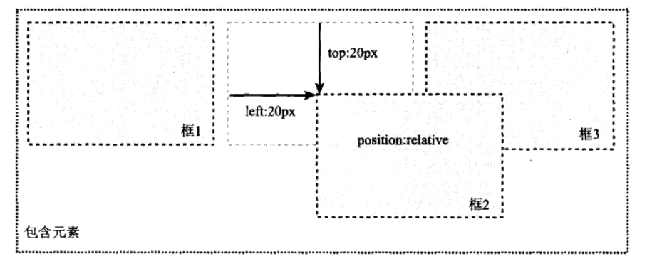 在使用相对定位时,无论是否移动,元素仍占据原来的空间,即上图框1与框3中间的那个虚框占据的空间。因此,移动元素会导致它覆盖其他框。
【本文地址】