| css加载动画(水滴效果) | 您所在的位置:网站首页 › css水流效果 › css加载动画(水滴效果) |
css加载动画(水滴效果)
|
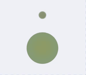
写了好几个加载动画,效果基本是网上找的参考,但代码都是自己实现的。这里就放两个吧,原理都差不多。 先看下效果:
最终实现效果视频可以看我Dou音,DY号:G_console 融合效果的重点是css里的filter属性。 原理是先blur模糊处理,让物体边界重叠,再提高对比度,这样模糊边界就会变清晰。 直接用filter自带的属性也可以实现,但调用svg滤镜效果会更好。看下代码: (以下都是封装的React组件,调用示例:) 水滴React: import cx from 'classnames'; import React from 'react'; import styles from './index.less'; interface ViewProps extends React.HTMLAttributes { active?: boolean; } export default class LoadingDot5 extends React.Component { public render() { const { active, className, children, ...restProps } = this.props; return ( { position: 'fixed', visibility: 'hidden', top: '-1000px', pointerEvents: 'none', }} > ); } }水滴Less: @duration: 1s; @w: 130px; @w_c: 30px; .circle { position: absolute; left: 50%; border-radius: @w; background: #000; animation-duration: @duration; animation-iteration-count: infinite; animation-timing-function: linear; animation-play-state: paused; } .box { width: 100%; height: 100%; display: flex; align-items: center; justify-content: center; &.active { .dot1, .dot2, .dot3 { animation-play-state: running; } } } .viewBox { position: relative; display: flex; flex-wrap: wrap; width: @w; height: @w; } .dot1 { .circle; background: #949b7c; width: @w_c; height: @w_c; top: 0; margin-left: 0px - @w_c * 0.5; animation-name: g_ani; animation-timing-function: cubic-bezier(1, 0.3, 1, 1); } .dot2 { .circle; background: #90a580; width: @w_c * 2; height: @w_c * 2; bottom: 10%; margin-left: 0px - @w_c; animation-name: y_ani; animation-delay: @duration; } .dot3 { .circle; background: #98a470; width: @w_c * 2; height: @w_c * 2; bottom: 10%; margin-left: 0px - @w_c; animation-name: k_ani; } @keyframes g_ani { 0% { transform: translate(0px, 0px) scale(0.4); opacity: 0; } 20% { transform: translate(0px, 0px) scale(1); opacity: 0.6; } 100% { transform: translate(0px, 50px) scale(1); opacity: 1; } } @keyframes y_ani { 0% { transform: scaleX(1) scaleY(1); } 5% { transform: scaleX(0.6) scaleY(1.4); } 15% { transform: scaleX(1.2) scaleY(0.8); } 25% { transform: scaleX(0.9) scaleY(1.1); } 35% { transform: scaleX(1) scaleY(1); } 100% { transform: scaleX(1) scaleY(1); } } @keyframes k_ani { 0% { transform: translate(0px, 0px) scale(0.6); } 5% { transform: translate(0px, -10px) scale(0.6); } 10% { transform: translate(0px, -5px) scale(0.6); } 100% { transform: translate(0px, 0px) scale(0.6); } }圈圈React: import cx from 'classnames'; import React from 'react'; import styles from './index.less'; interface ViewProps extends React.HTMLAttributes { active?: boolean; } export default class LoadingDot6 extends React.Component { public render() { const { active, className, children, ...restProps } = this.props; return ( { position: 'fixed', visibility: 'hidden', top: '-1000px', pointerEvents: 'none', }} > ); } }圈圈Less: @durationCir: 20s; @duration: 2.5s; @w: 100px; @w_b: 20px; .box { width: 100%; height: 100%; display: flex; align-items: center; justify-content: center; &.active { .cir, .dots { animation-play-state: running; } } } .viewBox { position: relative; display: flex; flex-wrap: wrap; width: @w; height: @w; } .cir { position: absolute; left: 0; top: 0; width: 100%; height: 100%; border-top: @w_b solid #949b7c; border-left: @w_b solid #949b7c; border-right: @w_b solid #839b7c; border-bottom: @w_b solid #949b7c; border-radius: @w * 2; clip-path: polygon(50% 0%, 100% 0%, 100% 120%, 10% 120%); -webkit-clip-path: polygon(50% 0%, 100% 0%, 100% 120%, 10% 120%); animation-name: g_ani; animation-duration: @durationCir; animation-iteration-count: infinite; animation-timing-function: linear; animation-play-state: paused; } .dots { position: absolute; width: 100%; height: 100%; top: 0; left: 0; animation-name: y_ani; animation-duration: @duration; animation-iteration-count: infinite; animation-timing-function: linear; animation-play-state: paused; .dot { position: absolute; width: @w_b * 1; height: @w_b * 1; border-radius: @w; background: #949b7c; &:nth-child(1) { top: 0; left: 50%; margin-left: 0px - @w_b * 0.5; } &:nth-child(2) { top: 50%; left: 0; margin-top: 0px - @w_b * 0.5; } &:nth-child(3) { bottom: 0; left: 50%; margin-left: 0px - @w_b * 0.5; } &:nth-child(4) { top: 50%; right: 0; margin-top: 0px - @w_b * 0.5; } } } @keyframes g_ani { 0% { transform: rotate(0deg); } 100% { transform: rotate(-360deg); } } @keyframes y_ani { 0% { transform: rotate(0deg); } 100% { transform: rotate(360deg); } } |

【本文地址】
公司简介
联系我们